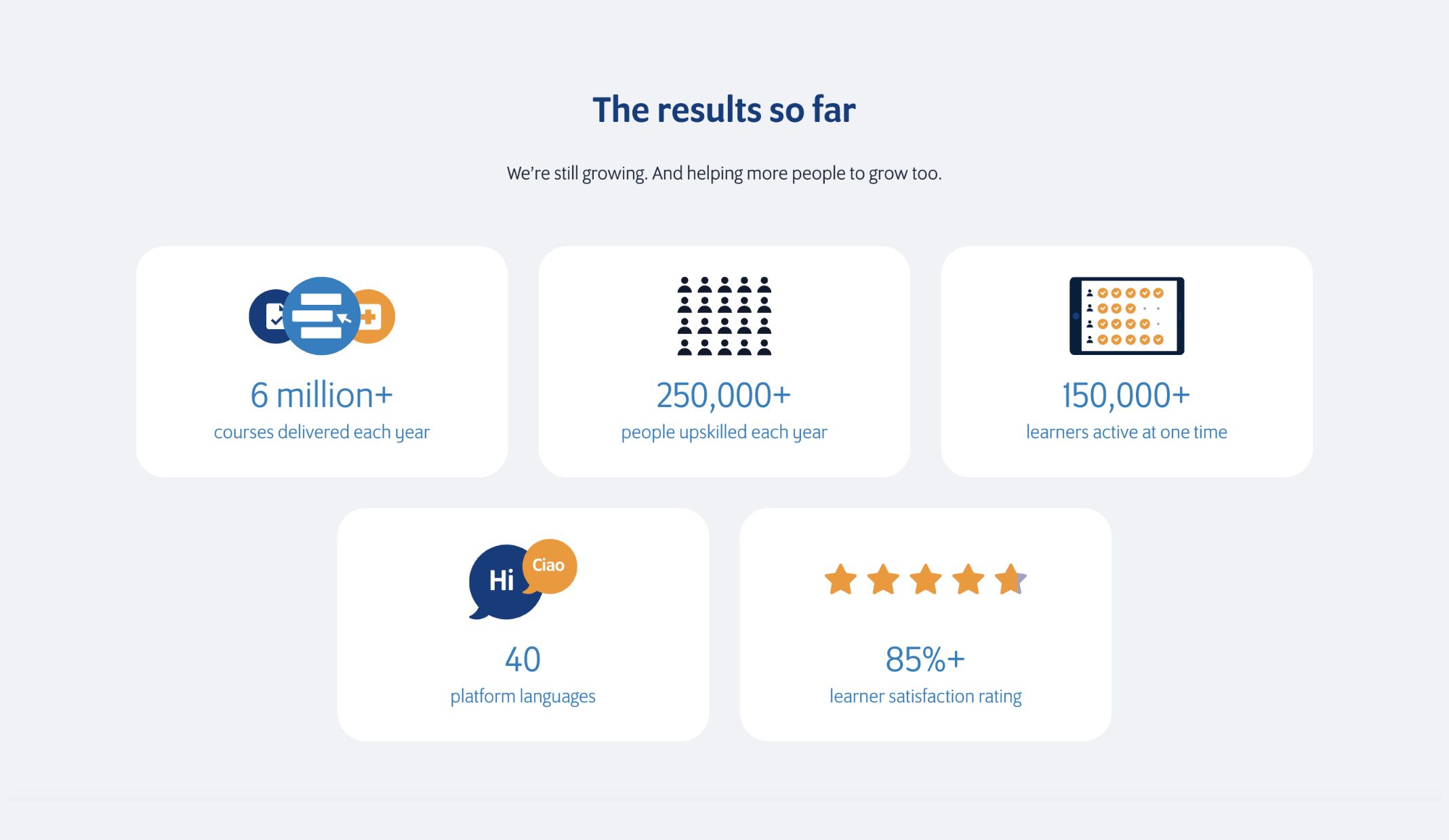
engagement rate
increase in users
conversion rate
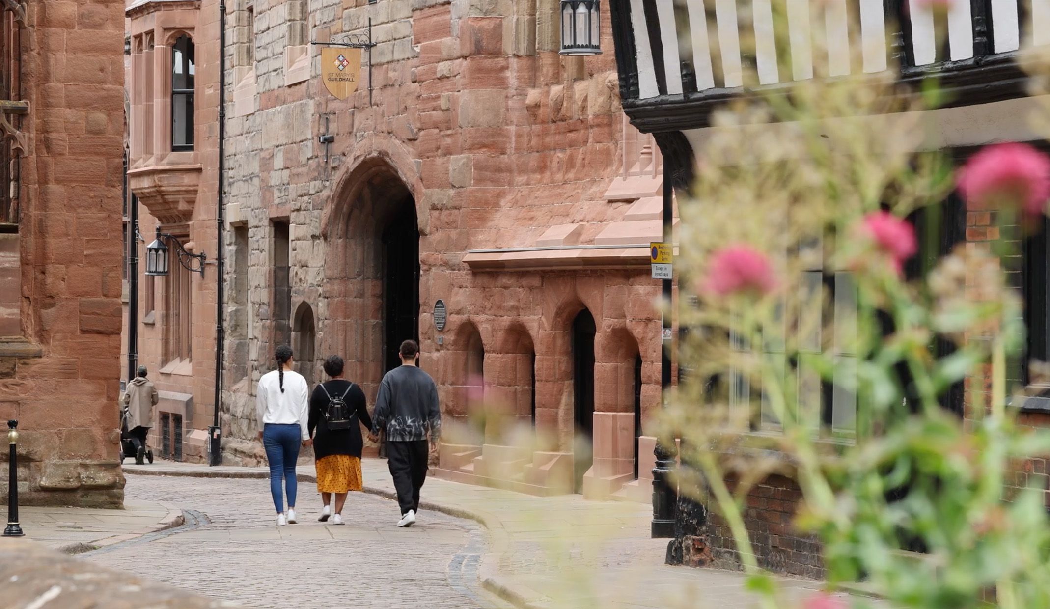
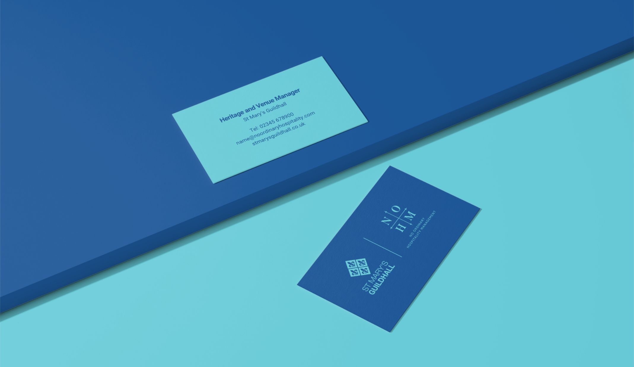
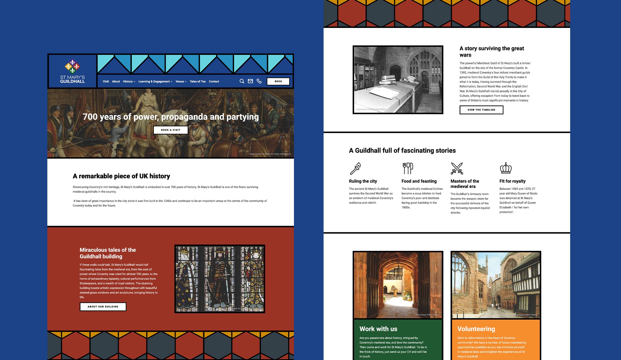
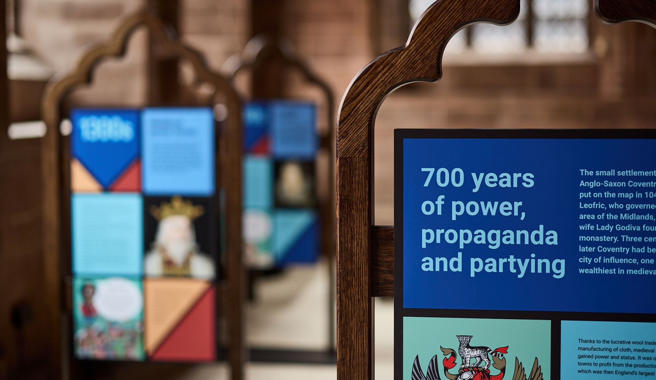
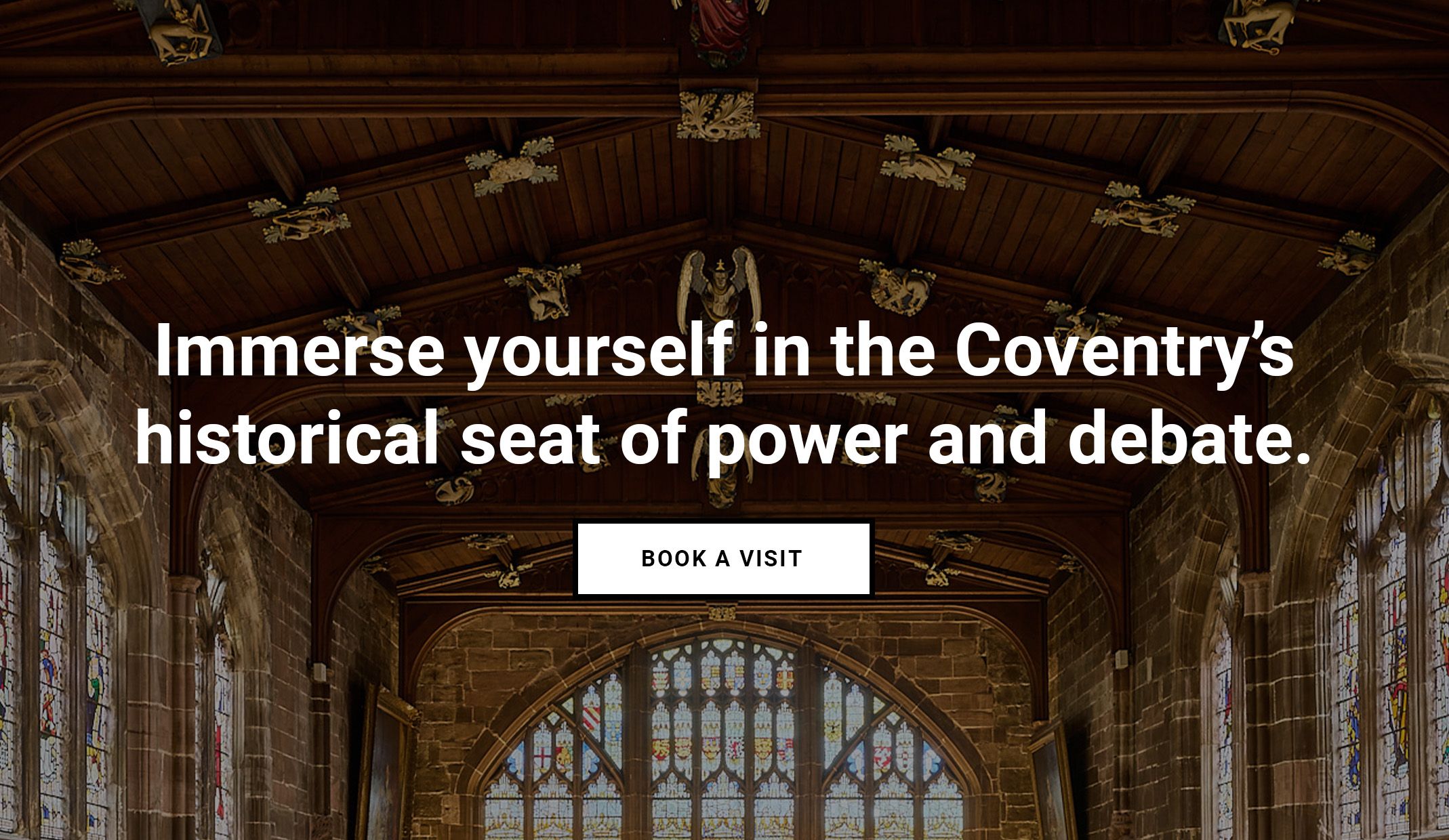
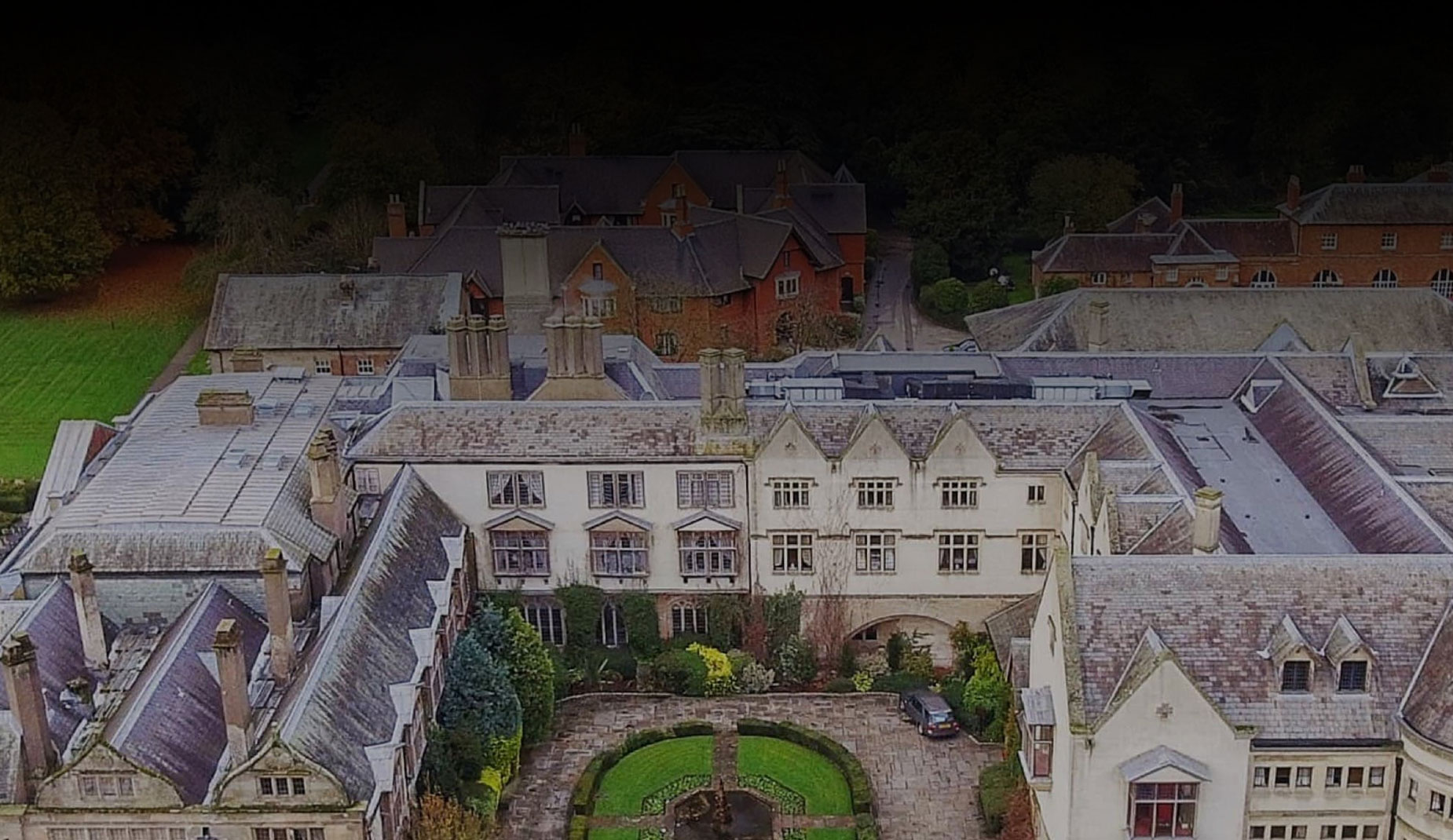
Having received a lottery investment of more than £6 million, St Mary’s Guildhall was able to transform into a must see visitor attraction. With plans to reopen their doors, they needed a new website to attract people to the newly opened historical destination.
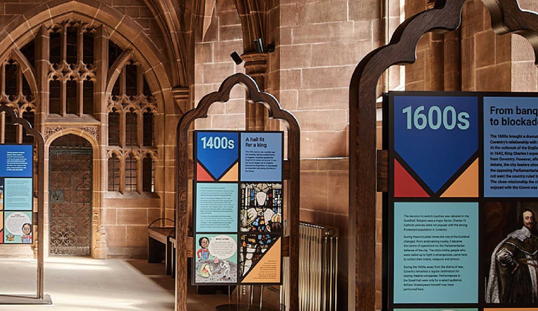
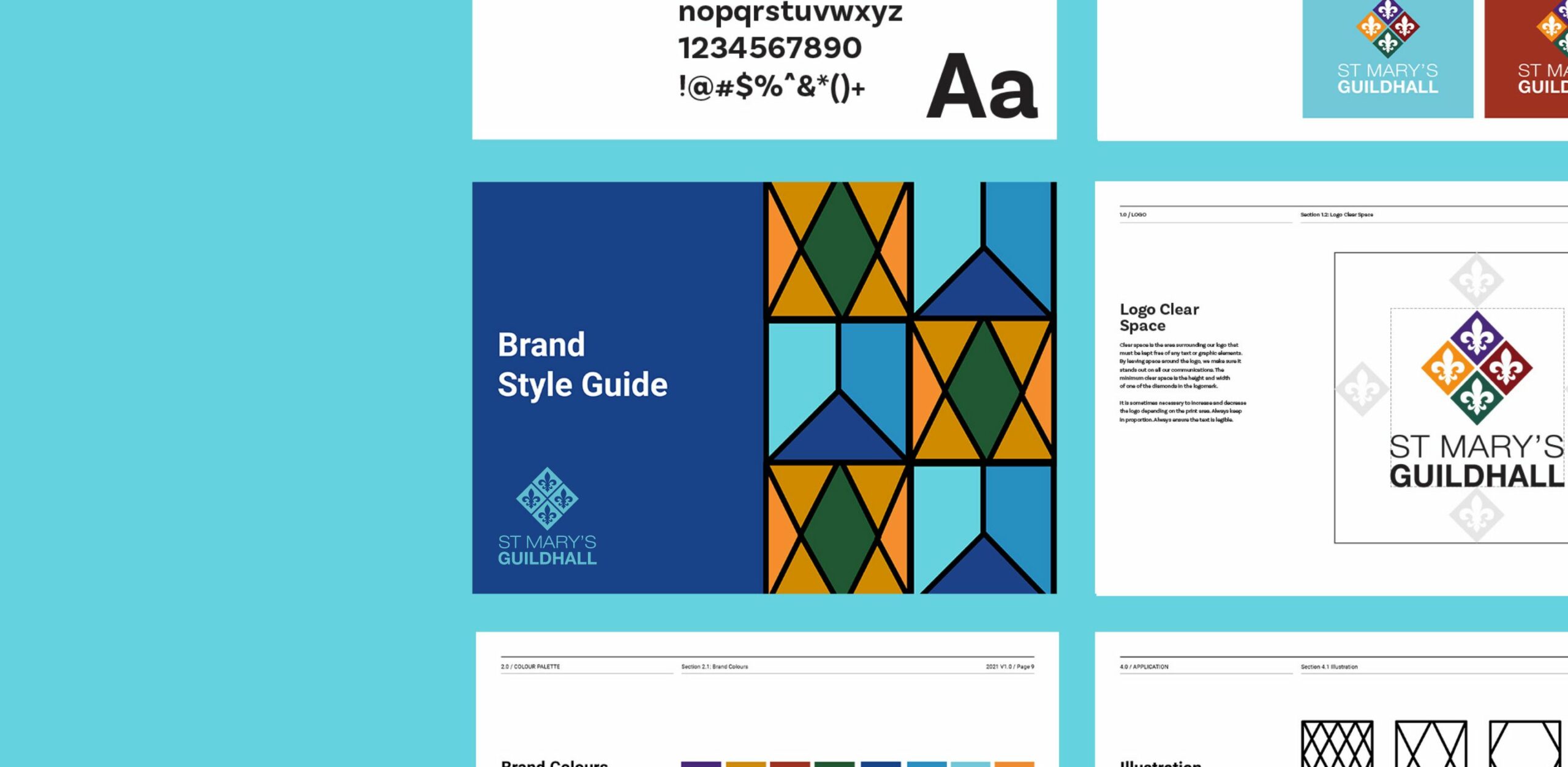
St Mary’s Guildhall needed a brand direction that was modern, respectful and appropriate for a wide range of people. To get across the idea that the iconic venue would be reinventing itself as an appealing attraction to all, we developed the existing brand guidelines and updated the internal signage in line with their marketing strategy, which emphasised the end-to-end experience.
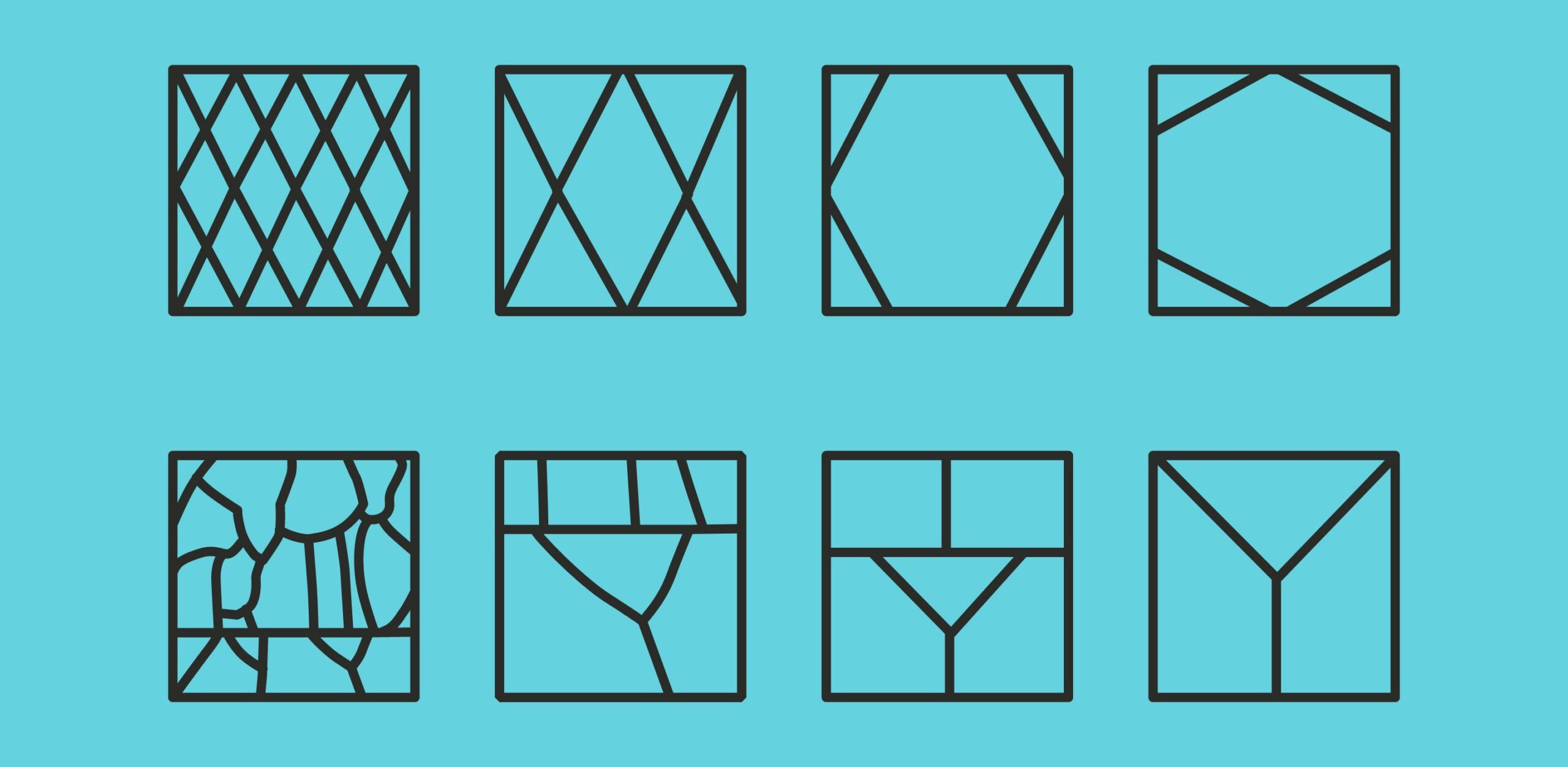
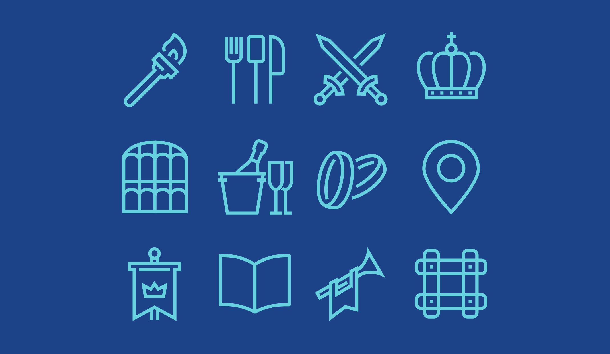
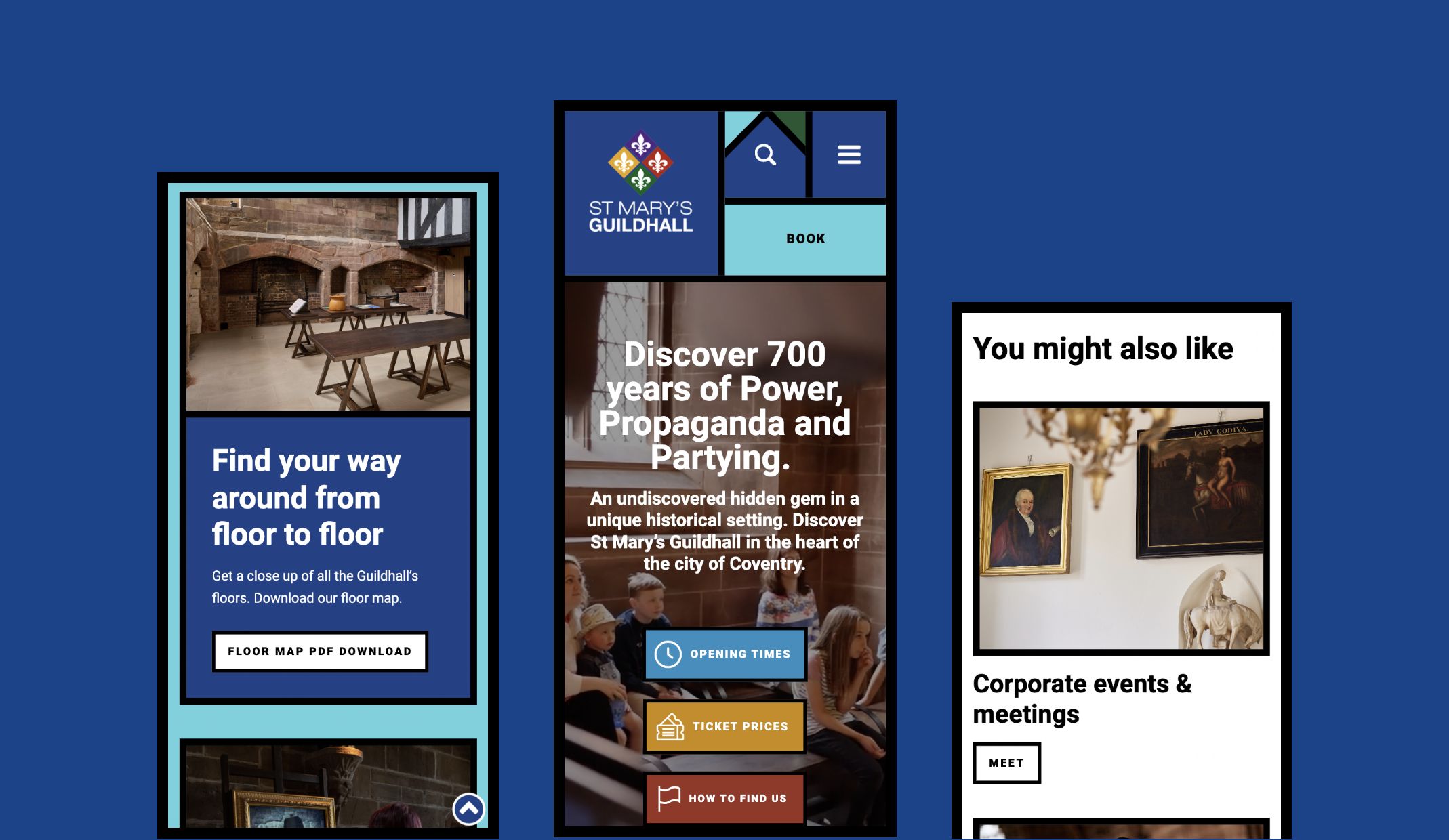
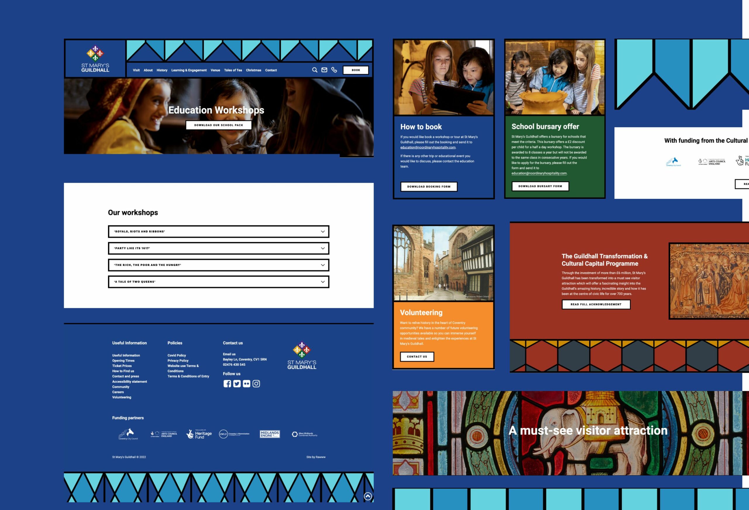
To maximise the marketing potential of the new visitor-friendly location and its various commercial offerings, we built a new website that embraces the Guildhall’s medieval history. We introduced colourful patterns to the website design that reflect the renowned glass stained windows, giving the venue a family-friendly feel.
The new website considers the entire user journey, including an easy to navigate booking system where group visits, celebrations and an afternoon tea experience can be booked. Alongside increasing booking footfall, the website works to encourage visitors to view the educational resources available, including a virtual tour where you can digitally view the famous Medieval Tapestry on the website, paying homage to the building’s unique history.
– Marketing Manager, SMGH
increase in website traffic
increase in page views
increase in direct brand awareness traffic
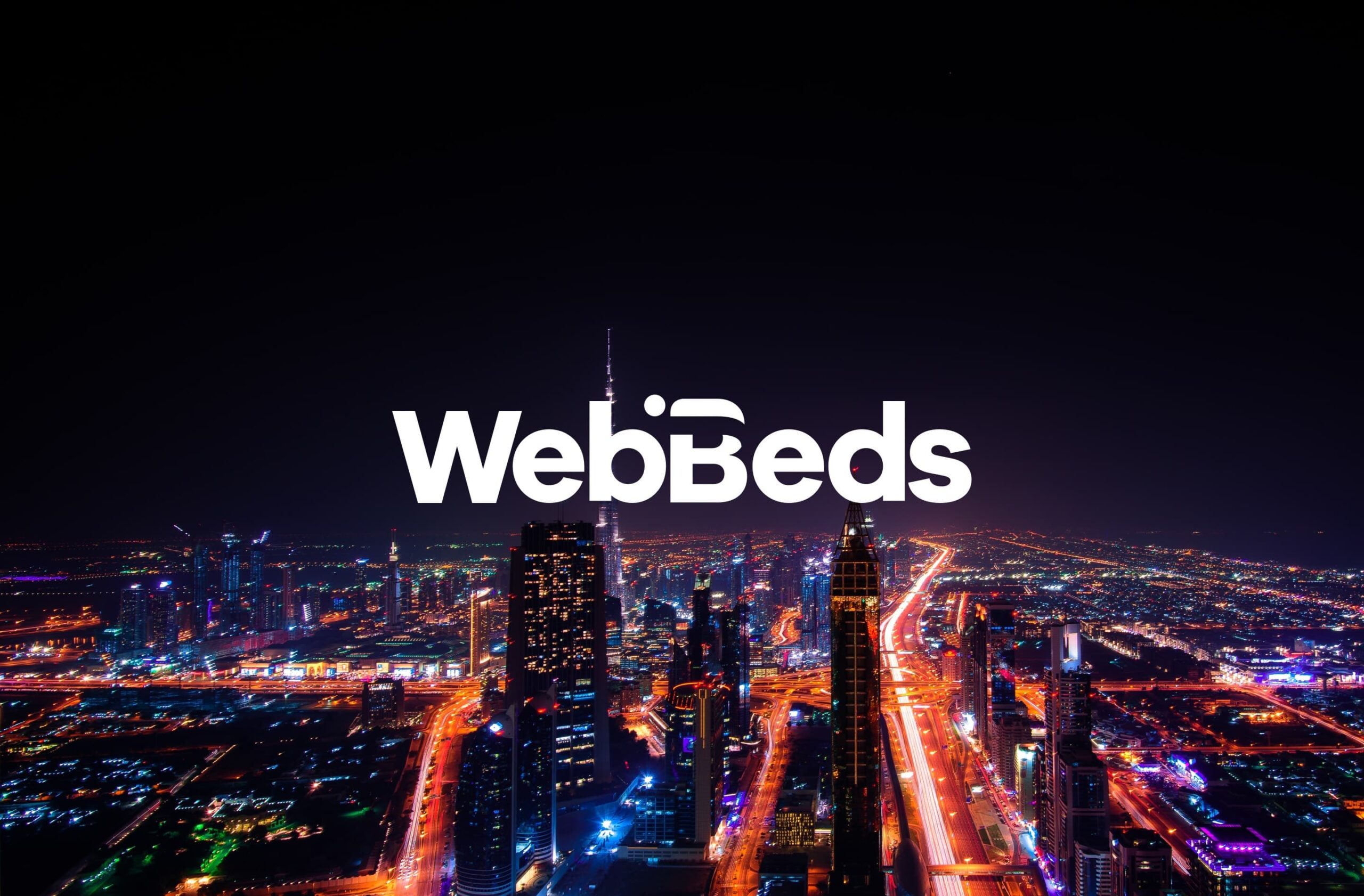
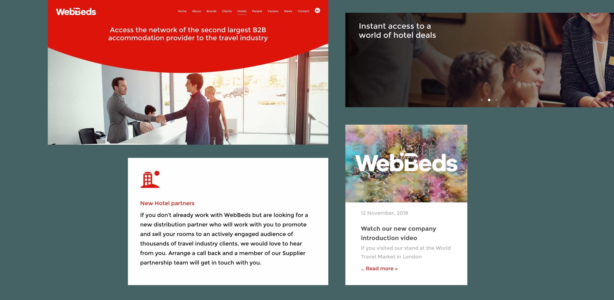
As a B2B division of WebJet, a leading online travel agency in Australia and New Zealand, WebBeds has built a global portfolio of five leading B2B travel providers. They needed branding that brought five trusted travel brands under one established brand, and effectively highlighted their forward-thinking approach to travel.
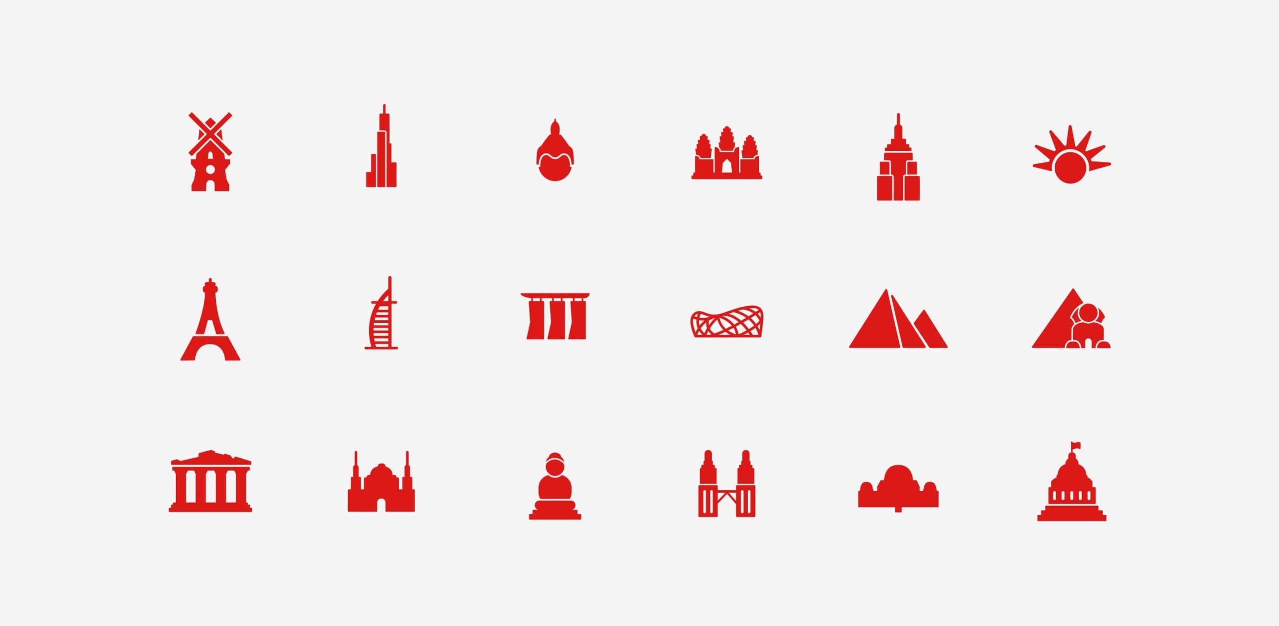
The concept behind the branding for WebBeds focused on creating a visual representation of what the business is all about – hotel accommodation for the travel industry. The typography in the new logo design is curved, a subtle reference to WebBeds being ‘ahead of the curve’ in the travel industry, whilst the letter ‘B’ encompasses an abstract figure lying in a hotel bed. The curvature of the logo also influenced the bespoke suite of icons we created for WebBeds to use across marketing materials, equipping WebBeds with a complete set of branded iconography to use in the future.
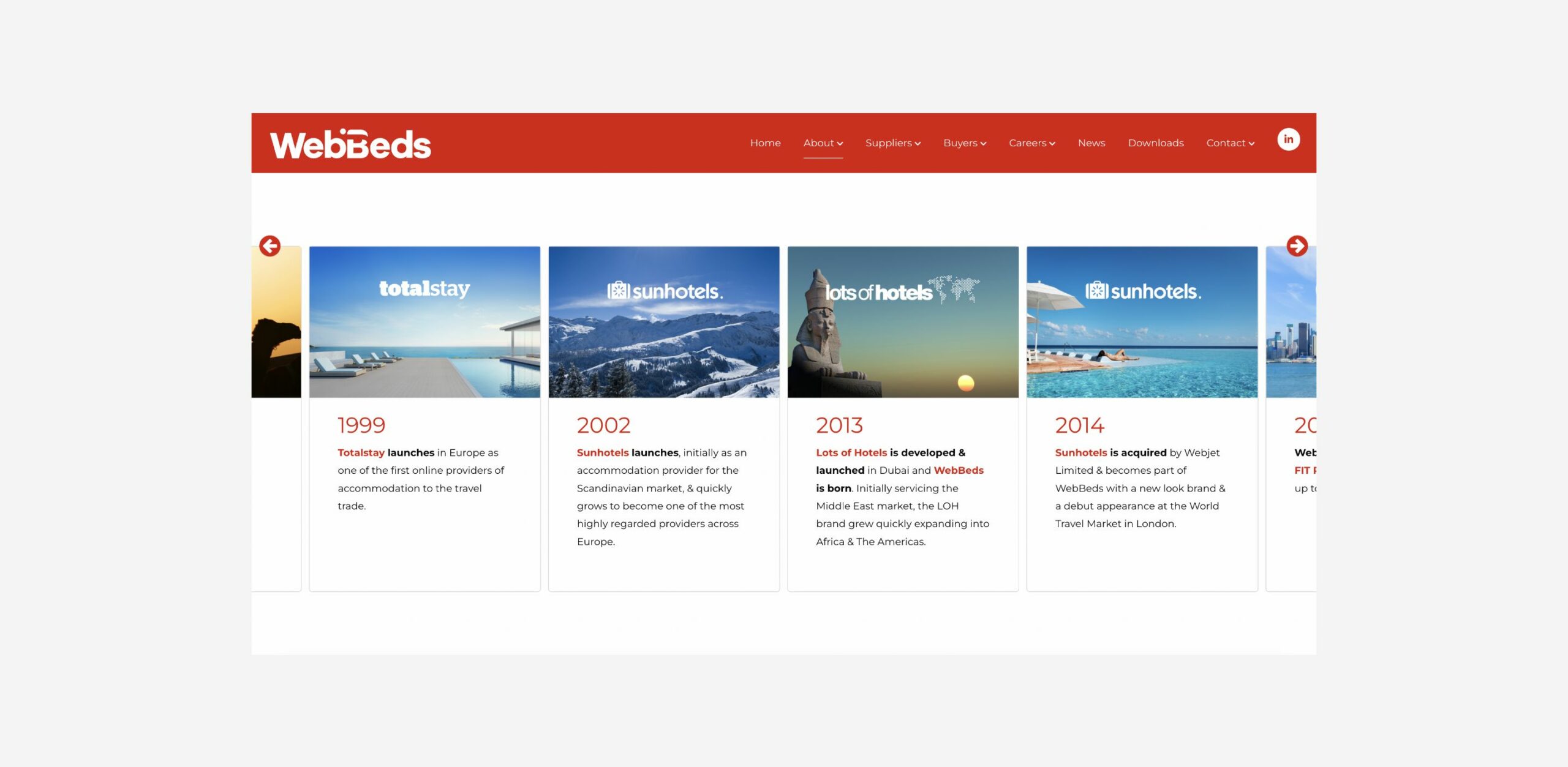
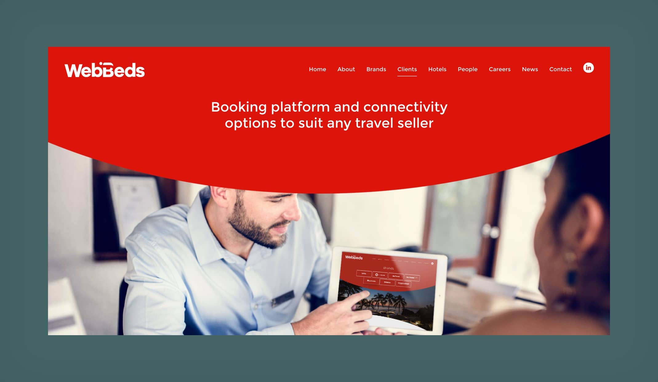
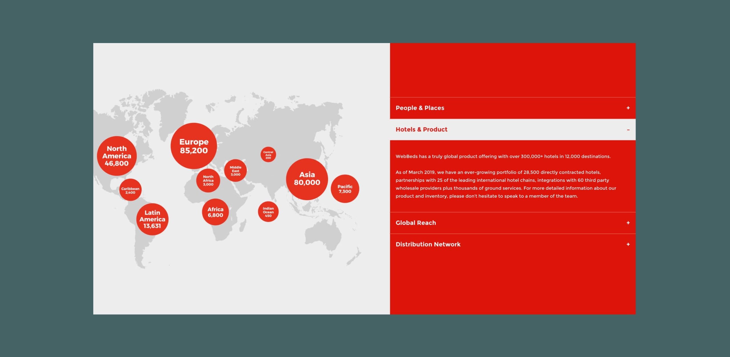
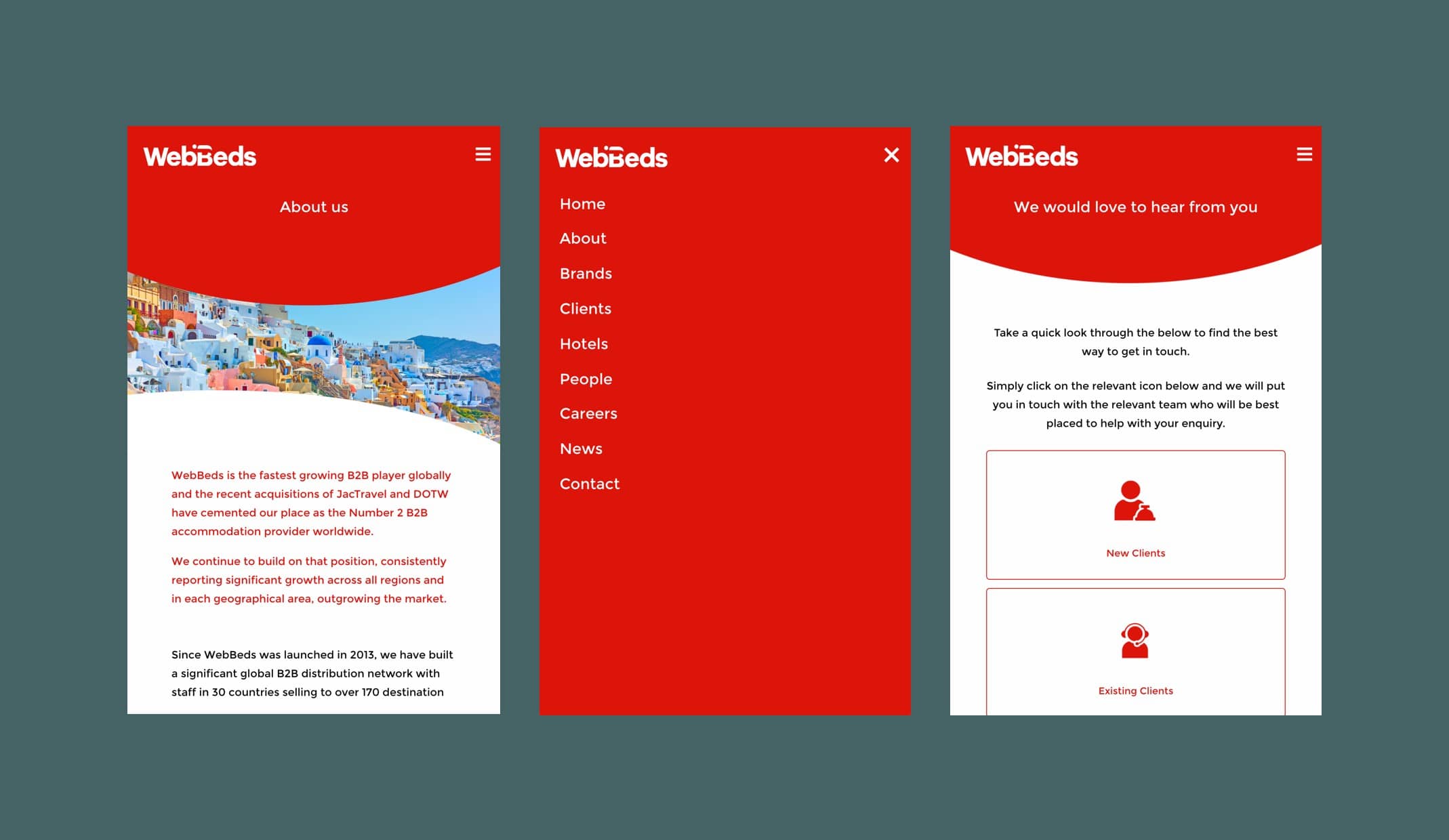
With 50 offices globally and hotels in more than 12,000 destinations worldwide, WebBeds needed a website that would provide a global platform for the multiple travel companies. We used elements of the WebBed’s curve into the design, using the brand’s new suite of icons to help structure page content and highlight key USPs. Within the ‘About’ page, we designed an animated world map that users can interact with to find out information relating to the regions WebBeds cover, their hotels and distribution network. A scrollable timeline carousel captures and brings to life the journey WebBeds has been on to become the global leader it is today.
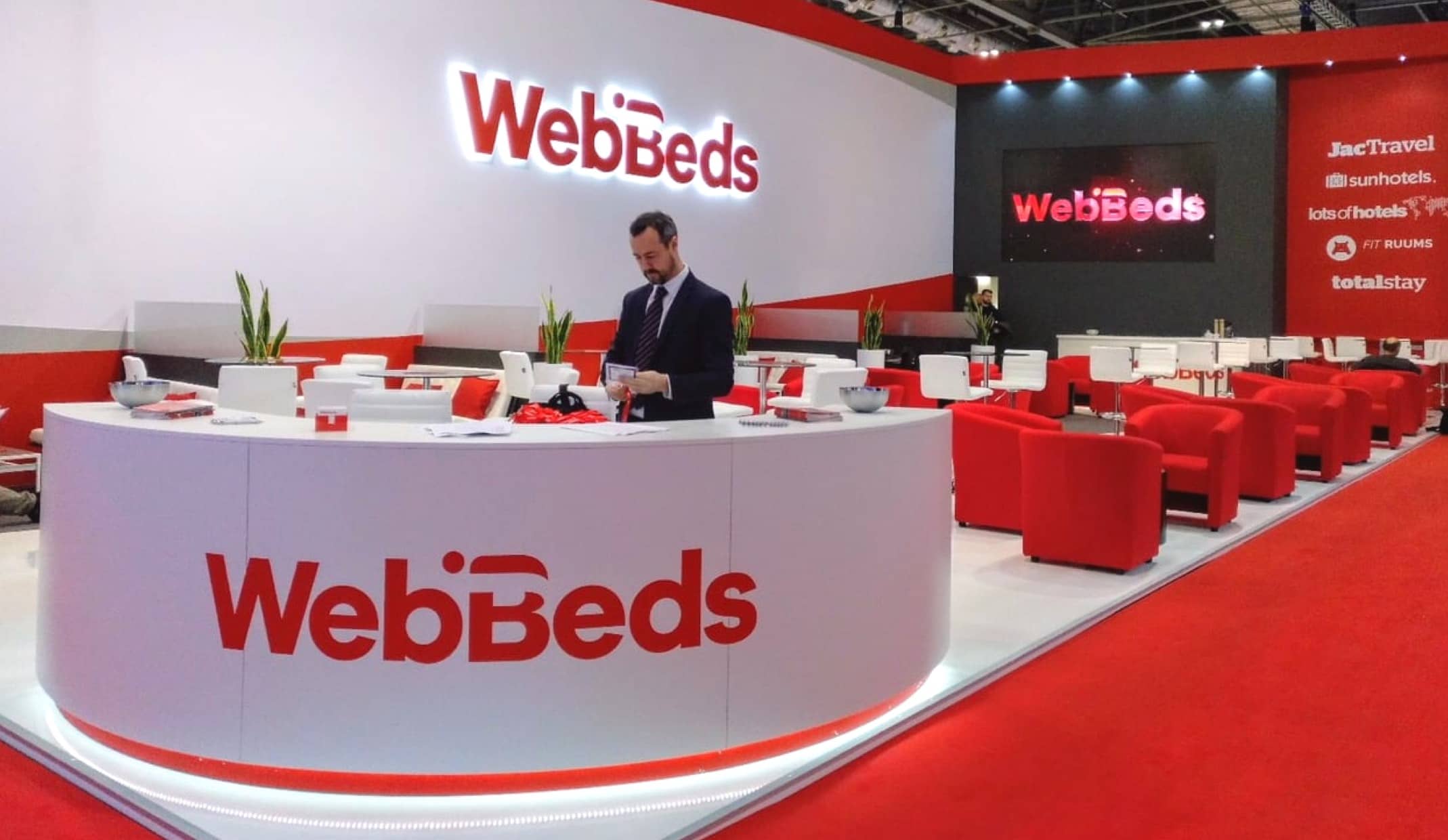
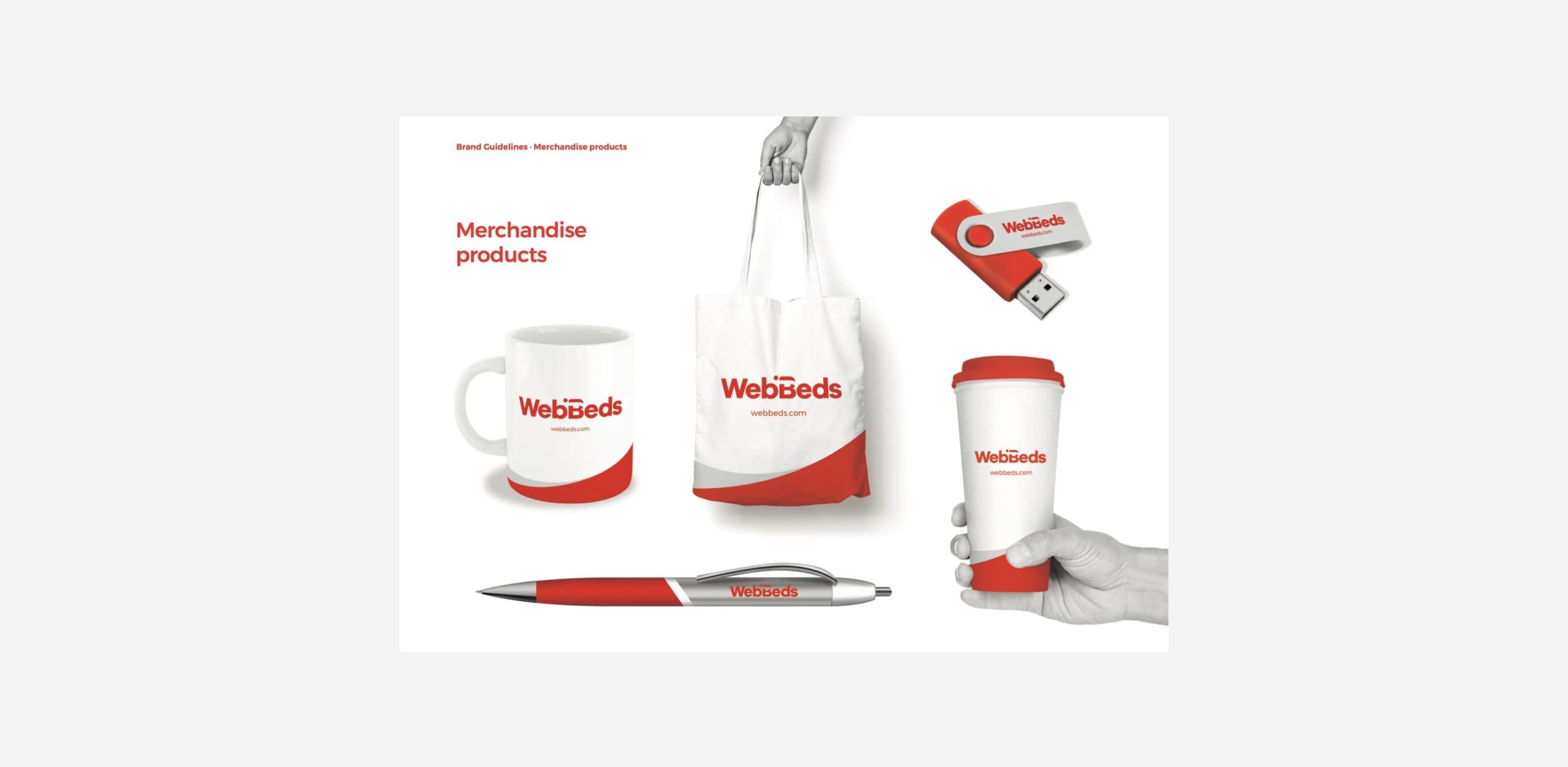
WebBeds exhibit and organise a lot of trade shows within the travel industry across the globe, and we ensured their new branding would attract the attention of any passer-by, in any country. The branding that was used for the event, made its debut at the 2018 World Travel Market trade show in London. To help WebBeds make a lasting impression following other trade shows, we created branded merchandise, which included bags, recyclable cups and mugs.
– Head of Marketing, WebBeds
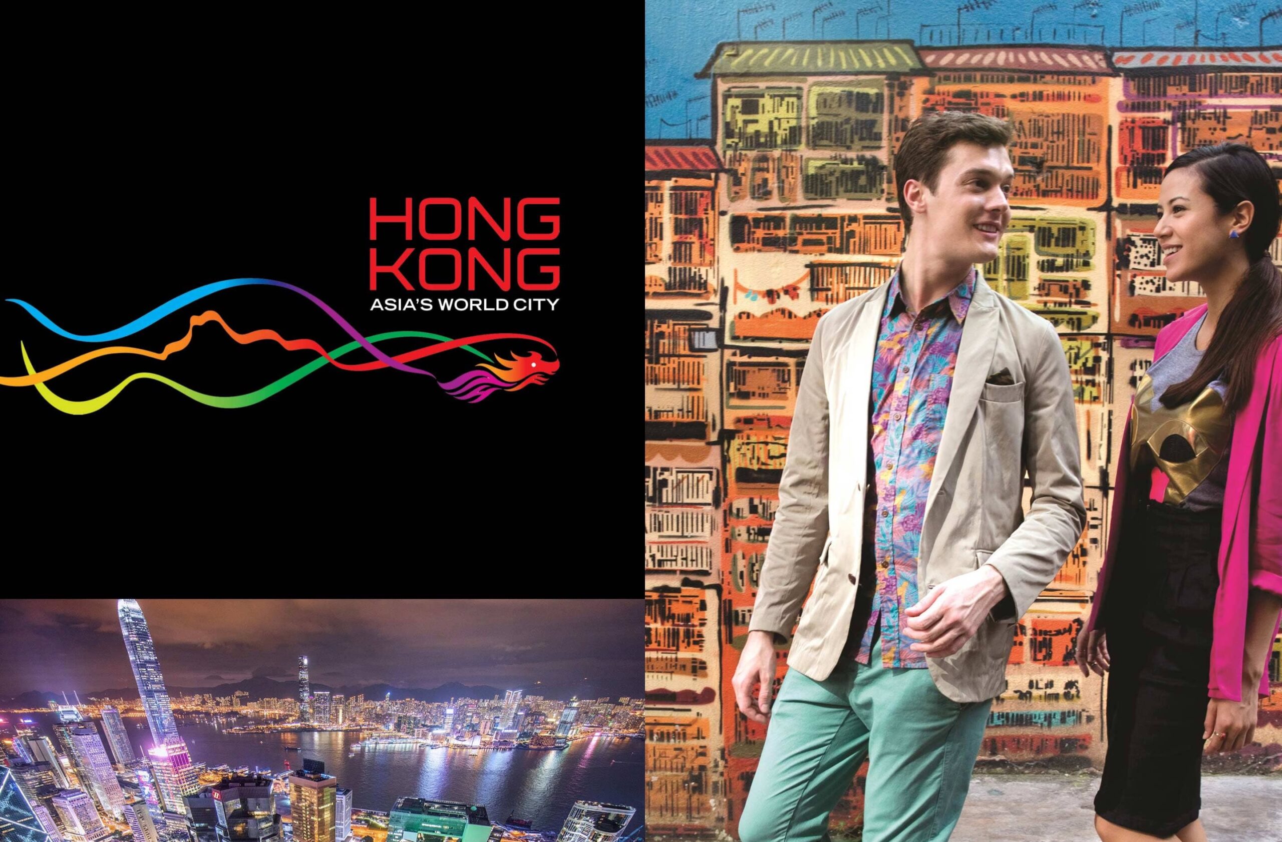
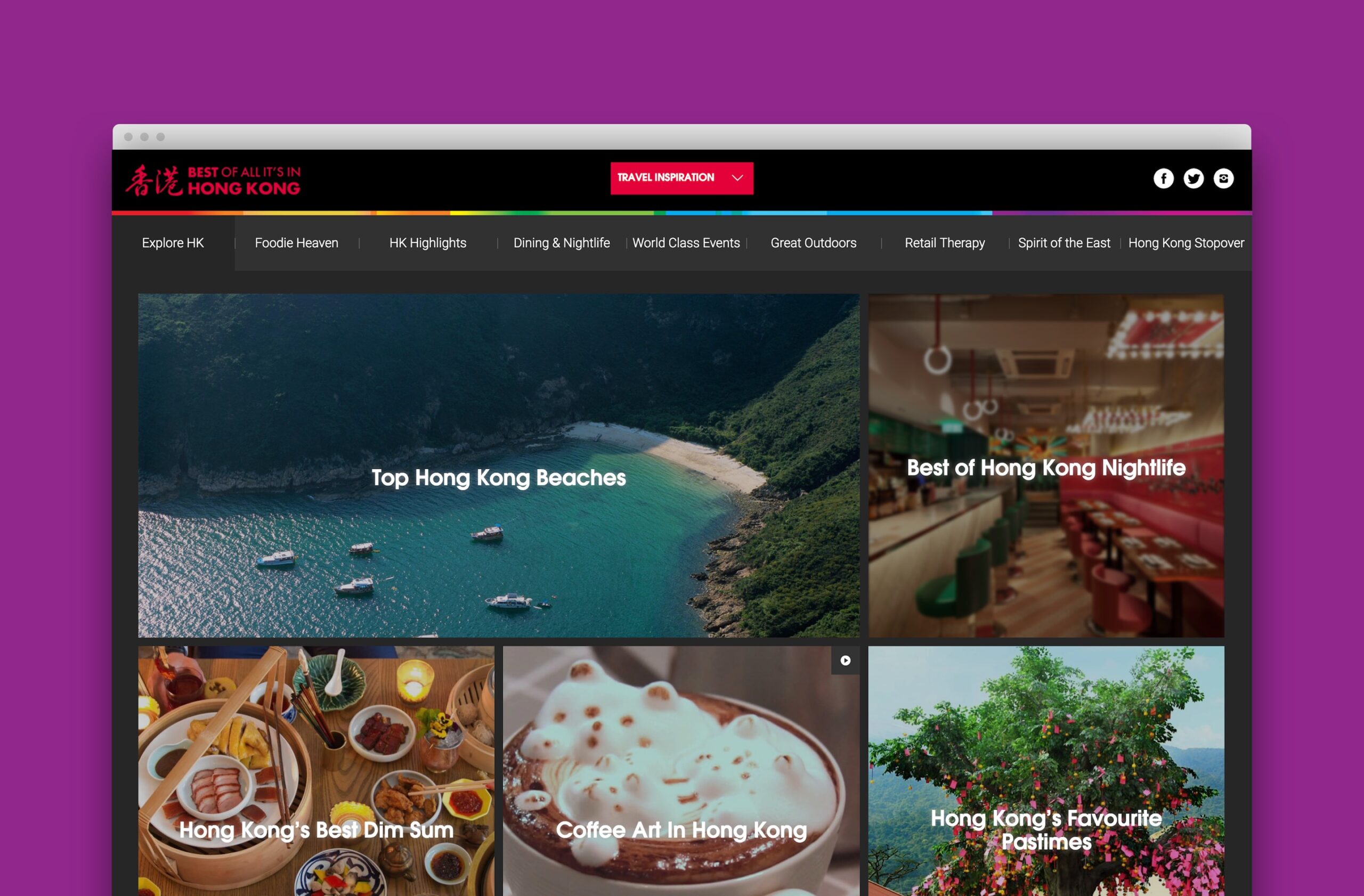
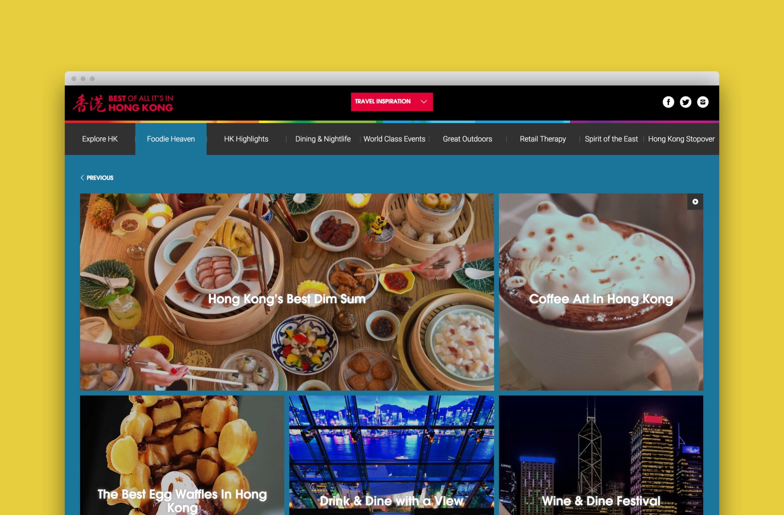
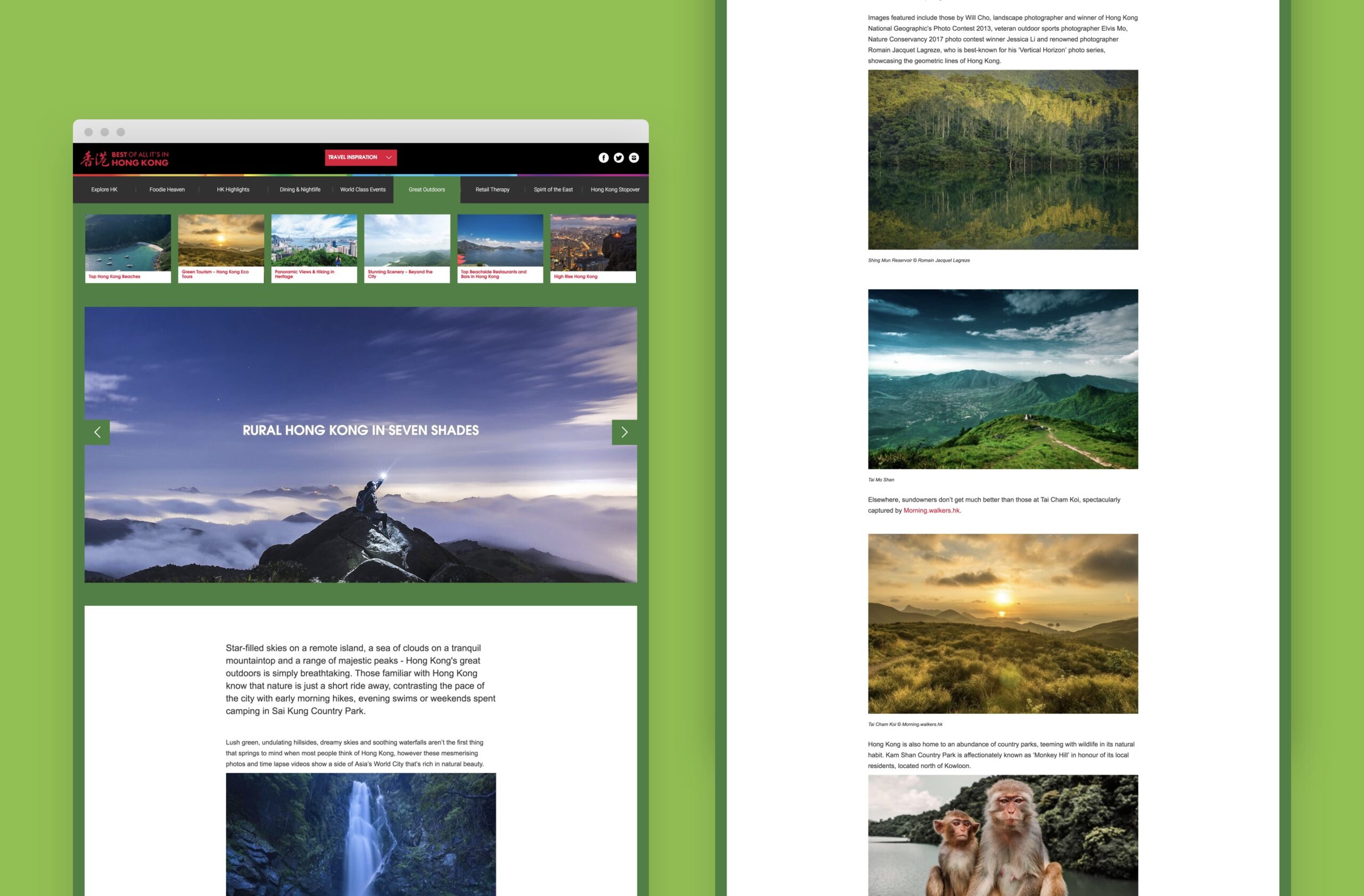
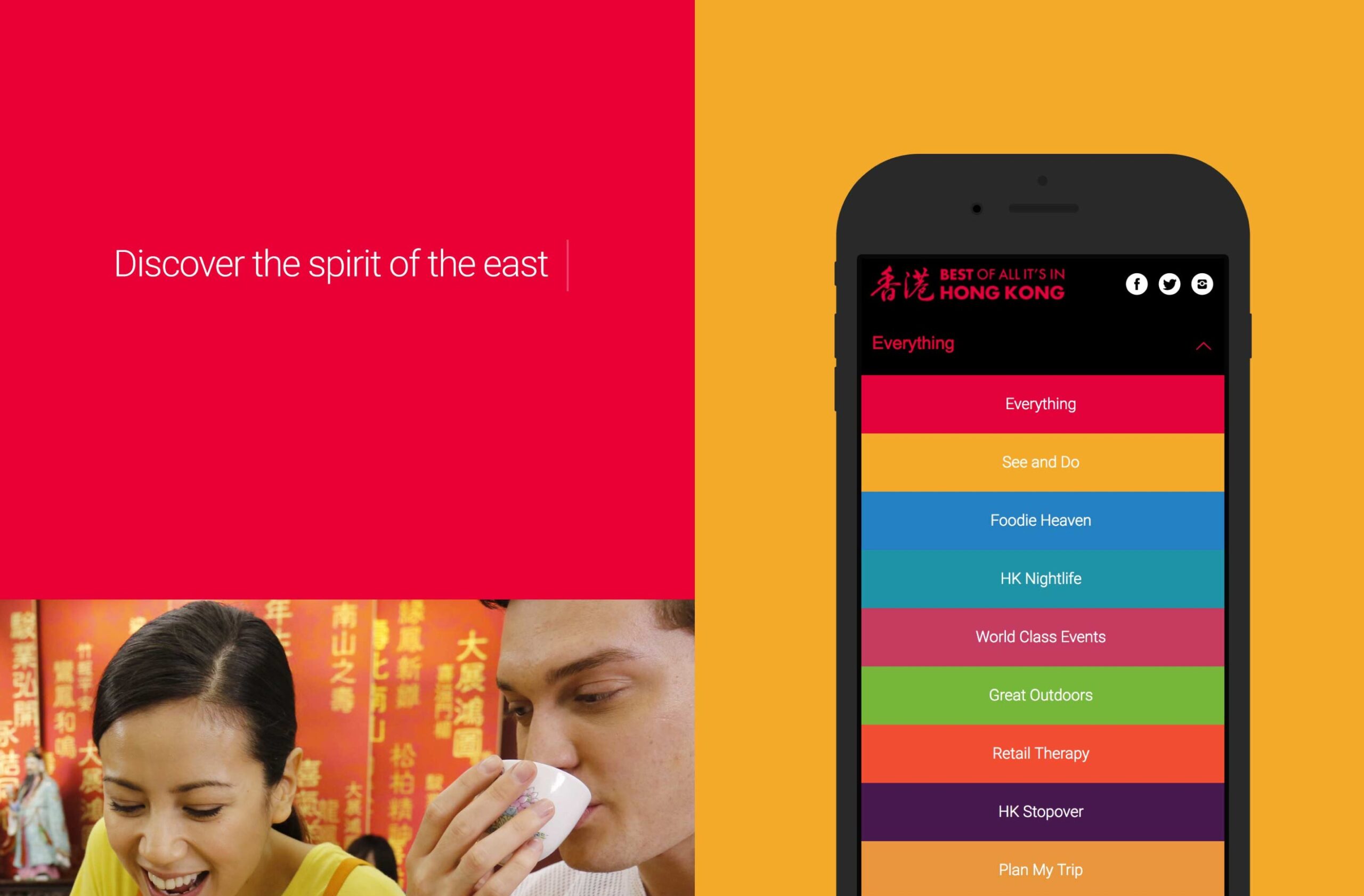
Many tourists viewed Hong Kong as an enjoyable but brief stopover rather than a destination to be experienced over a longer period. We countered this with a microsite for the Hong Kong Tourism Board that used rich content to convey the full range and depth of the Hong Kong experience. We delivered the site across the globe, working alongside local marketing managers to spread the word.
– Marketing Manager, Hong Kong Tourism UK
uplift in website users
site CTR increase
uplift in conversions
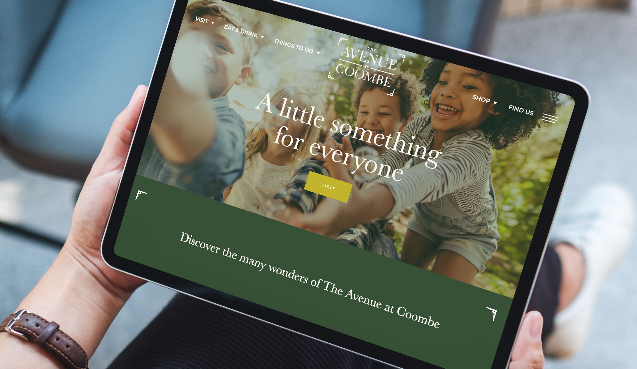
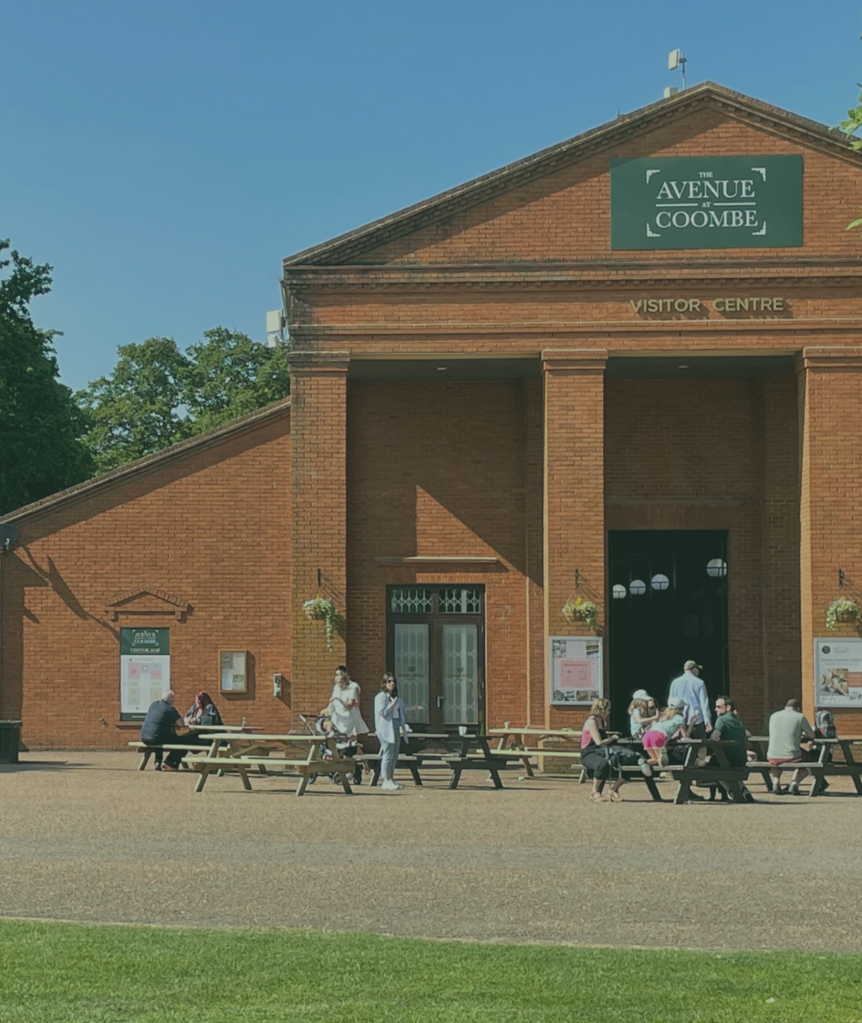
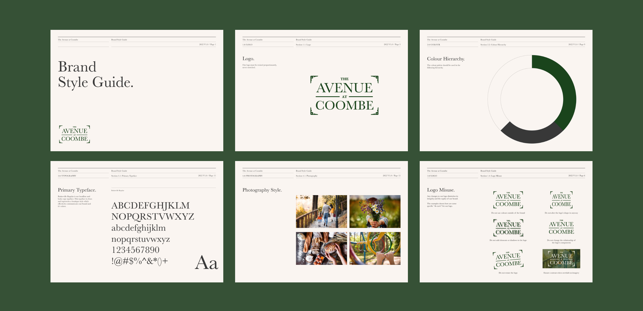
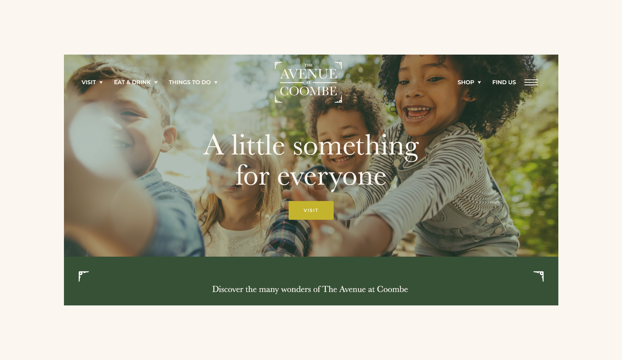
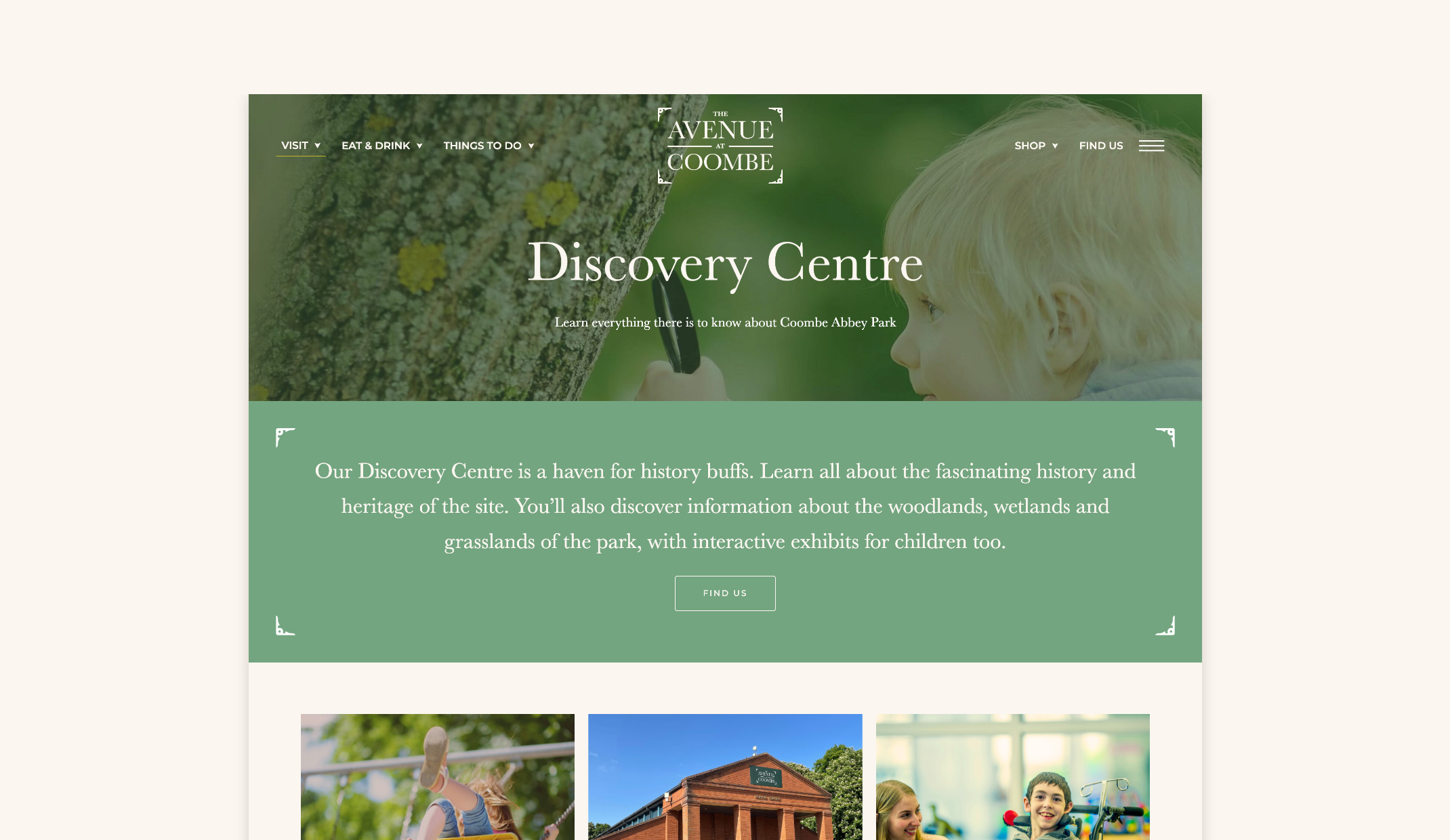
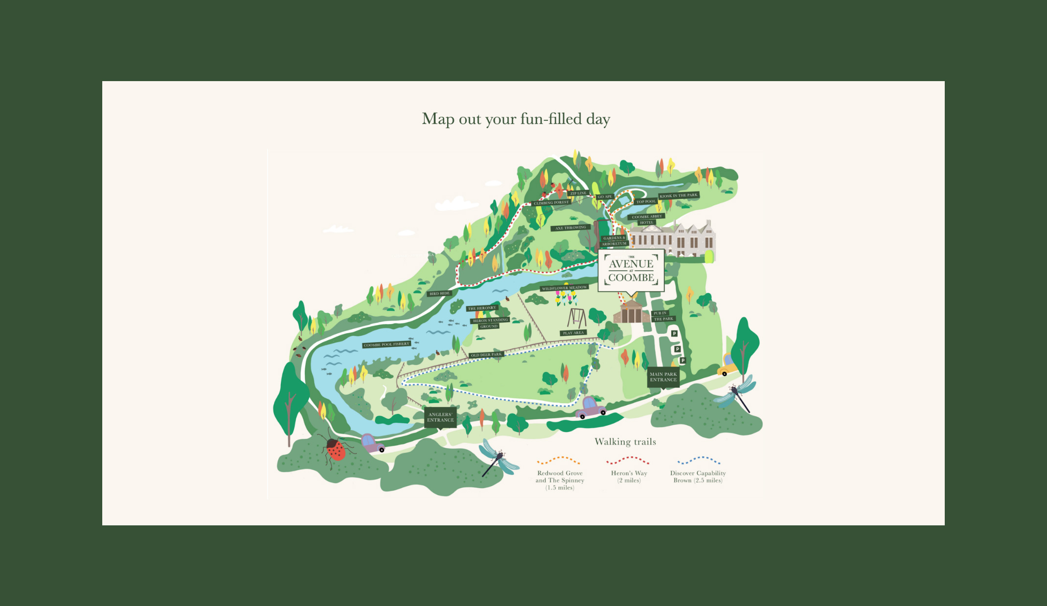
Sitting in the Coombe Abbey grounds, The Avenue at Coombe wasn’t very well signposted, meaning many park visitors were missing the building and heading straight for the park. Coombe Abbey came to us wanting to improve footfall to The Avenue, which included naming, creating a brand and building a website to improve awareness of The Avenue.
The Avenue at Coombe is bursting with shops, eateries, gifts and play areas, so the branding needed to represent everything they have to offer. We created a brand that not only articulates their services and USPs, but also raises awareness about its location, which was a key factor in the brief.
The family friendly branding takes on a different style to the Coombe Abbey and Coombe Park branding to ensure it’s represented as its own entity, whilst also complimenting the Coombe branding for consistency and bringing the brands together so visitors are aware that they can drop into The Avenue before and after they visit the Coombe Park.
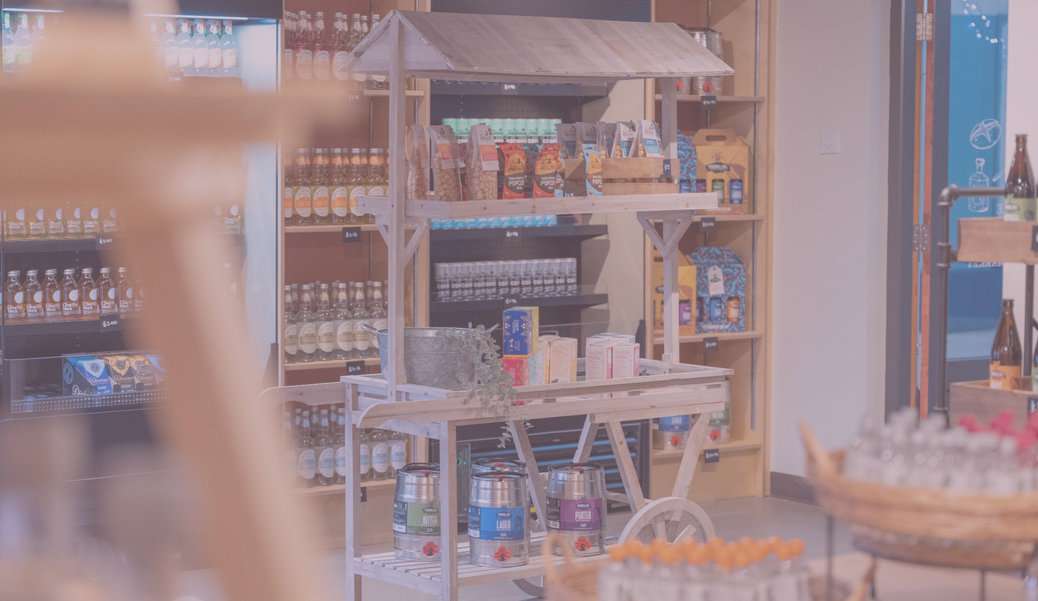
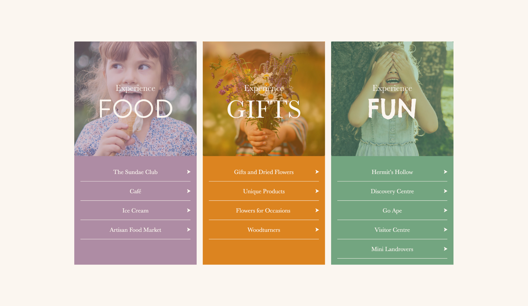
From a flower shop, an artisan market, to a discovery centre and much more, The Avenue at Coombe has something for every family member to enjoy and take part in, which the brand messaging and website highlight. The easy to use website has been built with the user journey in mind. Information is easy to find, split into 3 different services including; Food, Gifts and Fun, covering all bases of The Avenue. Families can experience this special family attraction and make a whole day of it at Coombe Abbey.
We’ve recently been working with The Avenue on the launch of their new and innovative play park, Hermit’s Hollow, set to open this summer. A place where children of all ages can play, explore and socialise with one another, and accompanying adults can enjoy a tasty treat or a hot drink from Hermit’s Cafe whilst the kids play. The perfect place, whether you’re a child or an adult to spend a summer’s day.
With a distinctive brand and website that represents The Avenue at Coombe as a unique family destination, the brand now has the awareness needed to attract their target audience and keep them coming back for more food, gifts and fun.
– Marketing Manager, No Ordinary Hospitality Management
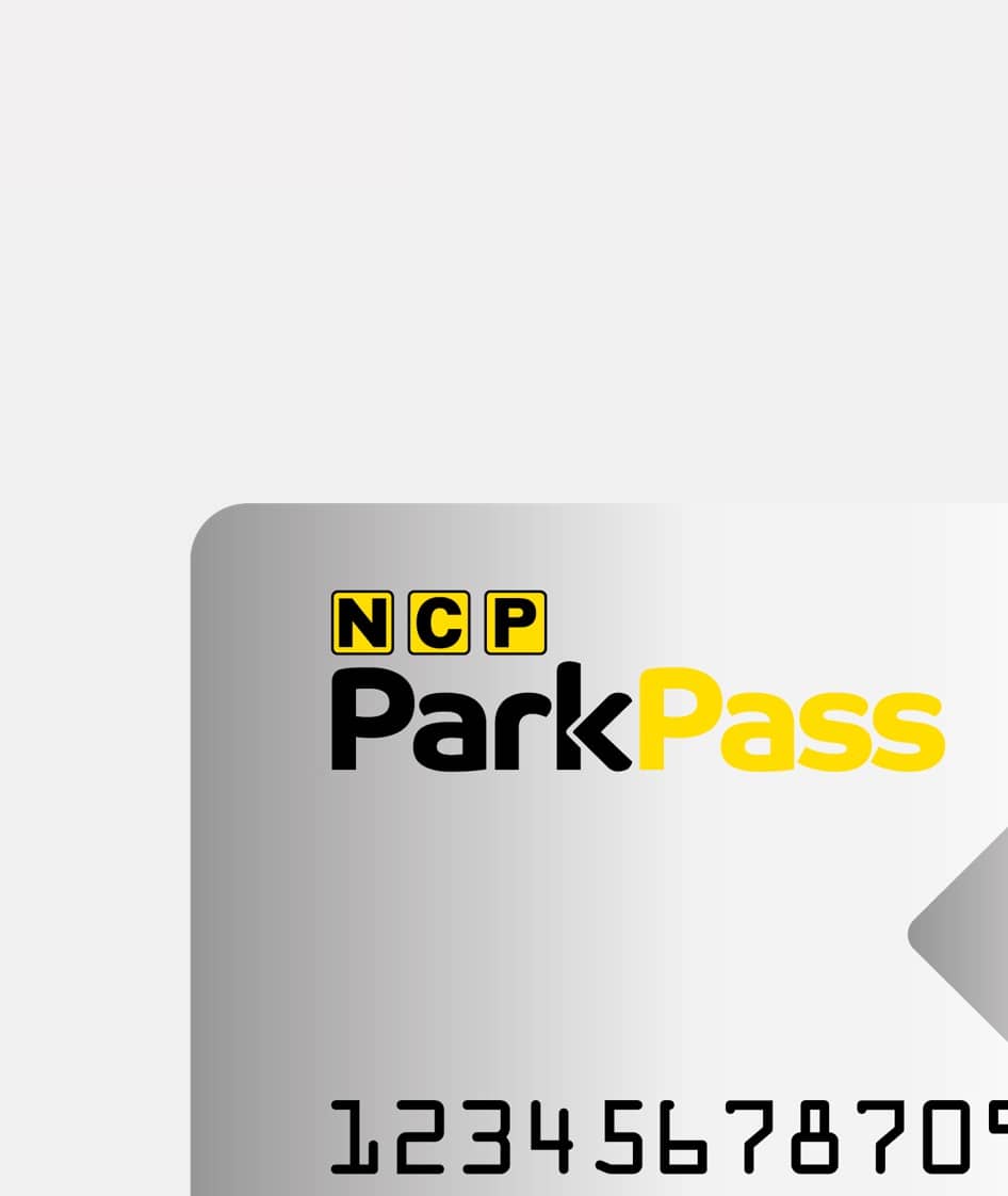
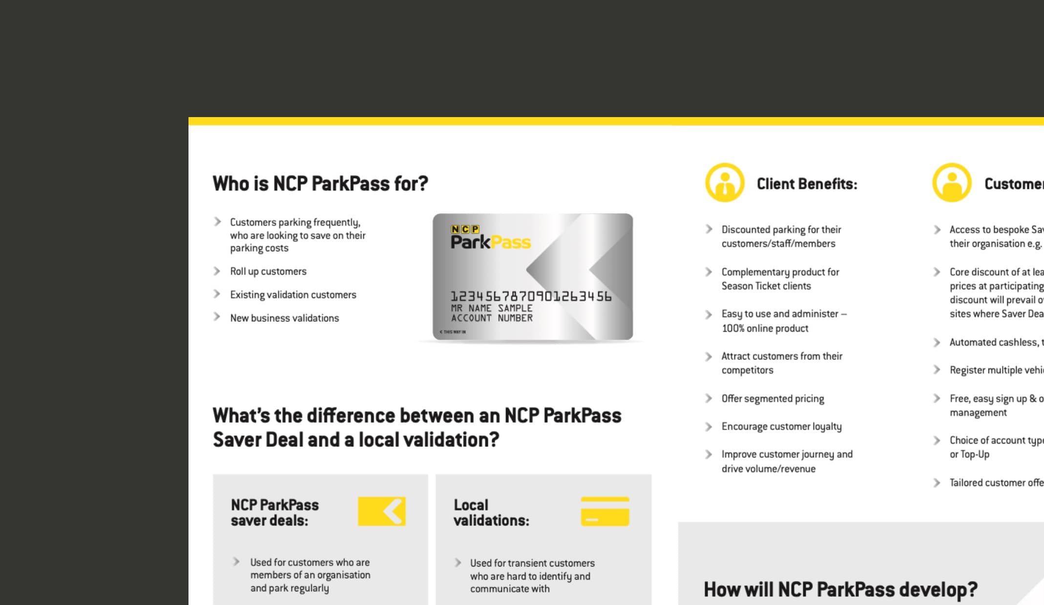
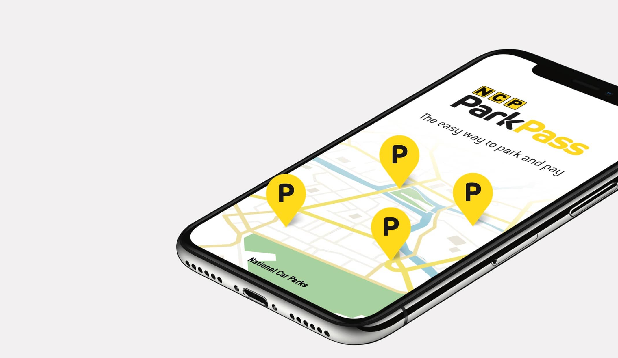
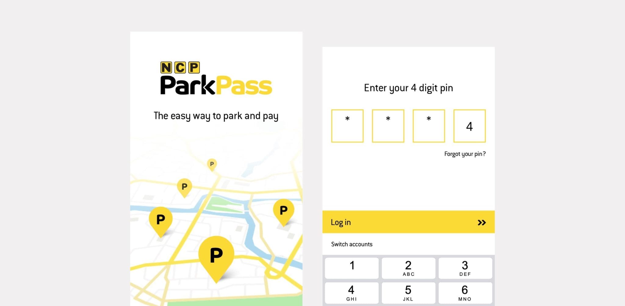
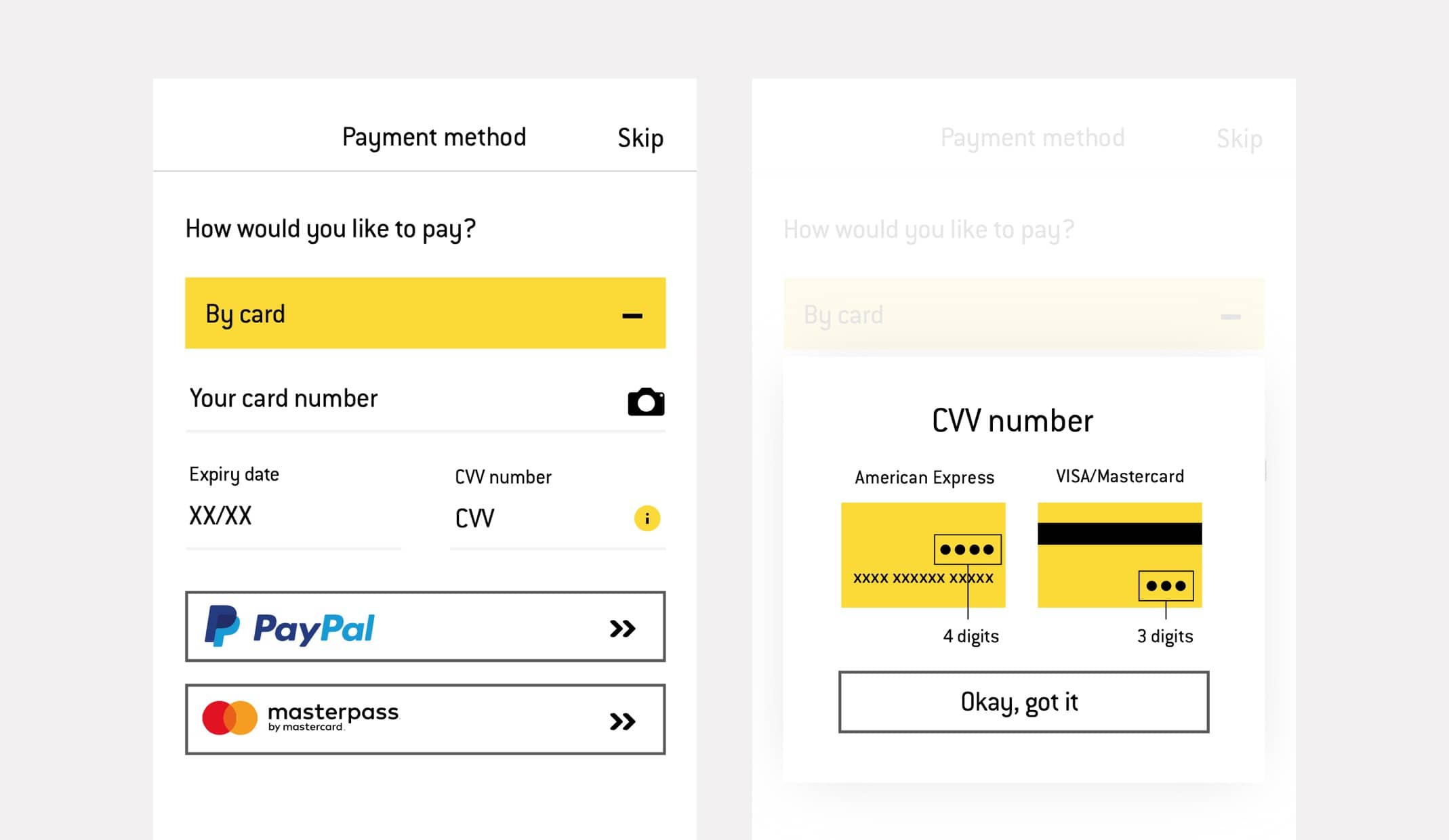
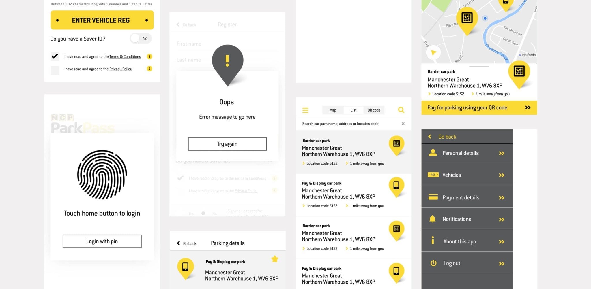
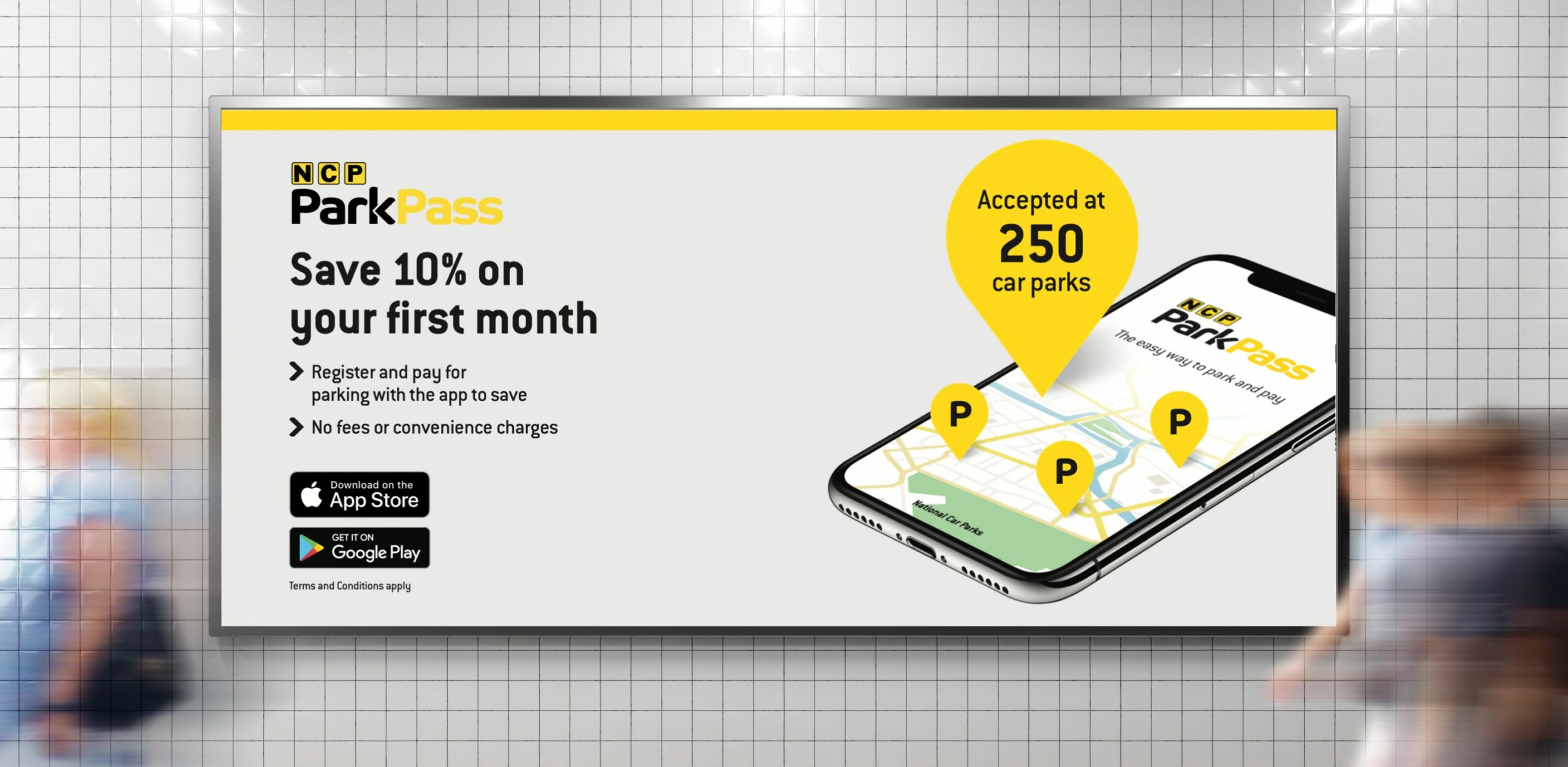
NCP were looking to make paying for parking even easier for customers with cashless parking, and adopting a digital-first approach to the payment process. They needed help with the name, branding and design of the app in order for it to work as a standalone sub-brand, whilst also making sure it was inline with their other NCP products and services.
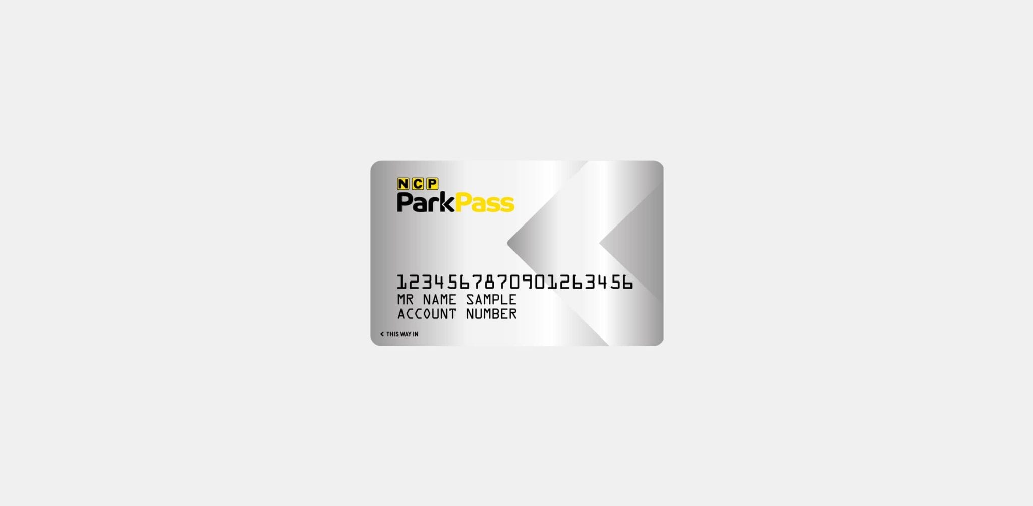
By working with research NCP had collected, the NCP ParkPass branding evolved through piloting and testing the product with customers during the design process, with Rawww’s support on creative and asset creation. We maintained consistency by using the NCP brand colour palette and typeface, but also introduced new elements such as the pin icon, to emphasise the idea of travel and 3D illustrations, which can be animated when used on digital platforms to capture the attention of users.
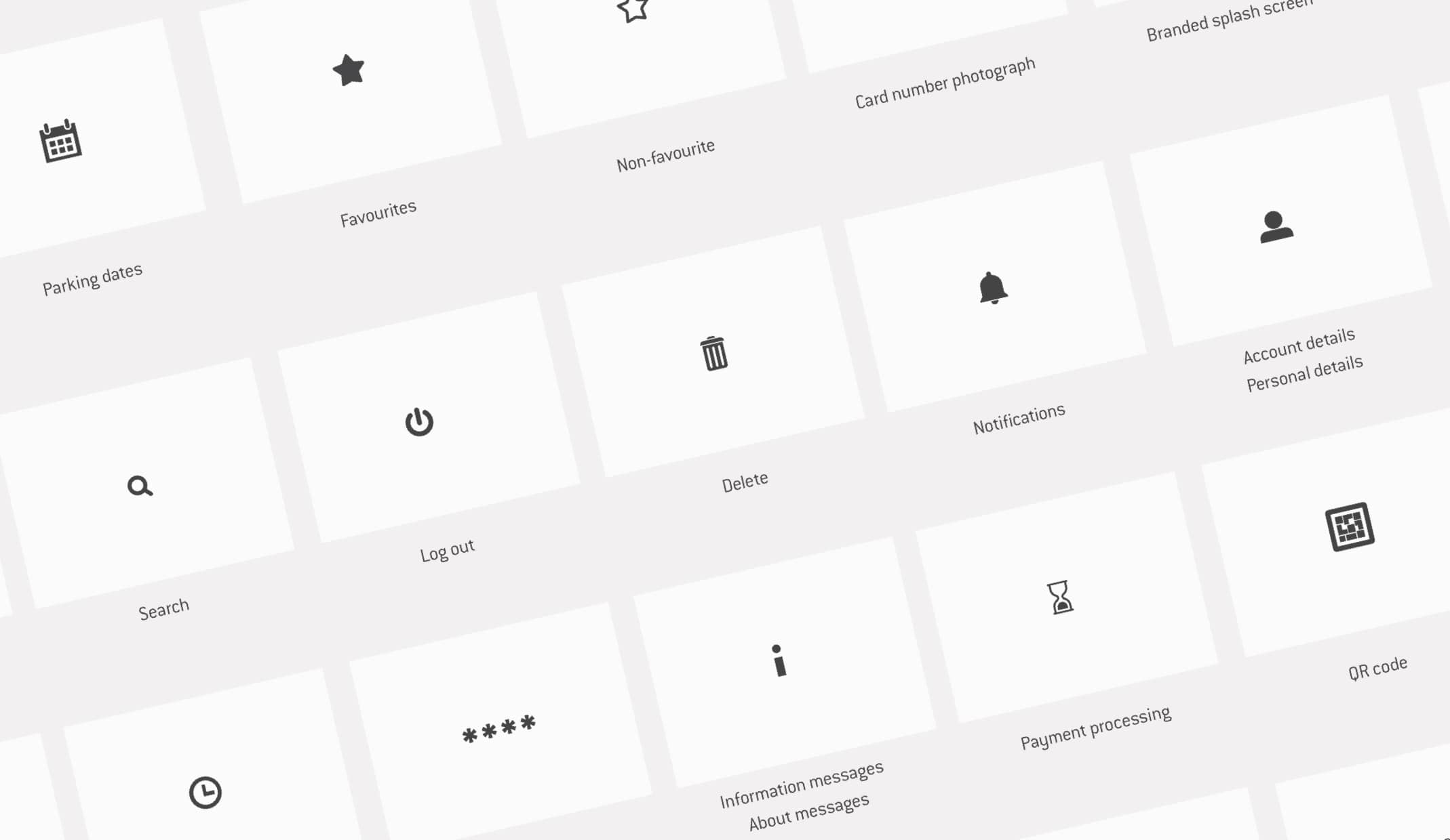
We worked with NCP to design the app, which was then developed in-house. We mapped out every inch of the end-to-end app user journey, and created a seamless system design, including a complete bespoke icon set to simplify the app. The NCP ParkPass app has a clear, easy to use interface design that has the user journey at the heart of it. Customers are able to easily locate a car park, pay for parking and extend their stay through their phone, without the need to worry about a ticket. To support the launch of the app, we optimised both the Android and Apple app stores, with app store videos that highlighted benefits and features of the app, including quick, ticketless parking and an exclusive introductory offer.
To ensure all future NCP ParkPass designs and promotions are consistent, we developed a style guide for the NCP team to use. This provides a centralised resource for logotype, colour and typeface references and usage guides. The style guide proved highly useful when we helped NCP later roll out their NCP ParkPass product in the form of a multitude of marketing assets including, car park advertising, Waze advertising, email marketing and landing pages, ensuring cohesive branding across all platforms.
– Brand Marketing Manager, NCP
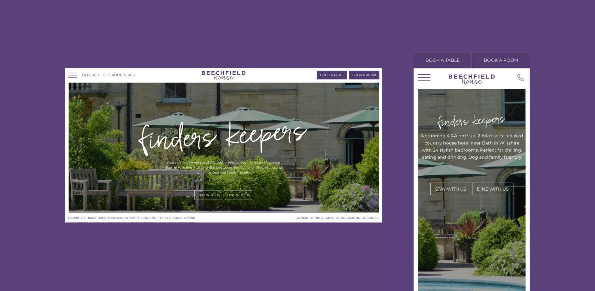
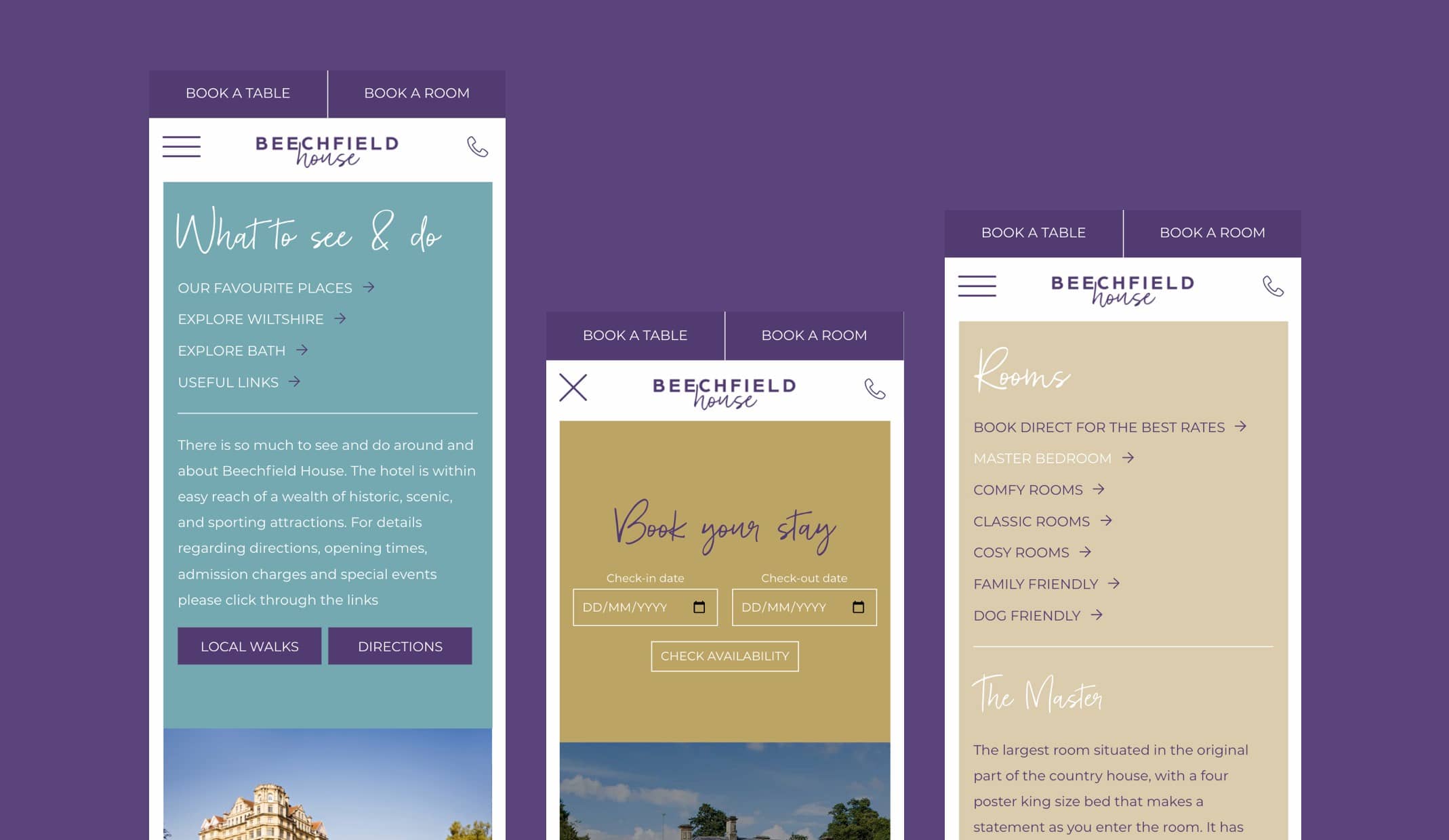
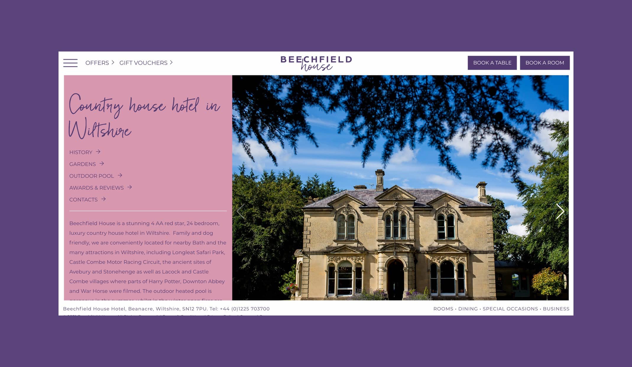
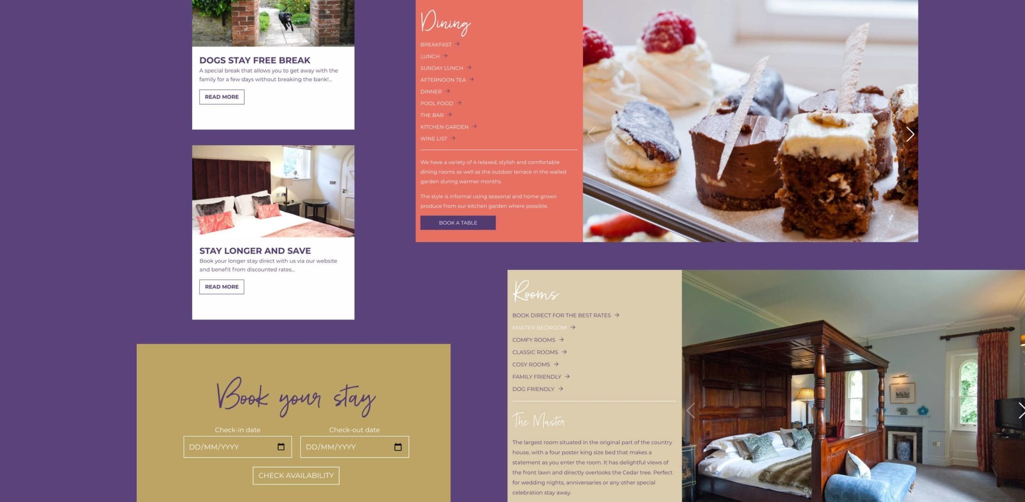
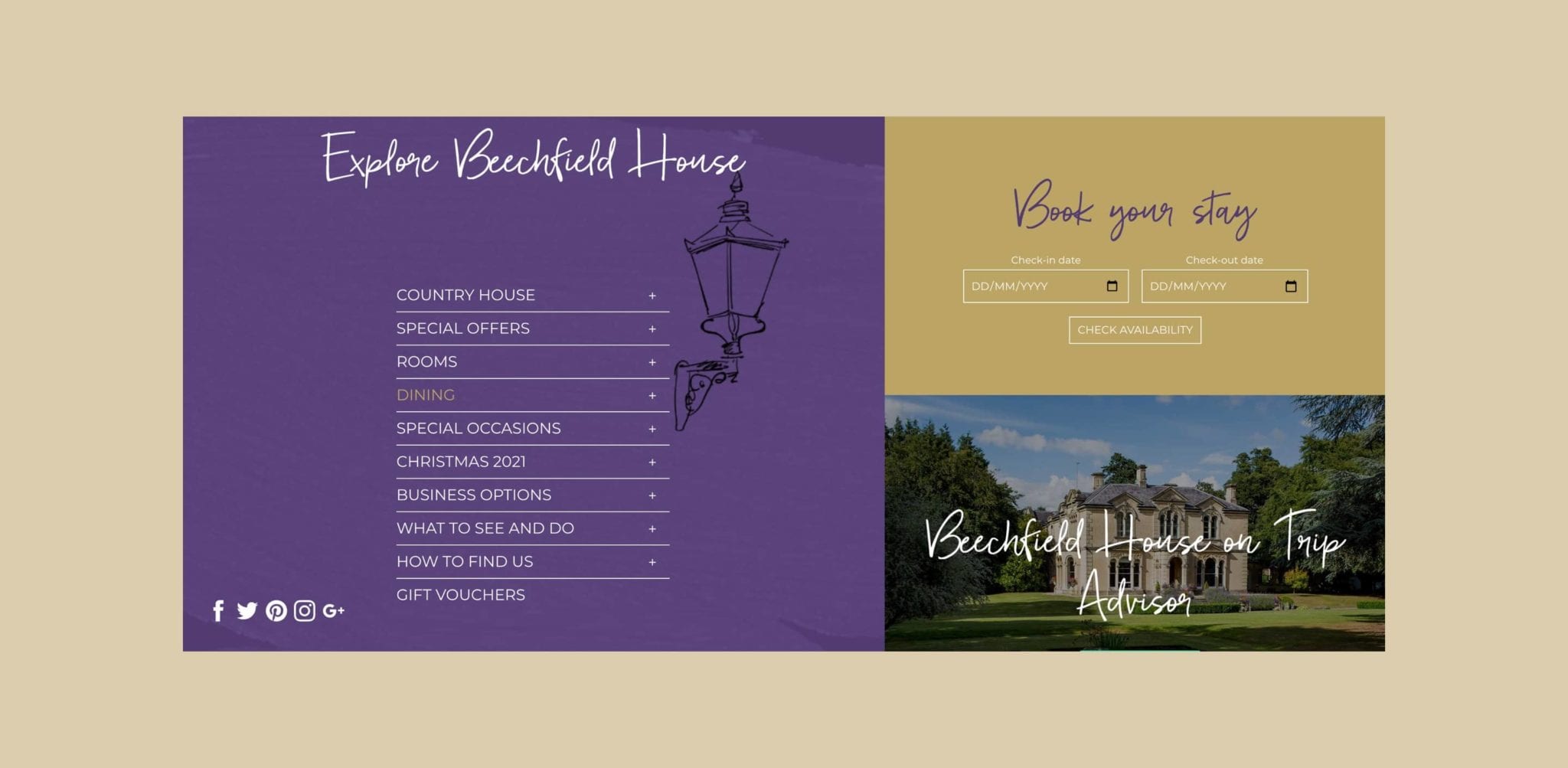
Beechfield House is a 4AA red star, 2AA rosette, relaxed country house hotel near Bath. The hotel offers guests a blissful base to explore Wiltshire, however the website experience was falling behind compared to what competitors were offering users. The Beechfield House team called for our expertise to carry out an audit to uncover ways to improve performance and keep content up to date.
We recommended a few incremental changes across the website to help improve user experience. This included improving the navigation structure and instating a call to action button hierarchy on pages, making it clear to visitors where to click and when.
Through strategic restructuring and incremental changes to the website, users are now able to find the right information in less than three clicks. They’re encouraged to stay on the website through the embedding of a book a table functionality, instead of being directed away from Beechfield House to place a booking.
The team is also able to now immediately inform website visitors about any important updates such as lockdown closures or new regulations, through the integration of a first-entry notice.
To give back control to Beechfield and to help ensure content could be kept up to date, we integrated a CMS system into the website allowing the team to make updates as and when needed.
Having the ability to keep content fresh will be of benefit both for SEO and also for Beechfield visitors to the website, who will be able to find out the accurate information they need. It was also important to ensure the hotel could be found more easily through search engines. We carried out thorough keyword research, optimising website content and delivering a detailed SEO strategy.
– Marketing Manager, Beechfield House
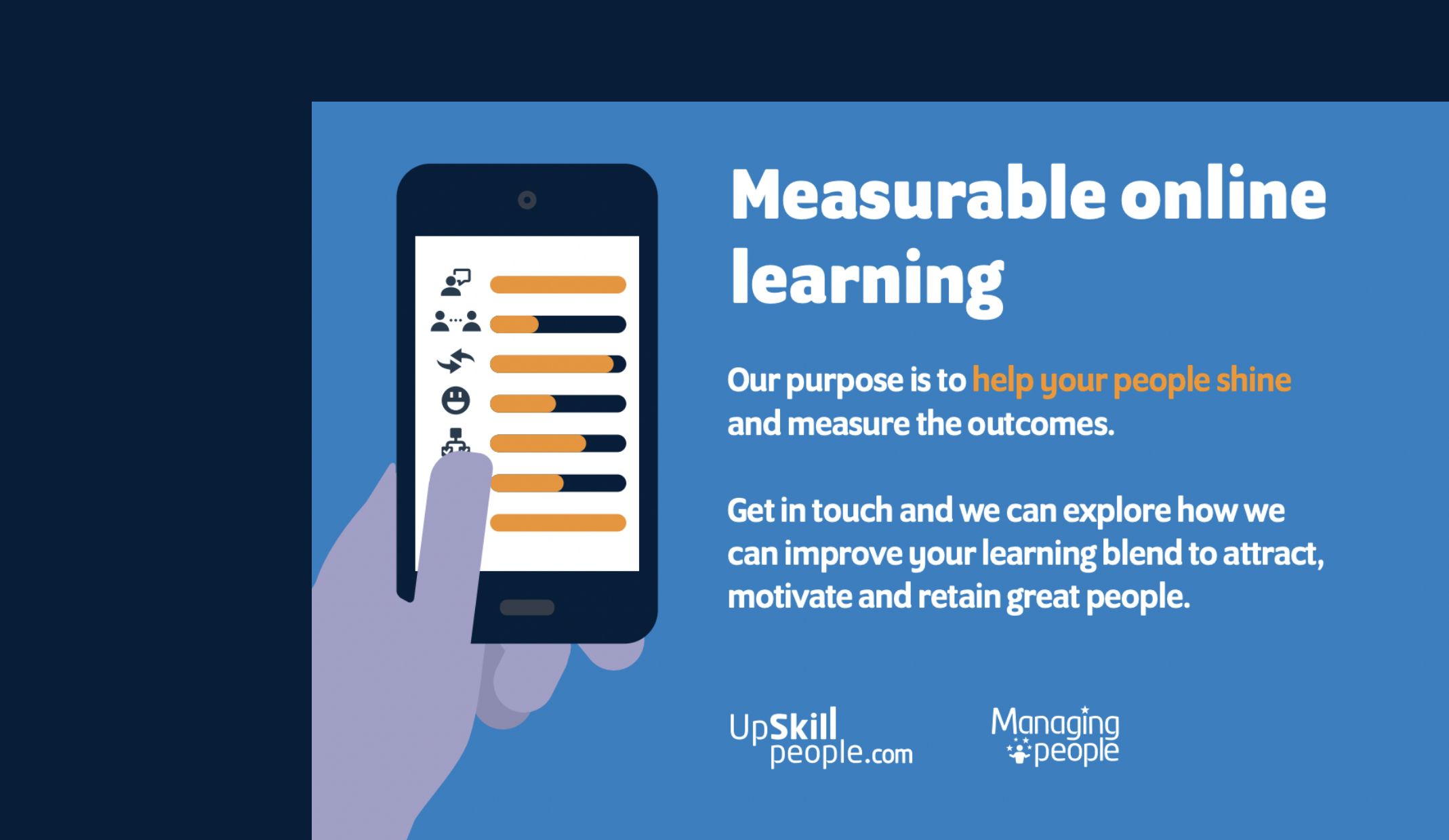
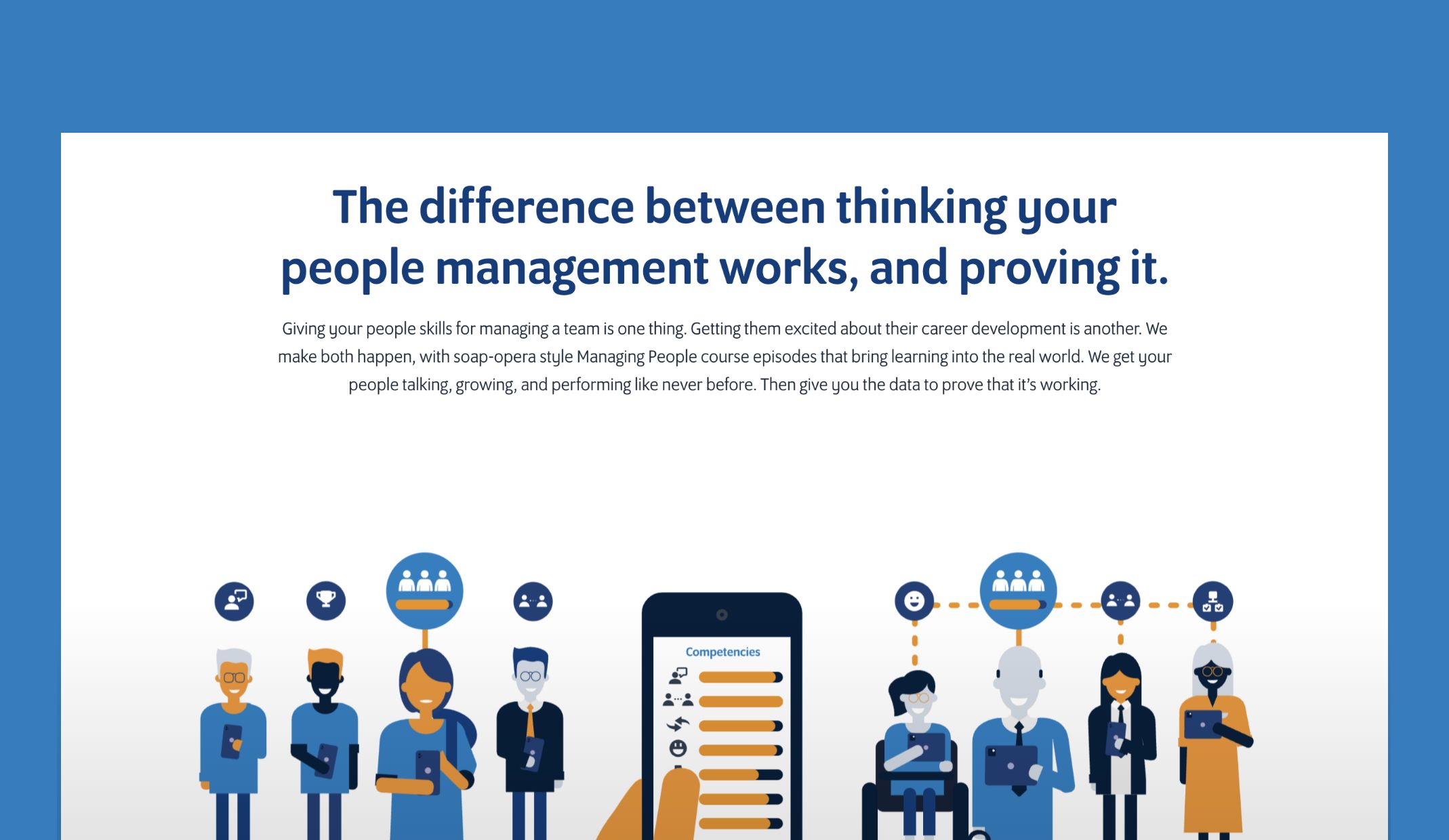
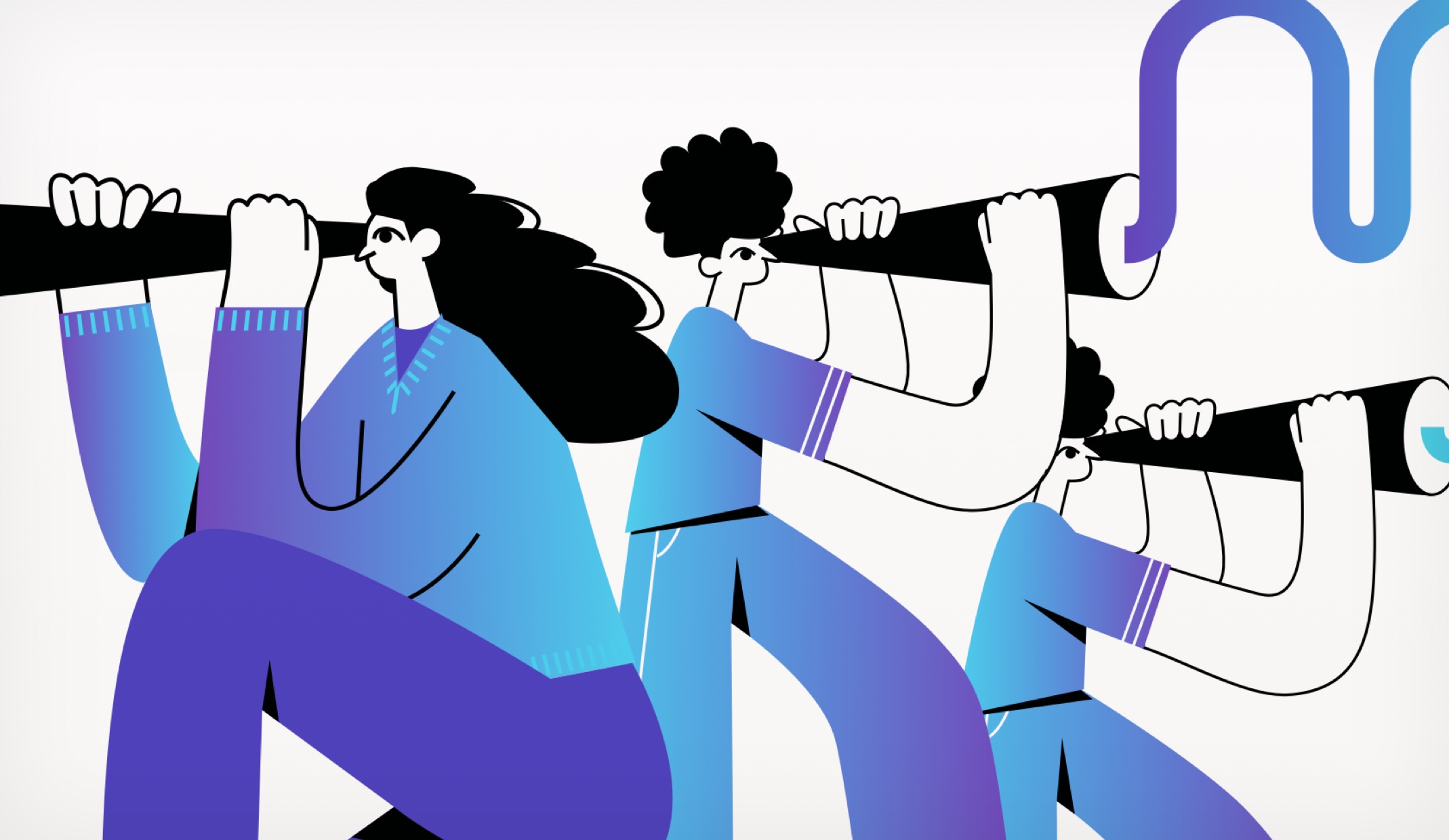
With a desire to get across the fact that their online training software focuses on managing people, Upskill People needed a standout website that both captured their USPs and told their story to showcase the real value of their services.
As a renowned e-learning provider, it was essential for Upskill to improve their website experience. With this in mind, we rebuilt and redesigned their website, prioritising the user journey, addressing key pain points and optimising the website in order to improve traction, increase conversions and boost ROI.
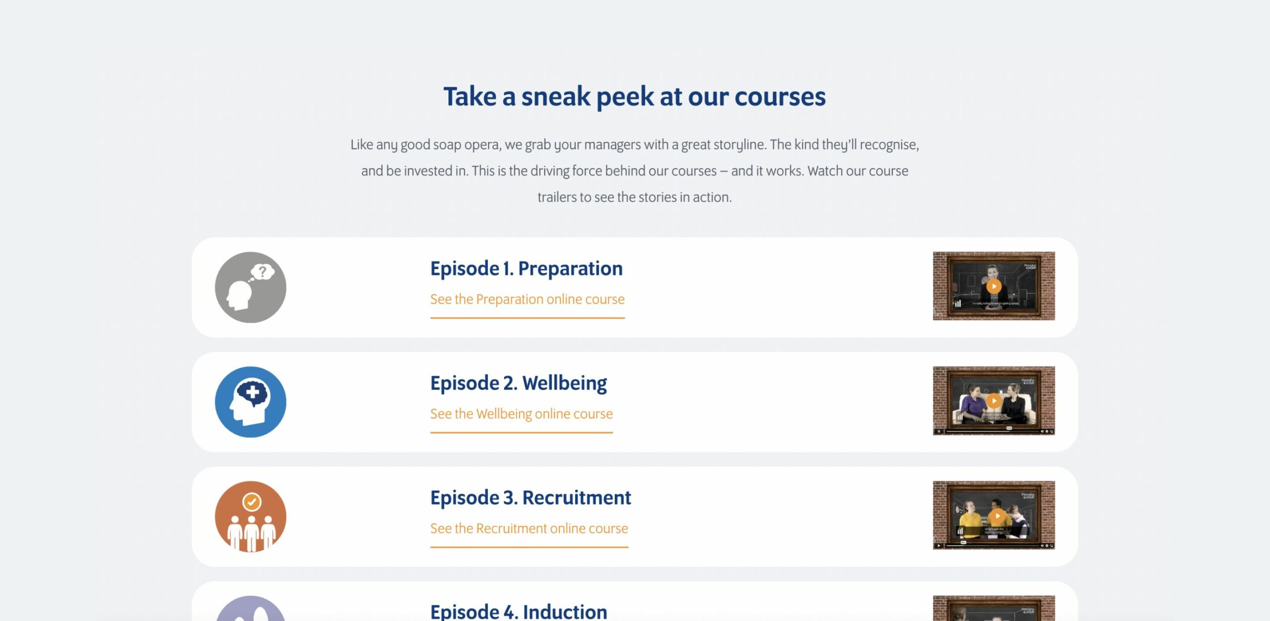
We separated their ‘Managing People’ course from their other courses, to emphasise how Upskill’s services can make a difference for managers in the real world, alongside communicating the end-to-end support their knowledgeable team provide.
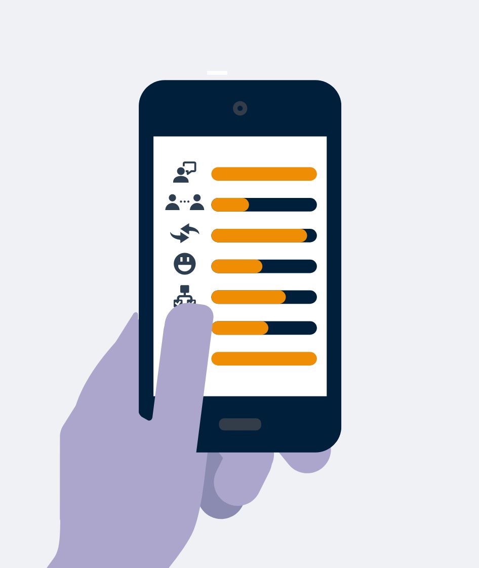
It was important that the new website not only presented their services and software clearly, but also highlighted the lasting results. Their customisable platform allows people to track their success and provides data to prove their services have a positive impact.
To get all these USPs across, we created bespoke illustrations that told a story, bringing these to life through animation and iconography, aligning to the Upskill software.
– Managing Director, Upskill People.
global brand awareness
disrupting a traditional industry
a complex service
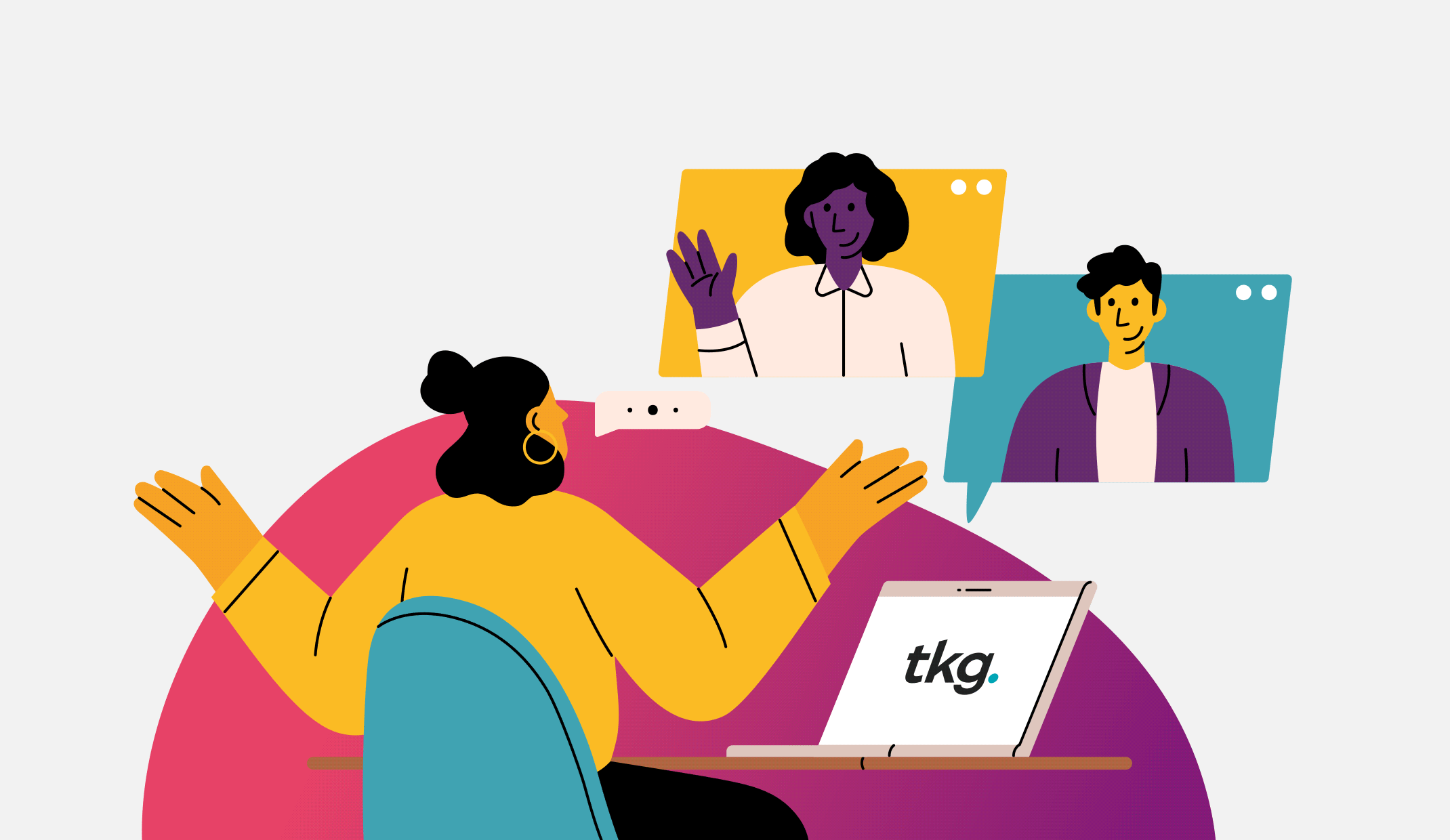
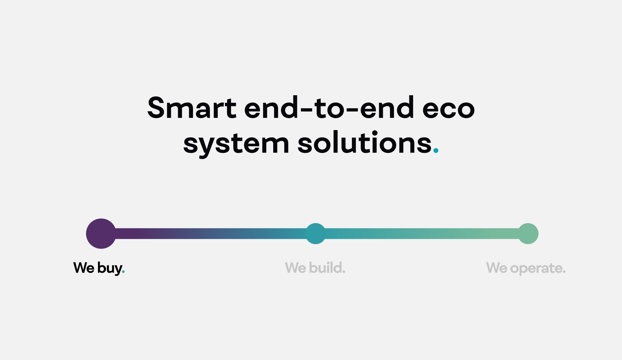
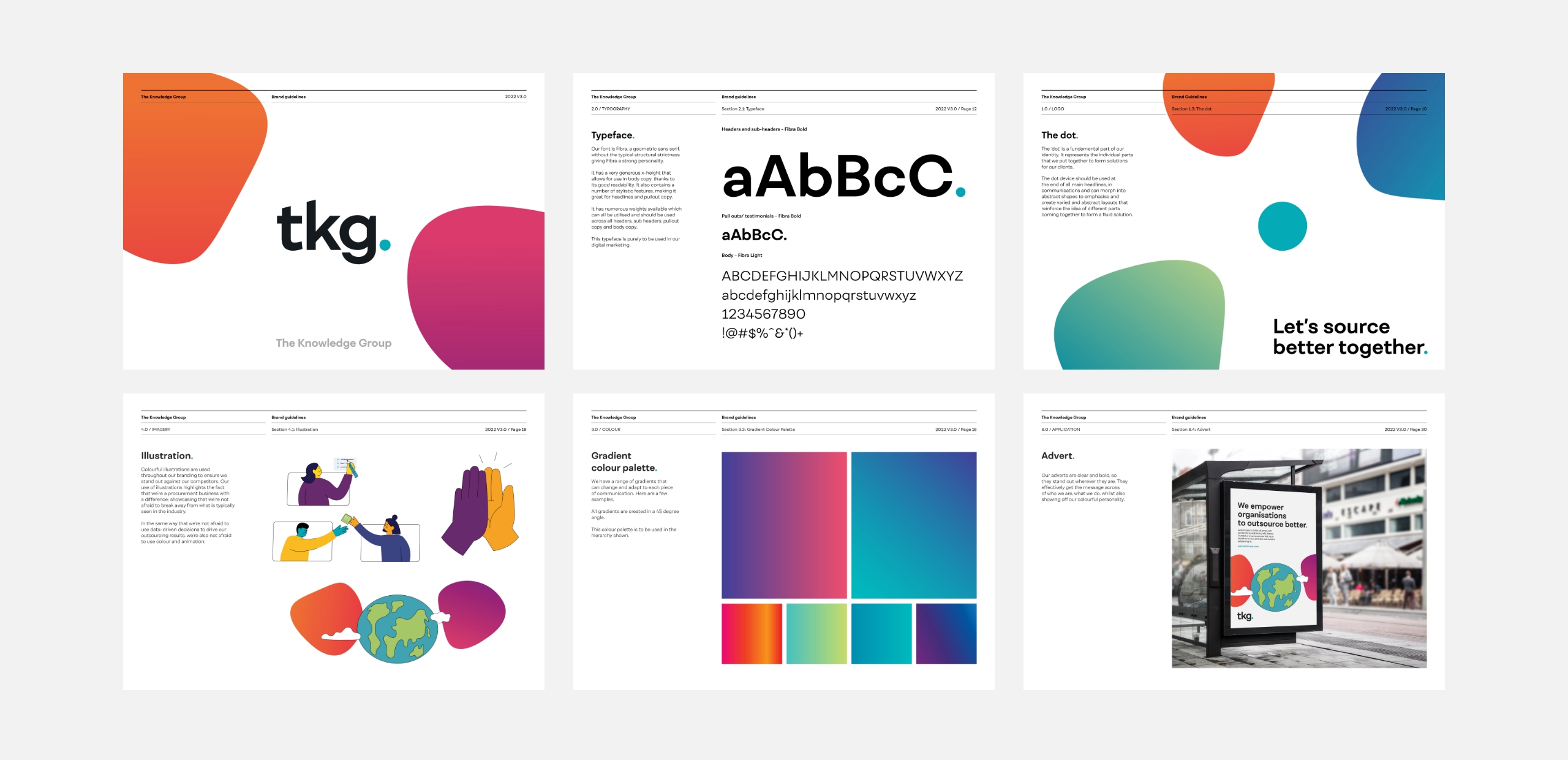
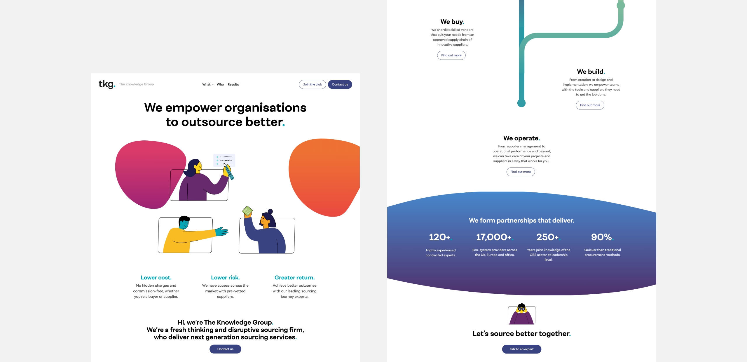
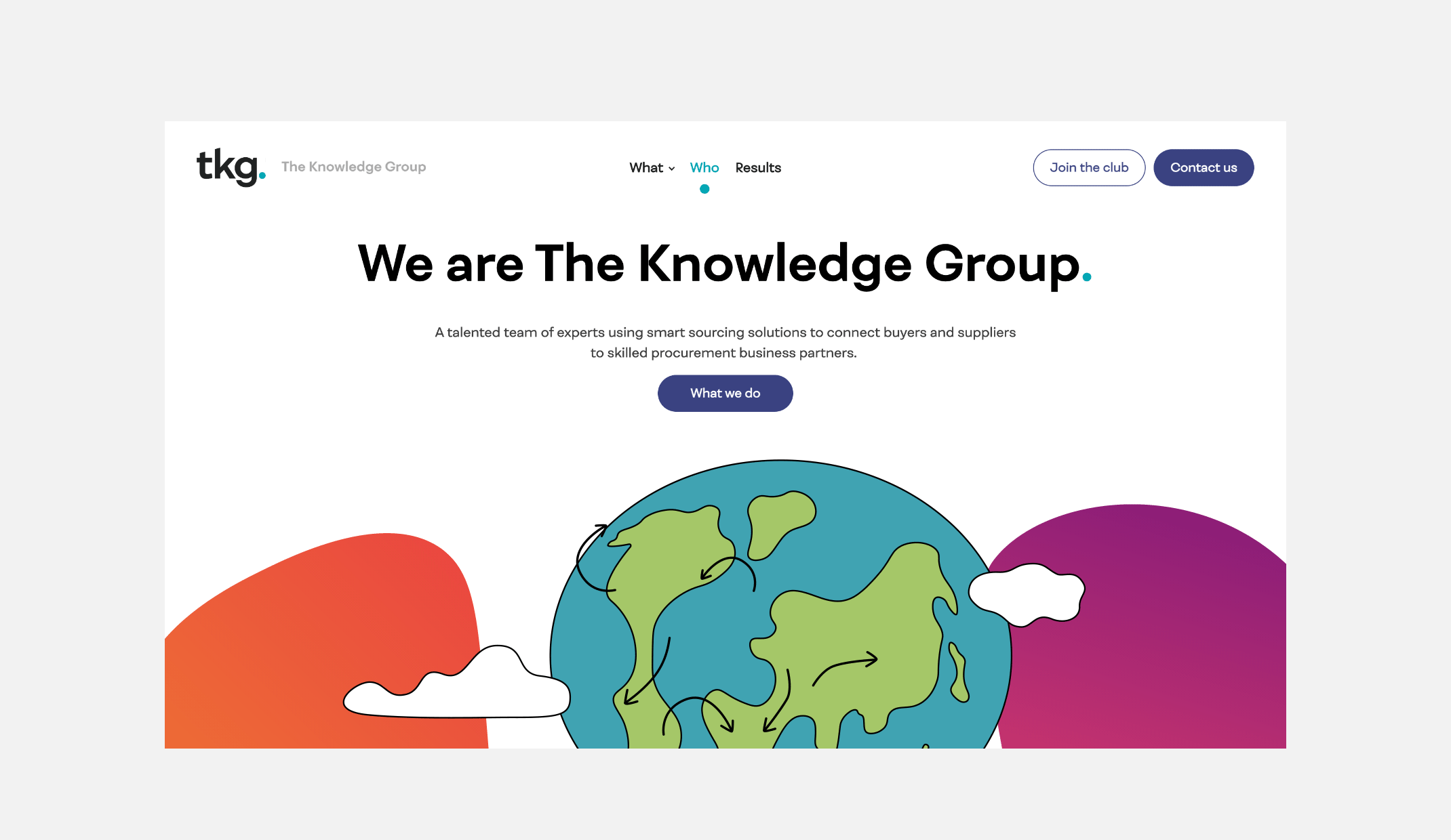
Following the success of their efforts in the vaccine rollout scheme in South Africa during the pandemic, tkg. were looking to apply their outsourcing service model to other industries and businesses across the world. In order to do this, they needed to strengthen their brand, evolve their website to match the new strategy, and align their messaging to a wider target audience.
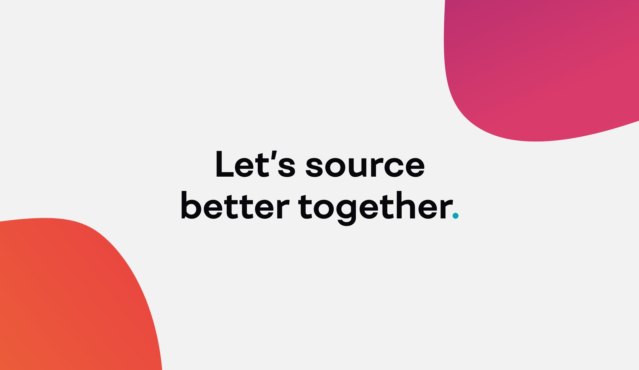
tkg. needed a developed brand that not only highlighted how quick, flexible and efficient their outsourcing services were, but also directly pointed out the issues with the traditional procurement process, in order to command industry change. We delivered a strategic messaging model that set tkg. apart from the rest, emphasising their hands-on, modern and digital approach to outsourcing, with particular focus on their expert-driven solutions.
We also developed a colourful and eye-catching style that aligned to their bold, disruptive tone of voice. Bright illustrated characters, gradient colouring and a modern typeface were all used, to ensure the cohesive brand stood out in the typically reserved outsourcing industry.
Their new website includes a friendly copy tone, alongside animation used on the illustrated characters to bring the tkg. procurement journey to life. We also provided brand and tone of voice guidelines to ensure the brand remains consistent throughout.
– Sales and Marketing Manager, tkg.
increase in website traffic
increase in organic traffic
increase in website sessions
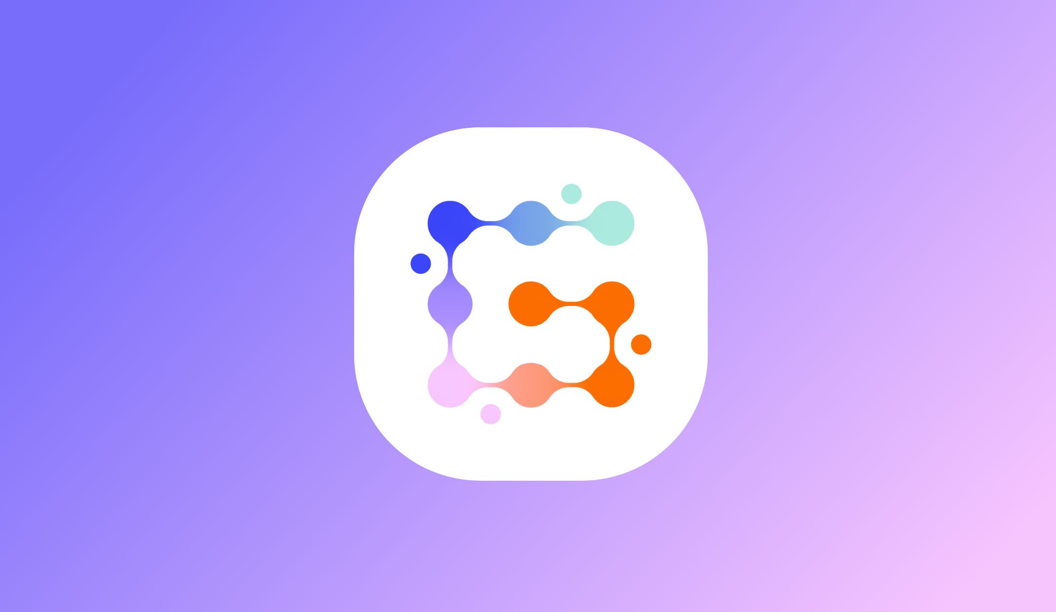
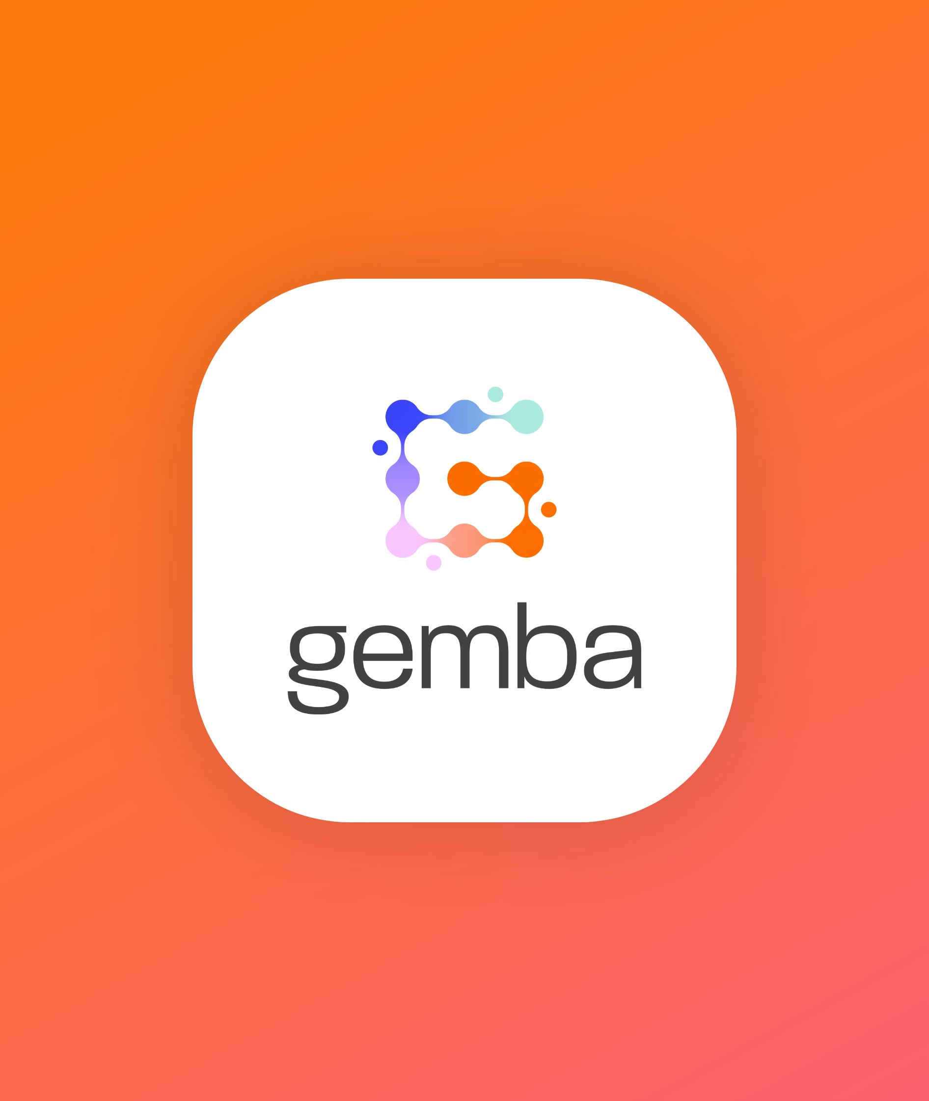
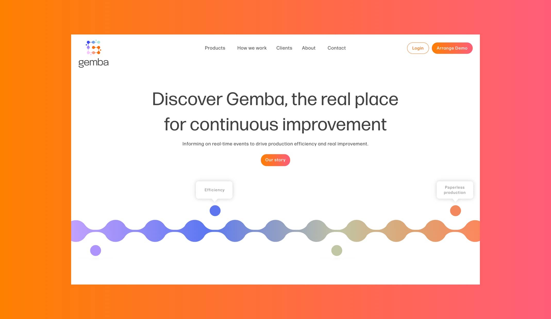
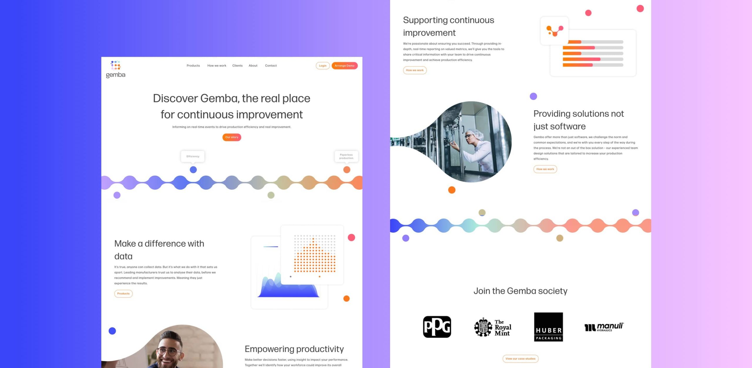
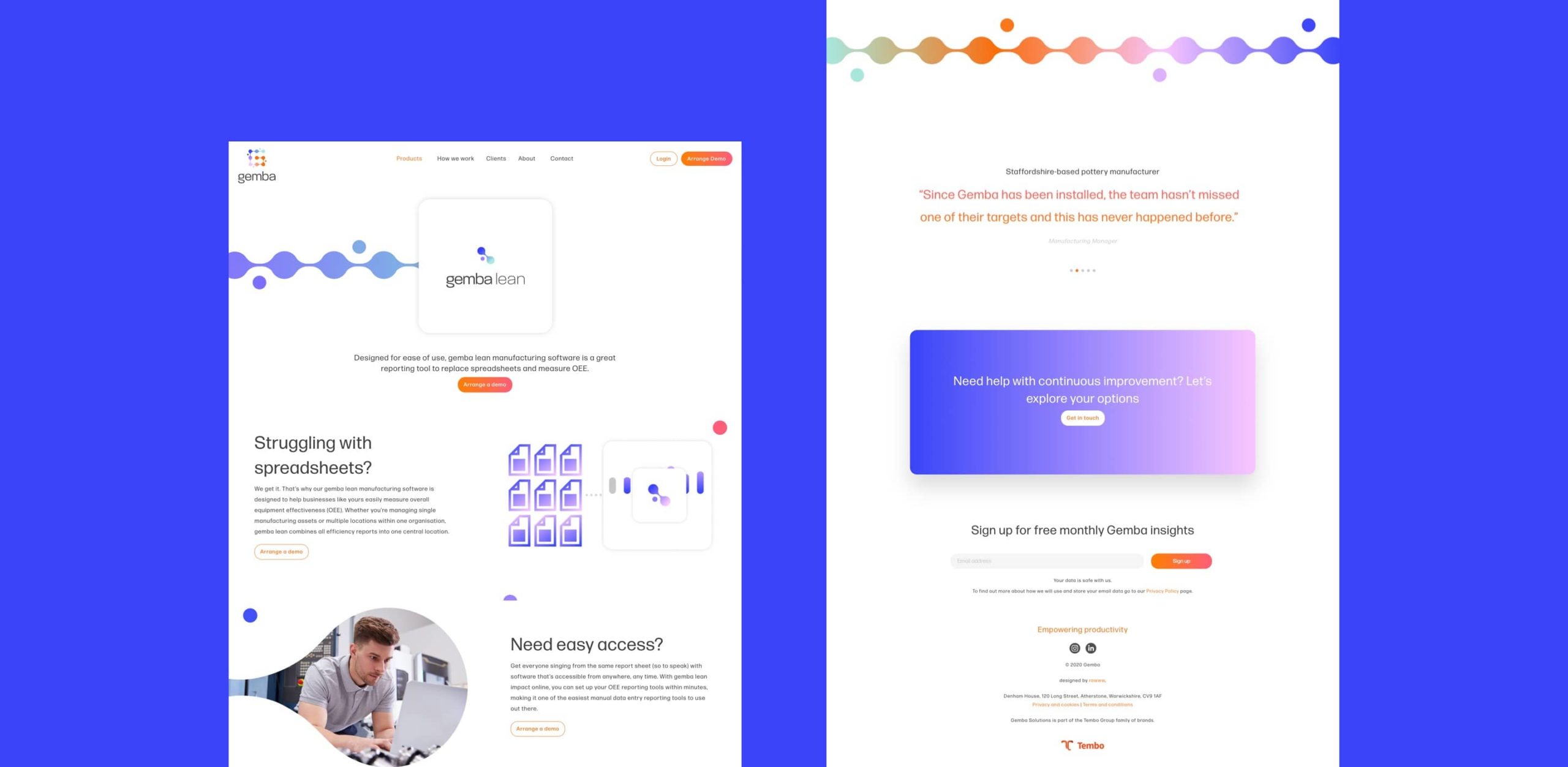
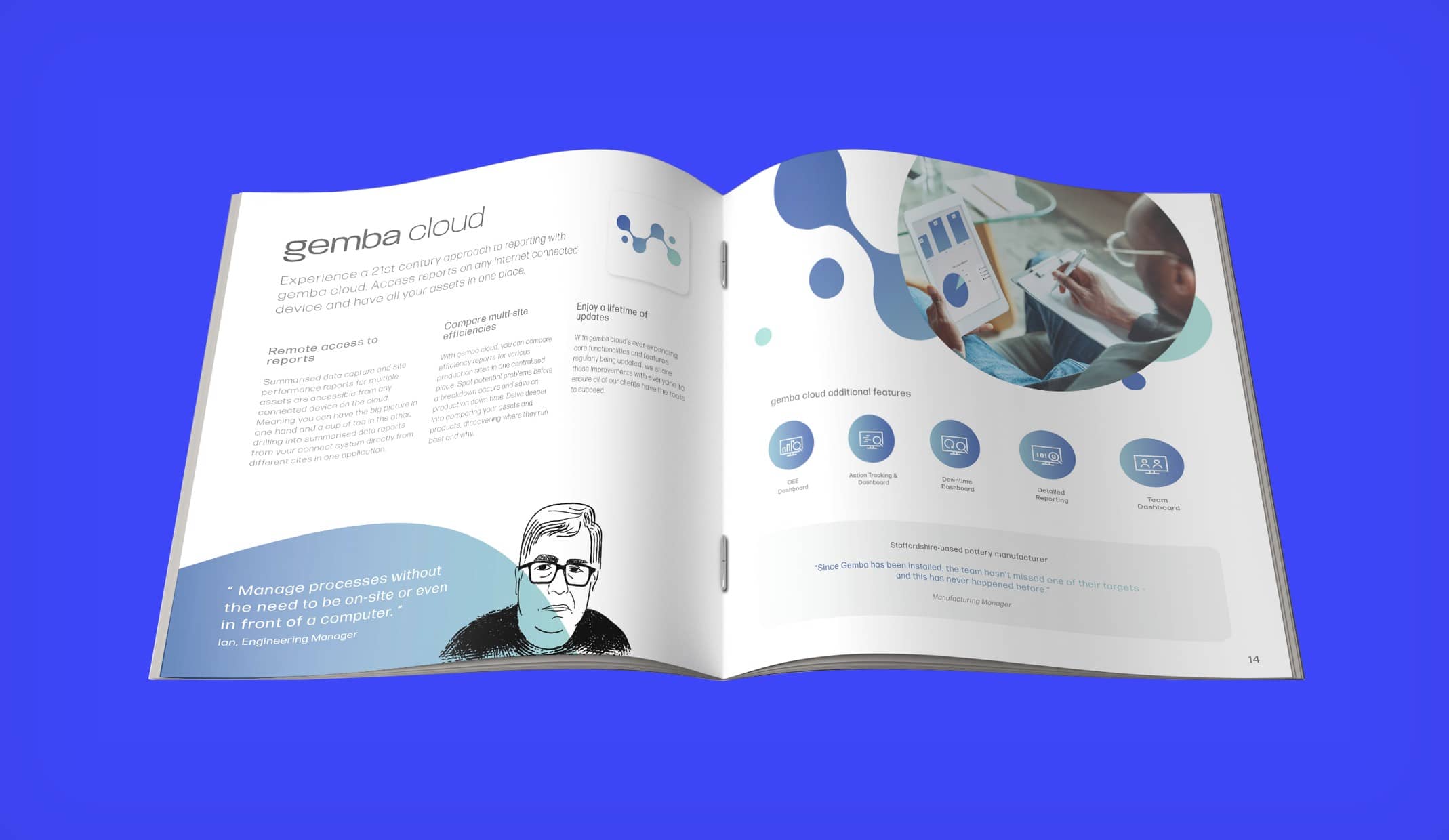
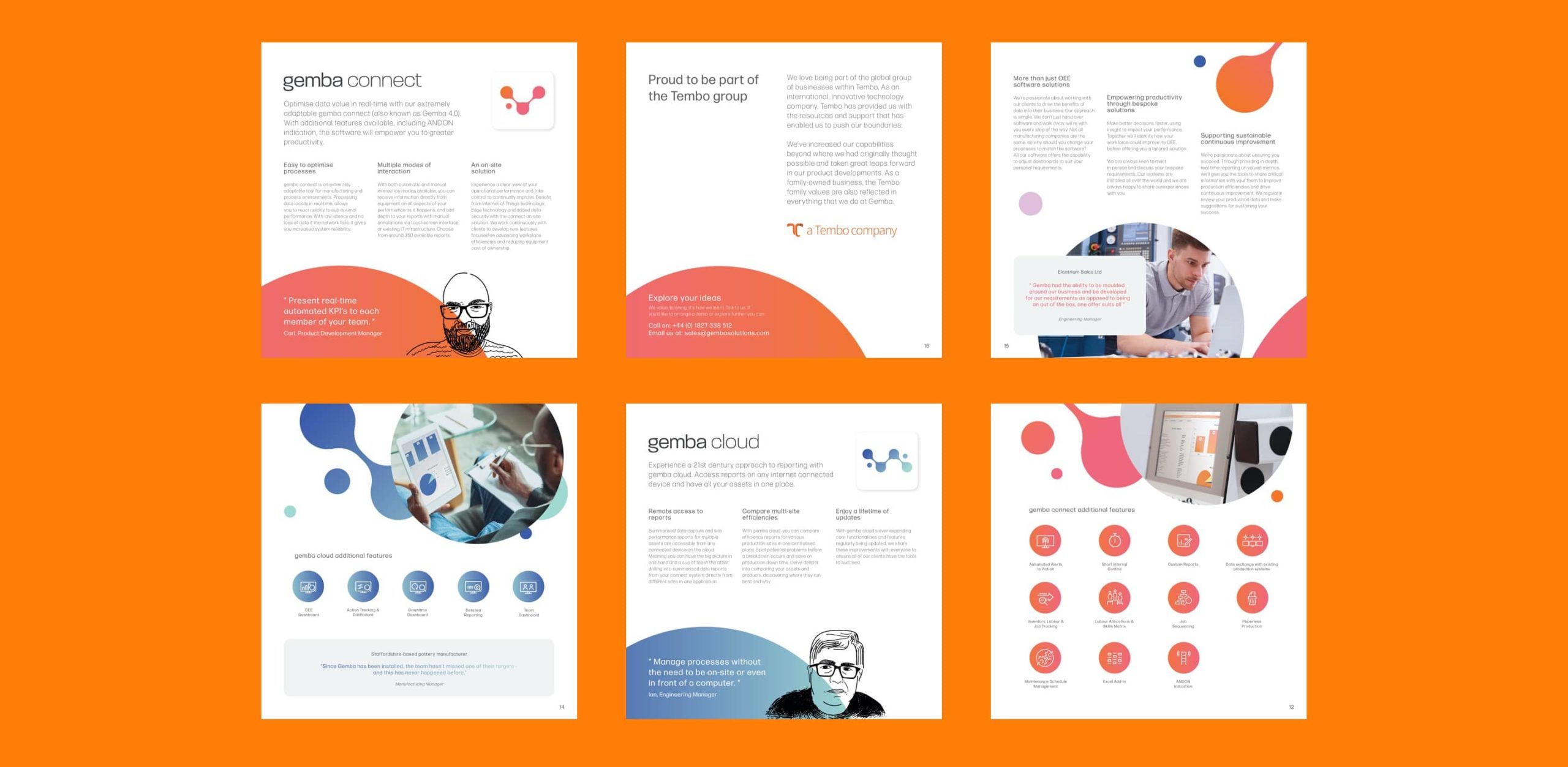
As a provider of software solutions for the manufacturing and production industry, Gemba’s previous branding was tired and didn’t consistently represent their forward-thinking business strategy and expert friendly team behind the operation.
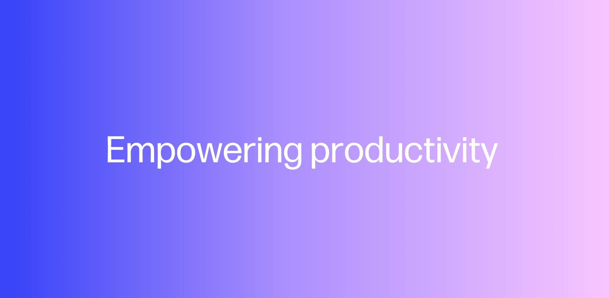
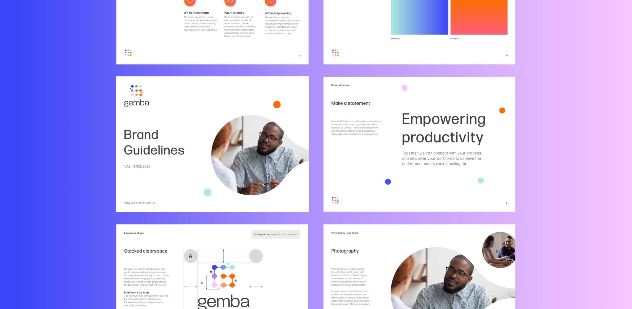
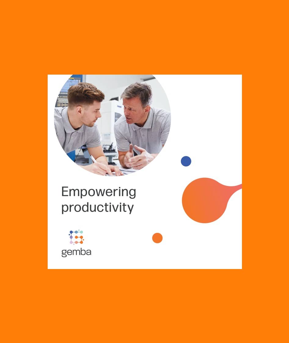
We wanted to bring the idea of ‘empowerment’ to the forefront of their brand message; Gemba ‘empower productivity’ in their clients, who in turn empower their workforce to achieve results. We introduced a vibrant new colour palette to better reflect the team’s friendly personalities.
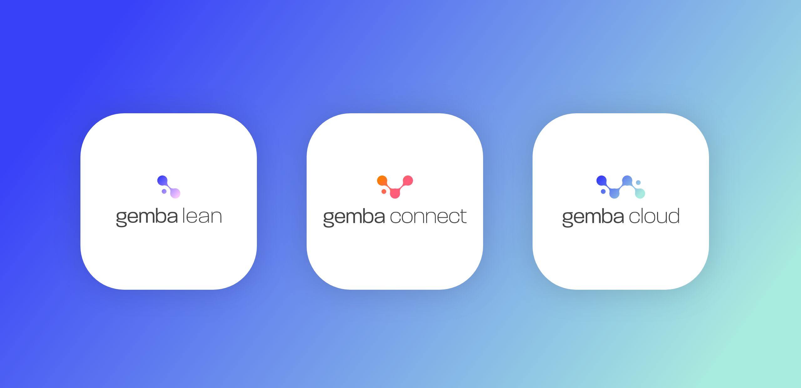
Fluid nodes merge together from start to finish to define Gemba’s end-to-end service and represent a production line. We also sub-branded Gemba’s three core software products, each product now has a unique identity that is inline with the overarching brand look. The branding project also included defining their tone of voice.
Over the years, we’ve created a new website, launched a Remote Working campaign to navigate the pandemic, and developed internal branding for a seamless brand experience both off-site and on-site. This comprehensive marketing toolkit brings content to life, humanises the brand, and promotes Gemba’s unique company culture.
– Gemba Solutions


© 2023 Rawww Ltd | All Rights Reserved. Company No: 05508453