Blog
Check out our latest insight-driven blogs...

SGE is Google’s new Search Generative Experience, and is set to be one of the biggest changes we see in...

In today’s digital landscape, mastering technical SEO is vital for ensuring your website’s visibility and performance. In this article, we’ll...

Looking back on 2023, we’ve seen the world go mad for Barbie, celebrated King Charles II’s coronation and as a...

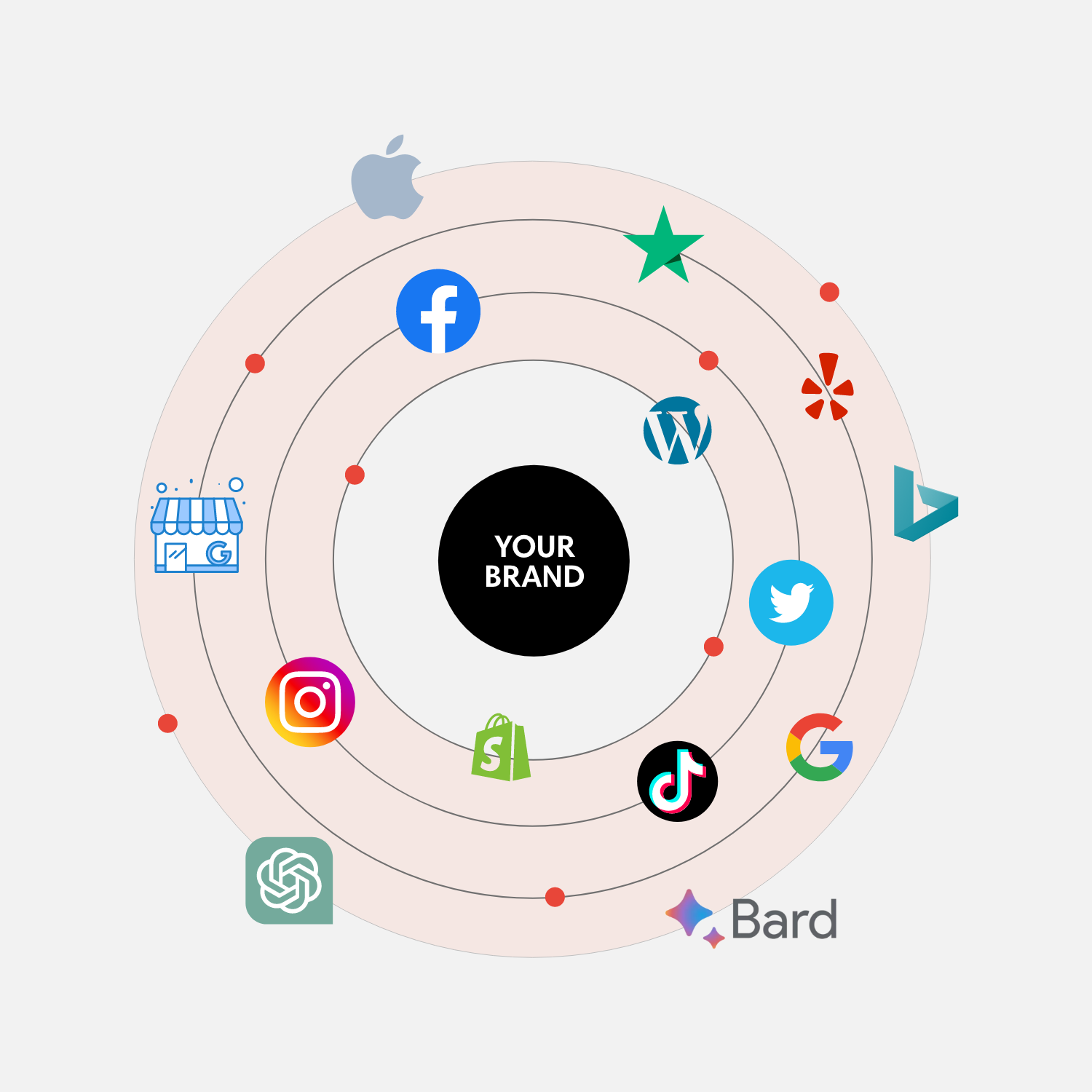
If recent digital transformations and AI advancements have taught us anything, it’s the power of a trustworthy online brand image....
With the rise of artificial intelligence applications such as ChatGPT, search engines are becoming increasingly more capable of understanding where...

So you’ve discovered online display advertising and want to understand how it can help boost your brand awareness and sales?...

Are you looking to improve your B2B digital marketing strategy so that you can attract more customers to your software...
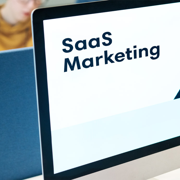
So, you’re looking to improve your SaaS marketing strategy and reach your target audience? As a creative digital marketing agency...

This Christmas, we supported those that needed it most by donating as much food as possible to the Coventry Foodbank,...

