increase in clicks to the website
search impressions
into the India, USA and French markets
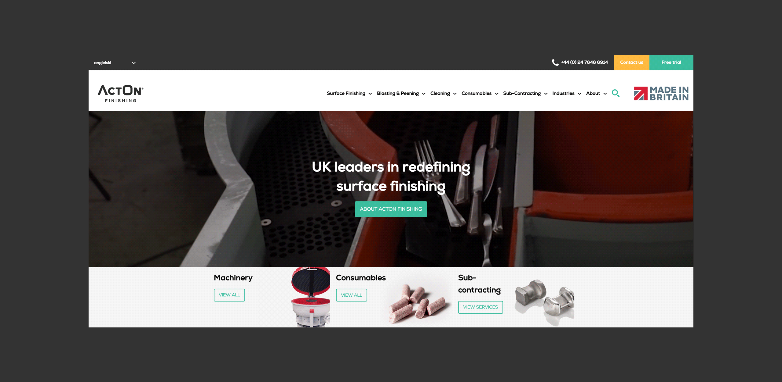
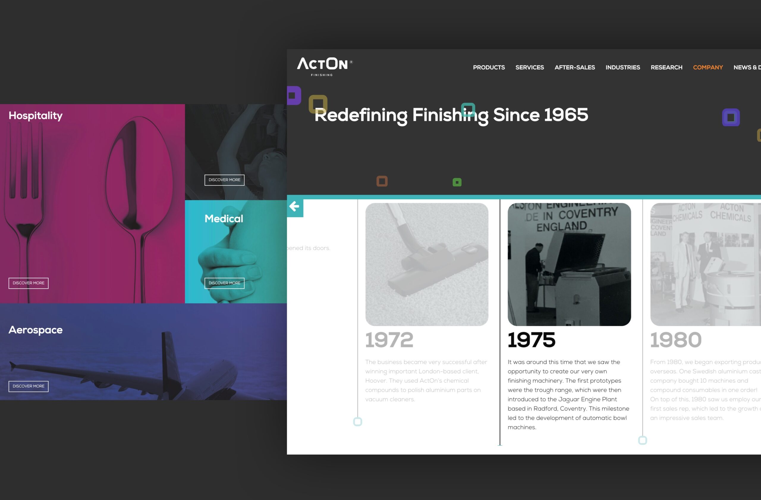
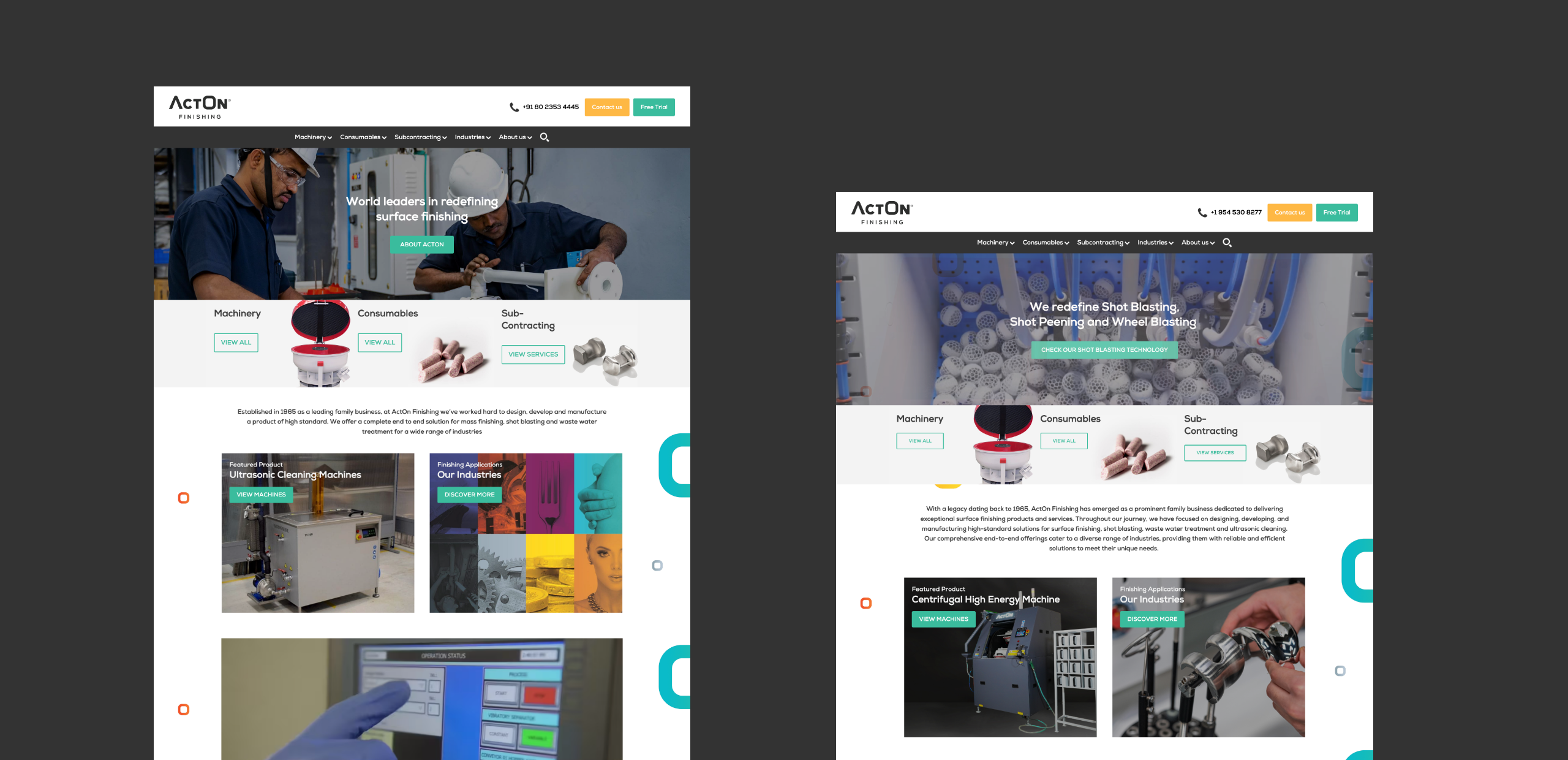
Having successfully created and developed the branding for ActOn Finishing UK, the mass finishing company wanted to branch out further across the globe. To do this, they needed to adopt a multi-channel marketing strategy to reach out and tailor their services to their growing target audience and establish market growth.
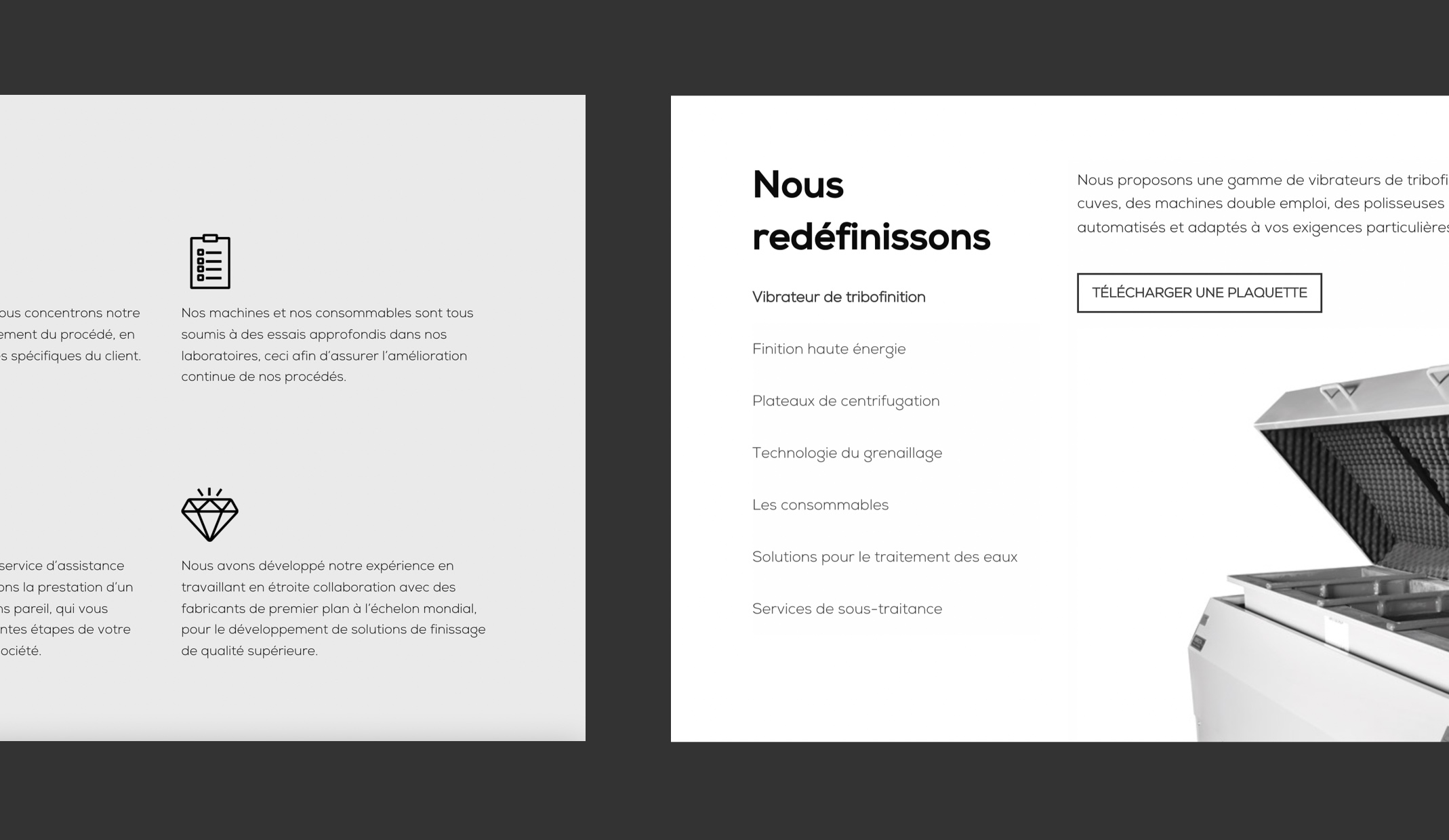
Our long-standing relationship with ActOn Finishing meant we already had a strong brand strategy, and developing a multi-channel marketing strategy felt like the next step to really help get their products and services to market. We supported ActOn with their marketing strategy, including helping them decide which channels to market for each region (India, Europe and the USA), and ensuring that the brand was used consistently, whilst the messaging was tailored to the different target markets.
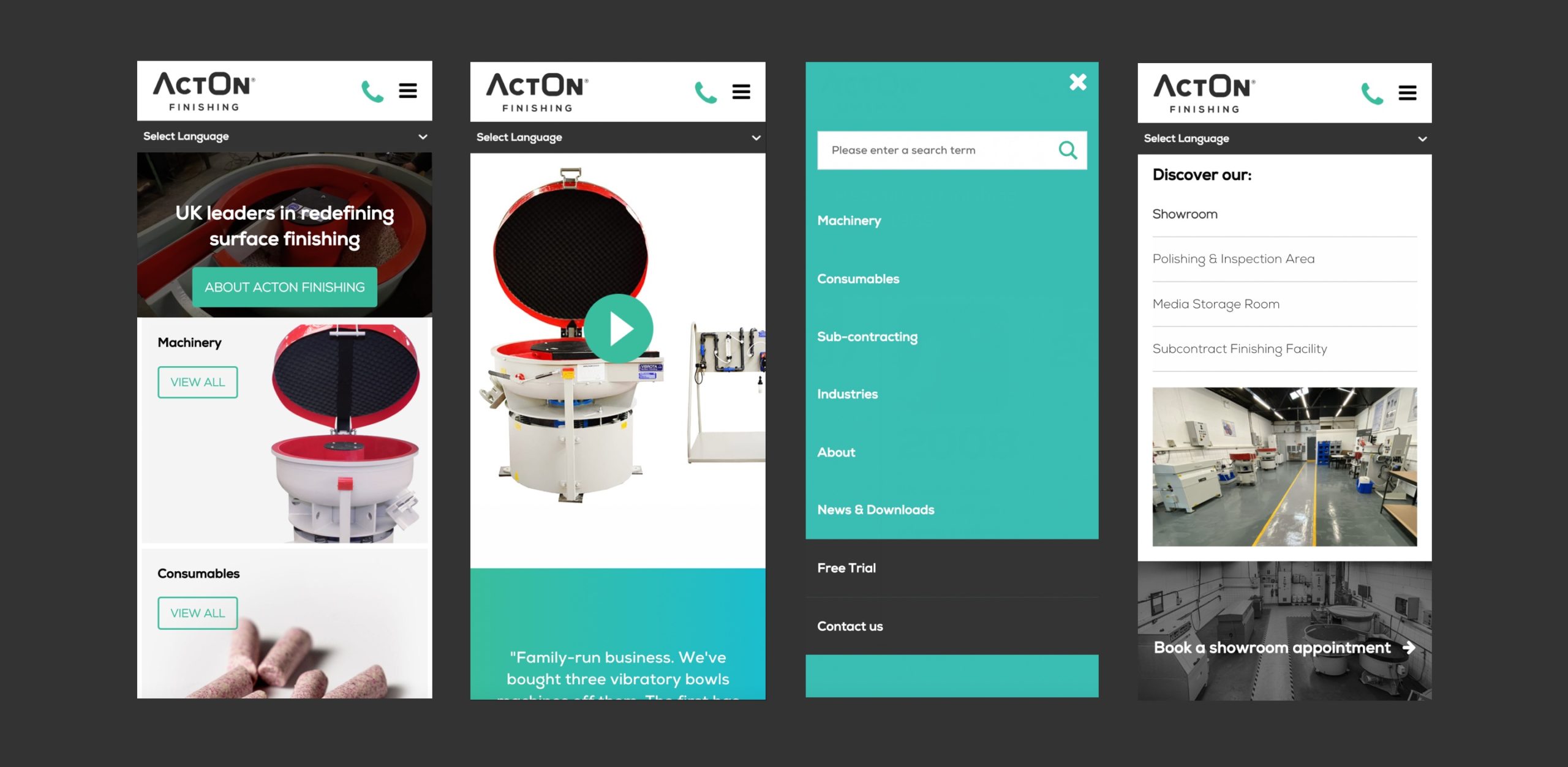
Armed with an established identity and a well structured marketing plan, ActOn Finishing has been able to successfully grow their brand by implementing digital marketing in numerous locations, including digital advertising, email marketing, targeted landing pages and country specific websites.
We work with the brand on a regular basis to ensure that their Google Ads and SEO strategies are constantly optimised to work alongside the latest search and advertising algorithm changes, making sure we’re able to maintain and improve their conversion rate and ROI. This ongoing strategy is what supports the success of the business today.
– Operations Director, ActOn Finishing
increase in impressions
increase in URL clicks
average sessions per month
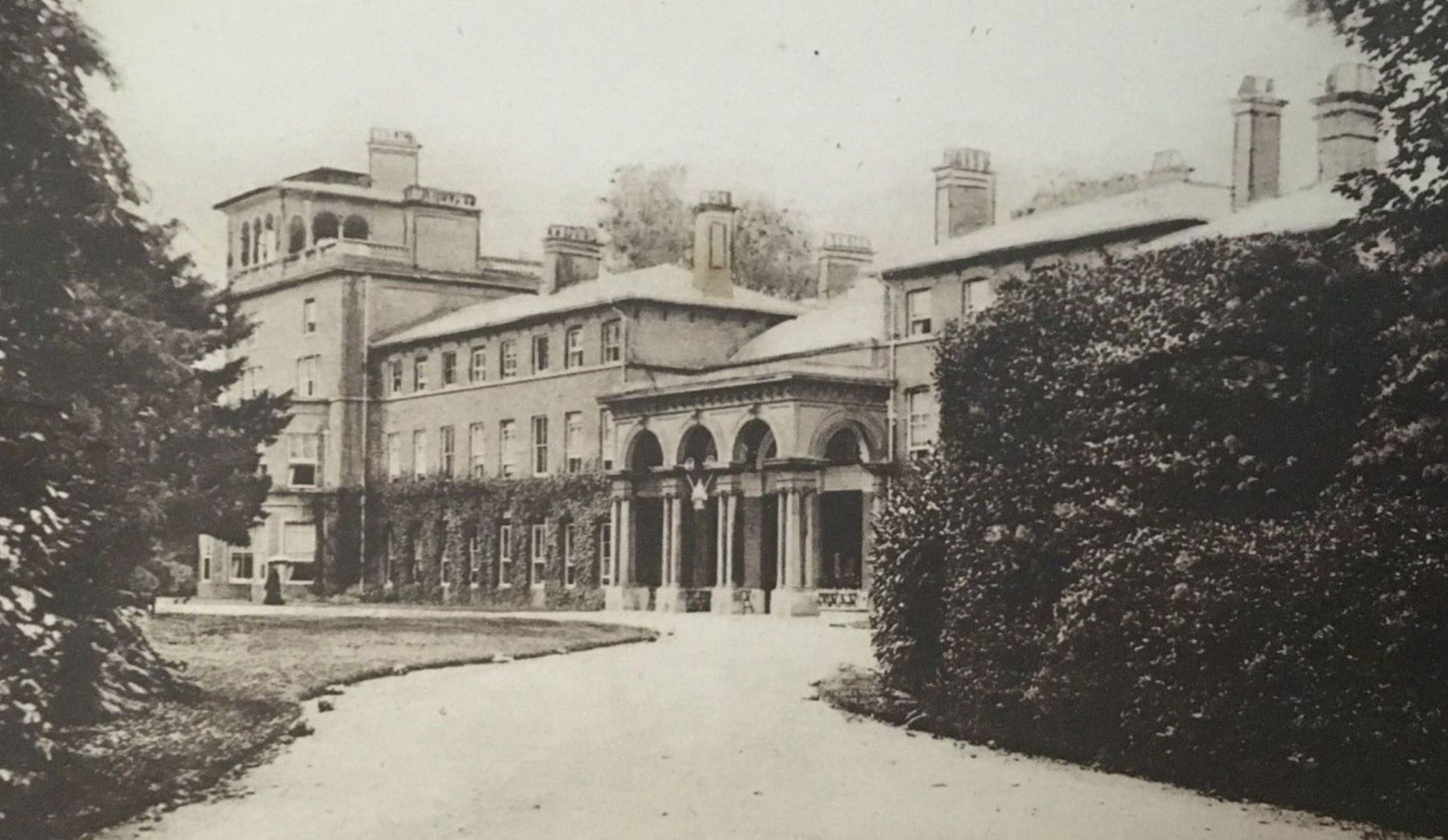
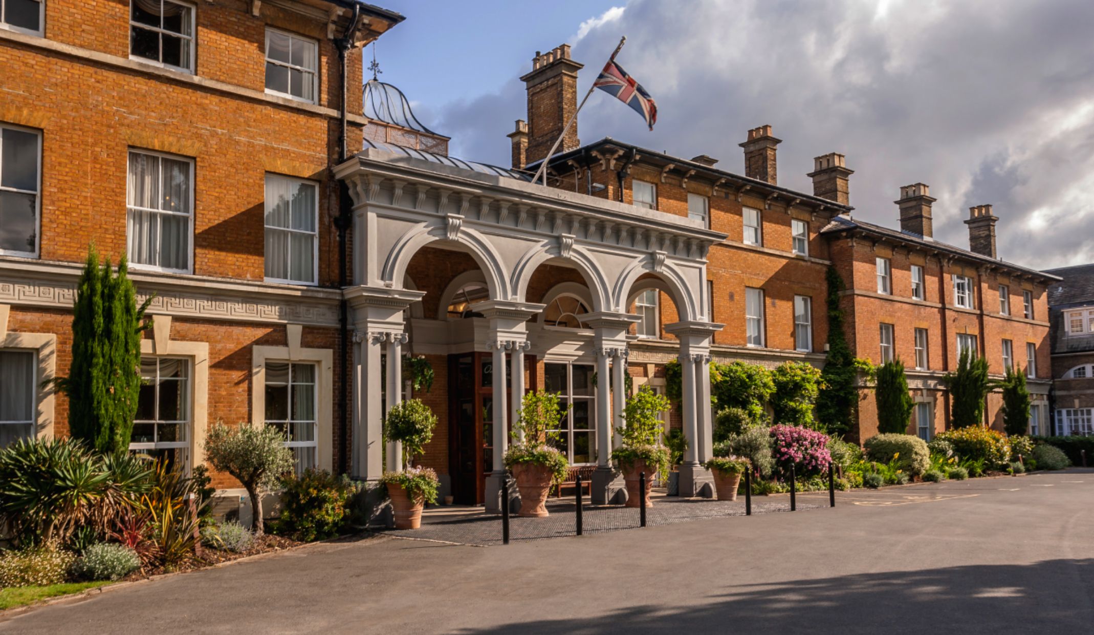
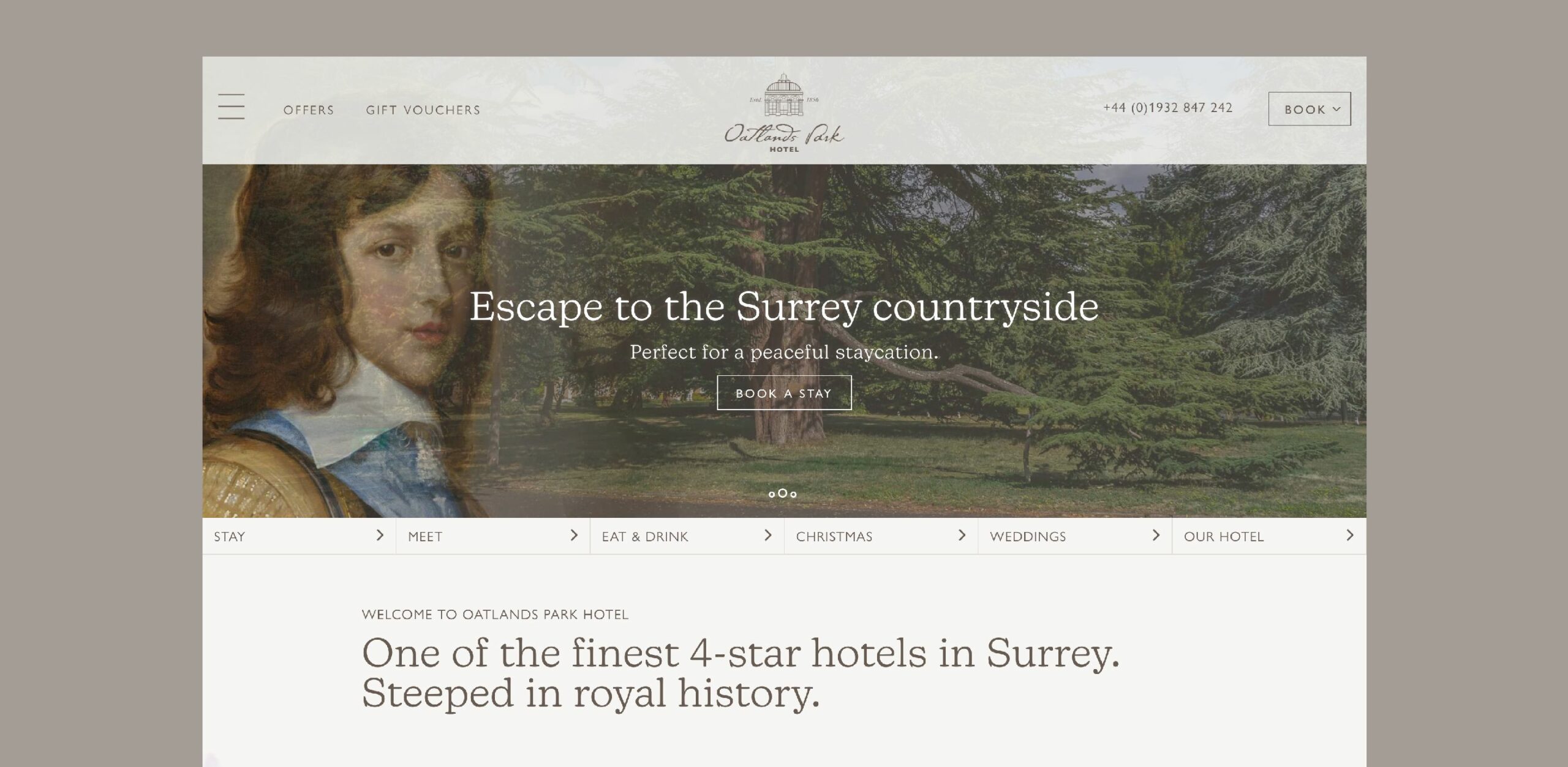
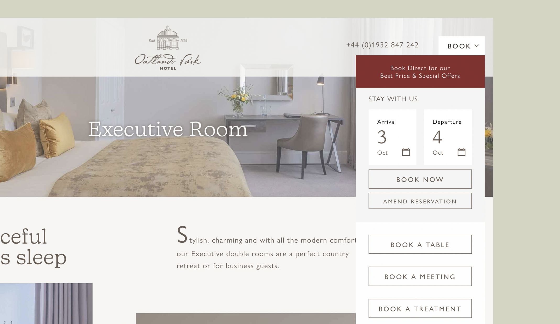
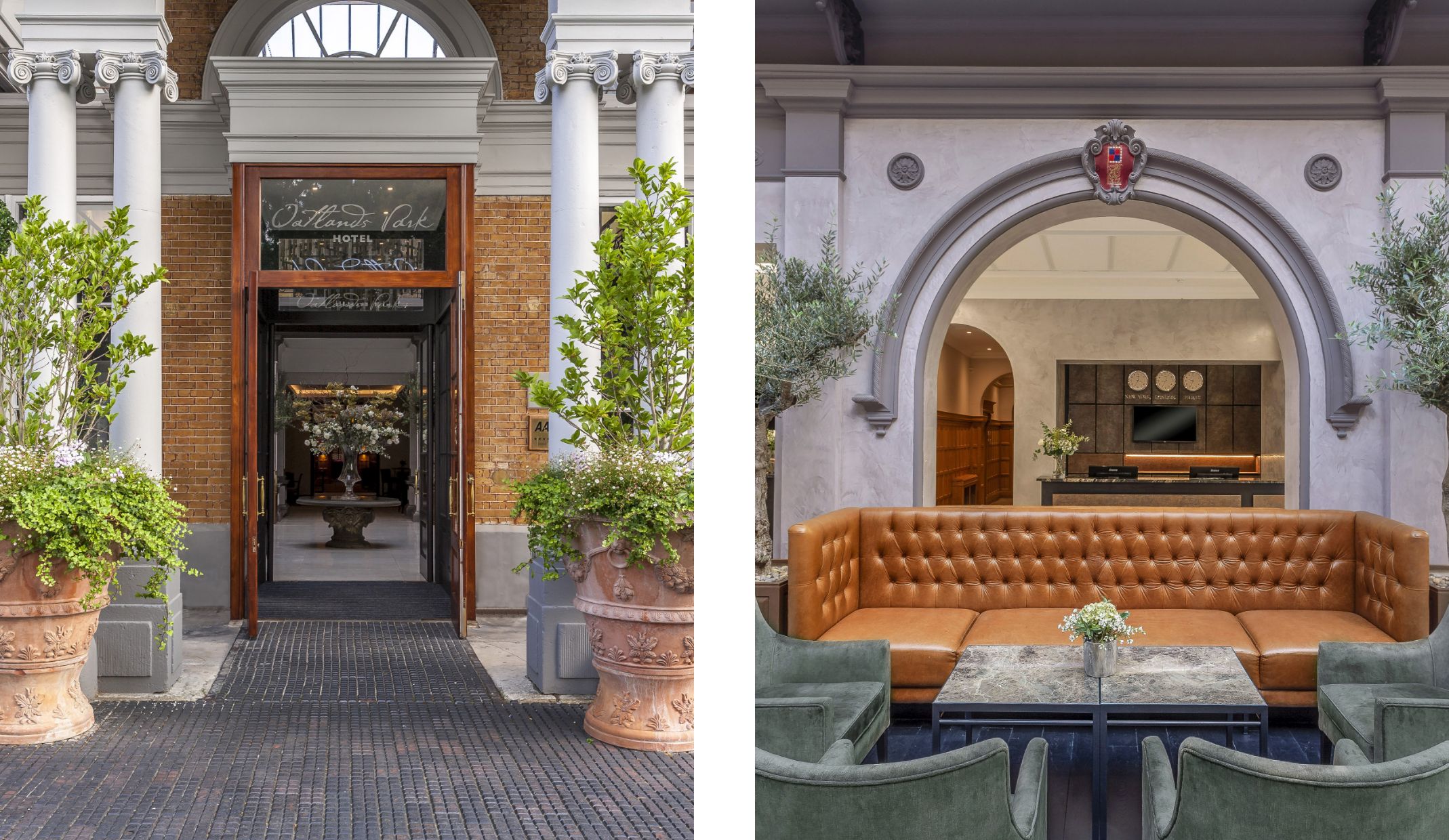
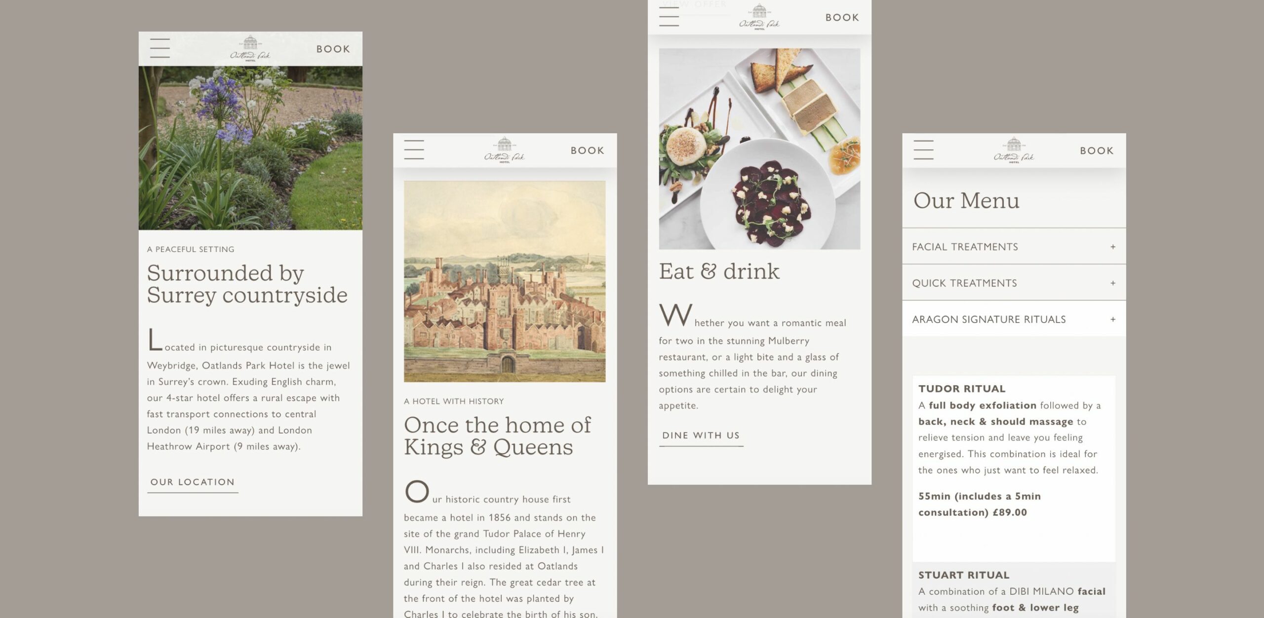
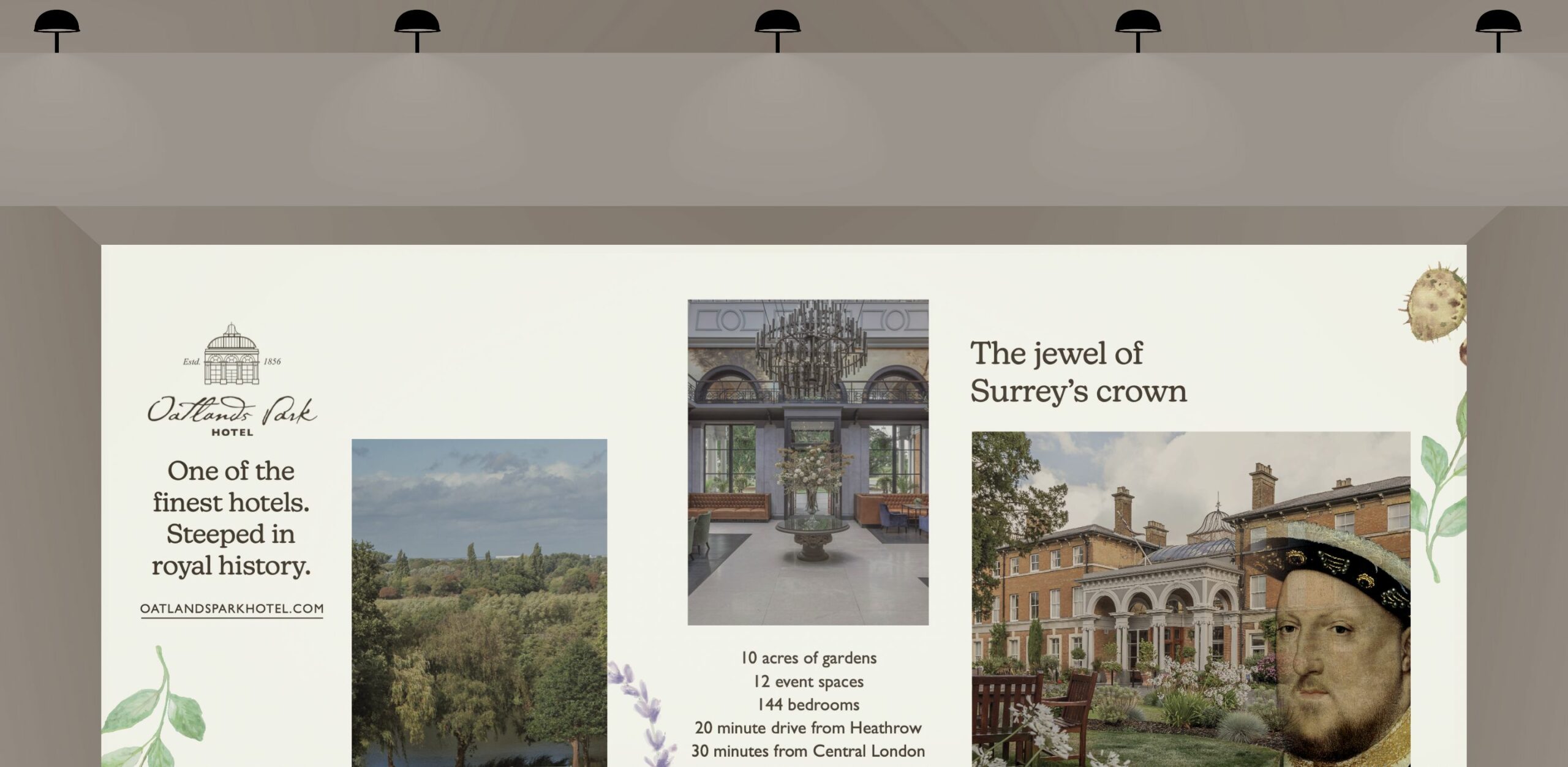
In order to match the premium experience that guests feel while entering the beautifully British manor hotel, the overall brand style and website needed to mirror it to tie everything together. To reach its full potential, the Oatlands Park Hotel website needed to address its user experience challenges so that guests could navigate the site effectively and increase conversions.
Having audited the brand, it was clear from both the internal team at Oatlands, and the data driven insight we gathered that the website was the key component in letting the brand down. The content was difficult to locate, making it less user-friendly, resulting in reduced conversion rates for rooms, events, weddings, and table reservations.
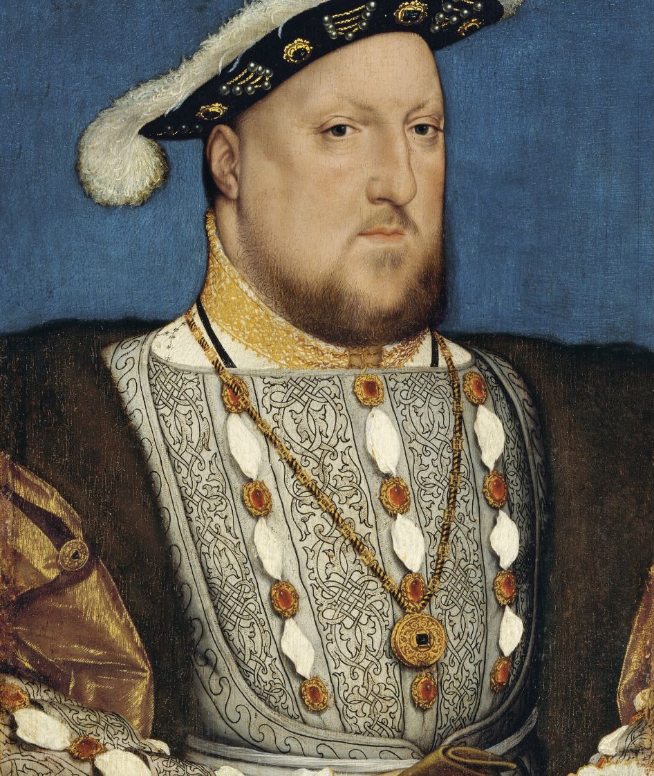
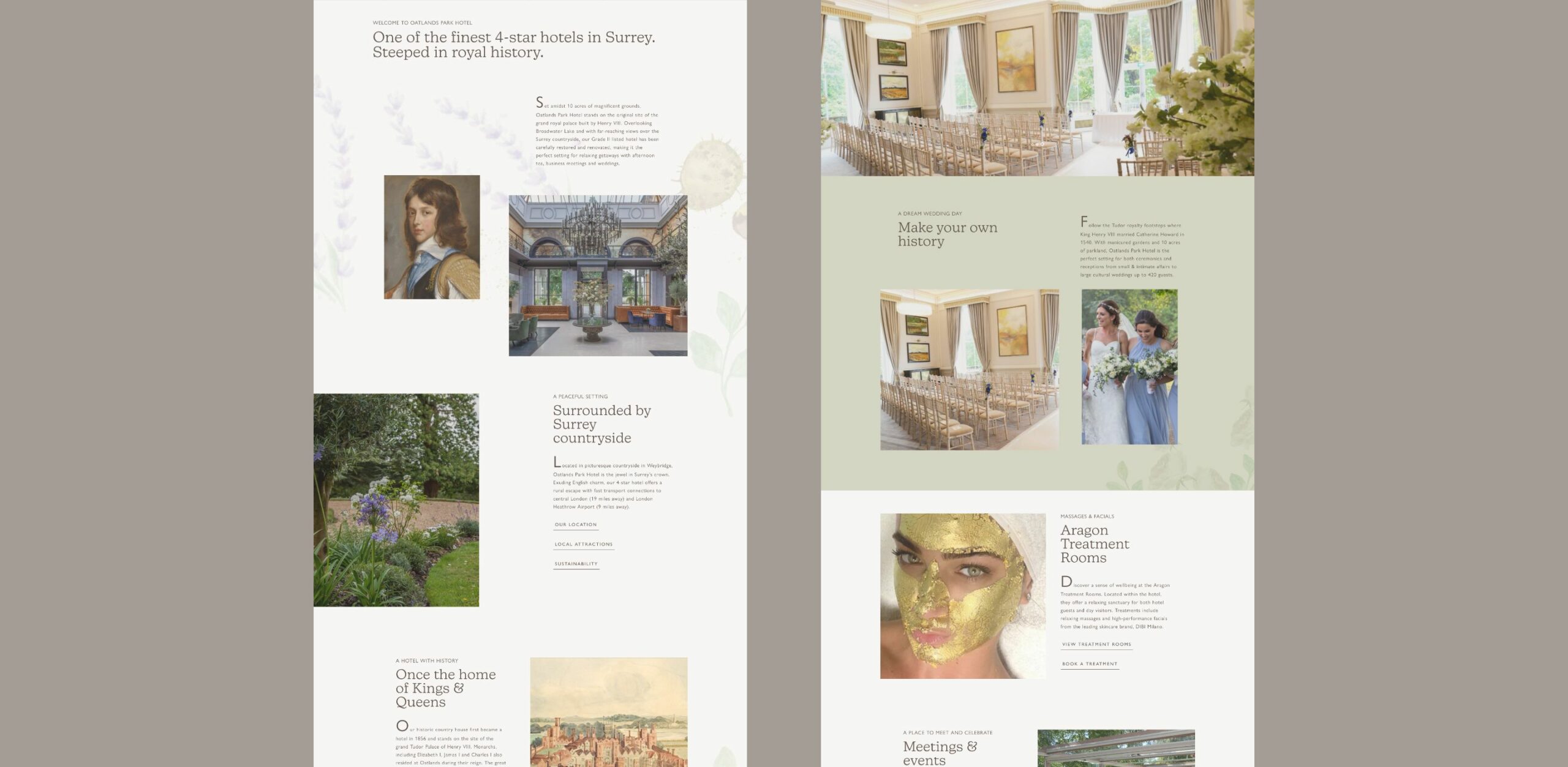
We redesigned the architecture and aesthetic of the website, with the goal of providing a seamless user experience. The relaunch ensured that it was a true reflection of the Oatlands experience, which is a hybrid of history and luxury, and told the iconic story of Henry VIII.
The website needed to convey the hotel’s true British country charm, located in a convenient location, to encourage customers to book not just a modern countryside escape, but an experience for weddings, celebrations and corporate events. The revived website emphasises that Oatlands isn’t your average hotel, ensuring those who are booking a stay appreciate how special this hotel truly is.
The redesign of other marketing materials for Oatlands became necessary as a result of the website revisions and updated house style being rolled out, in order to bring the brand together as one. This included advert publications and event branding to ensure the message and brand were consistent throughout the journey to the website from other avenues, leaving a lasting impression.
With a unique and consistent style that can be applied to all marketing materials, Oatlands now stands out from the competitive landscape, locally and nationally. The new branding effectively captures the brand’s charming personality, their dedication to customers and their sophisticated character.
– Marketing Manager, Oatlands Park Hotel
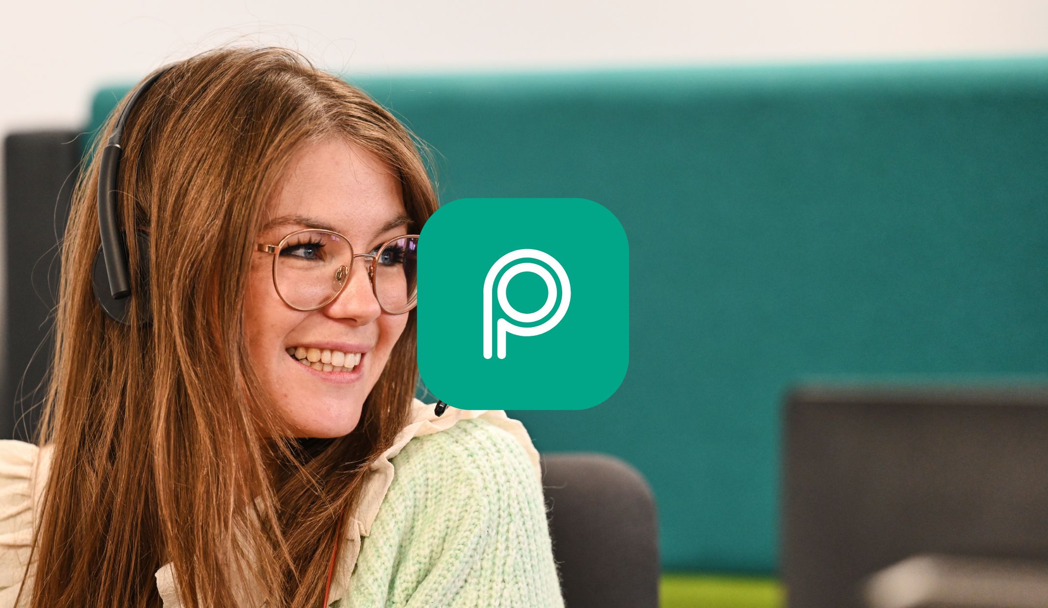
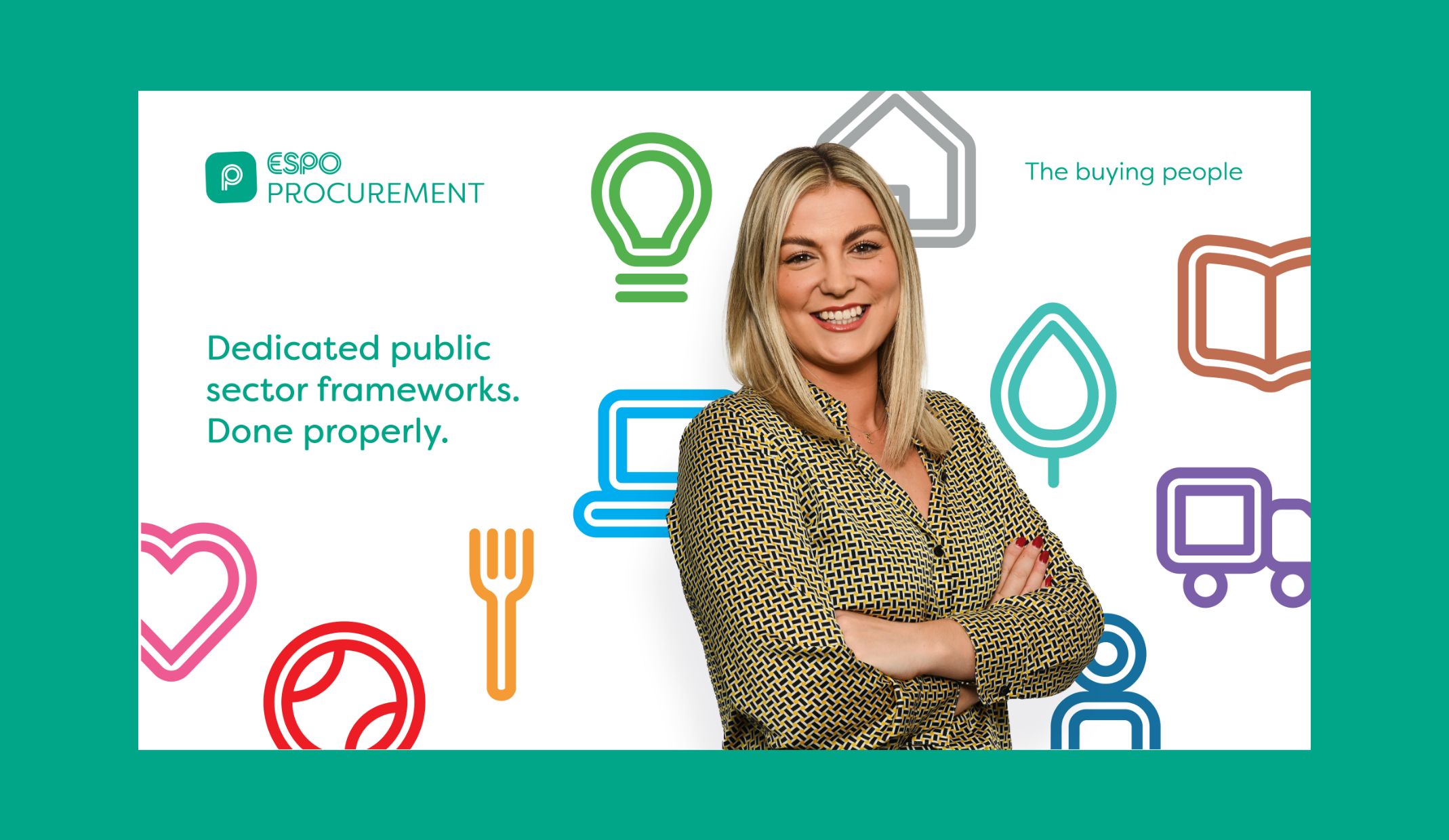
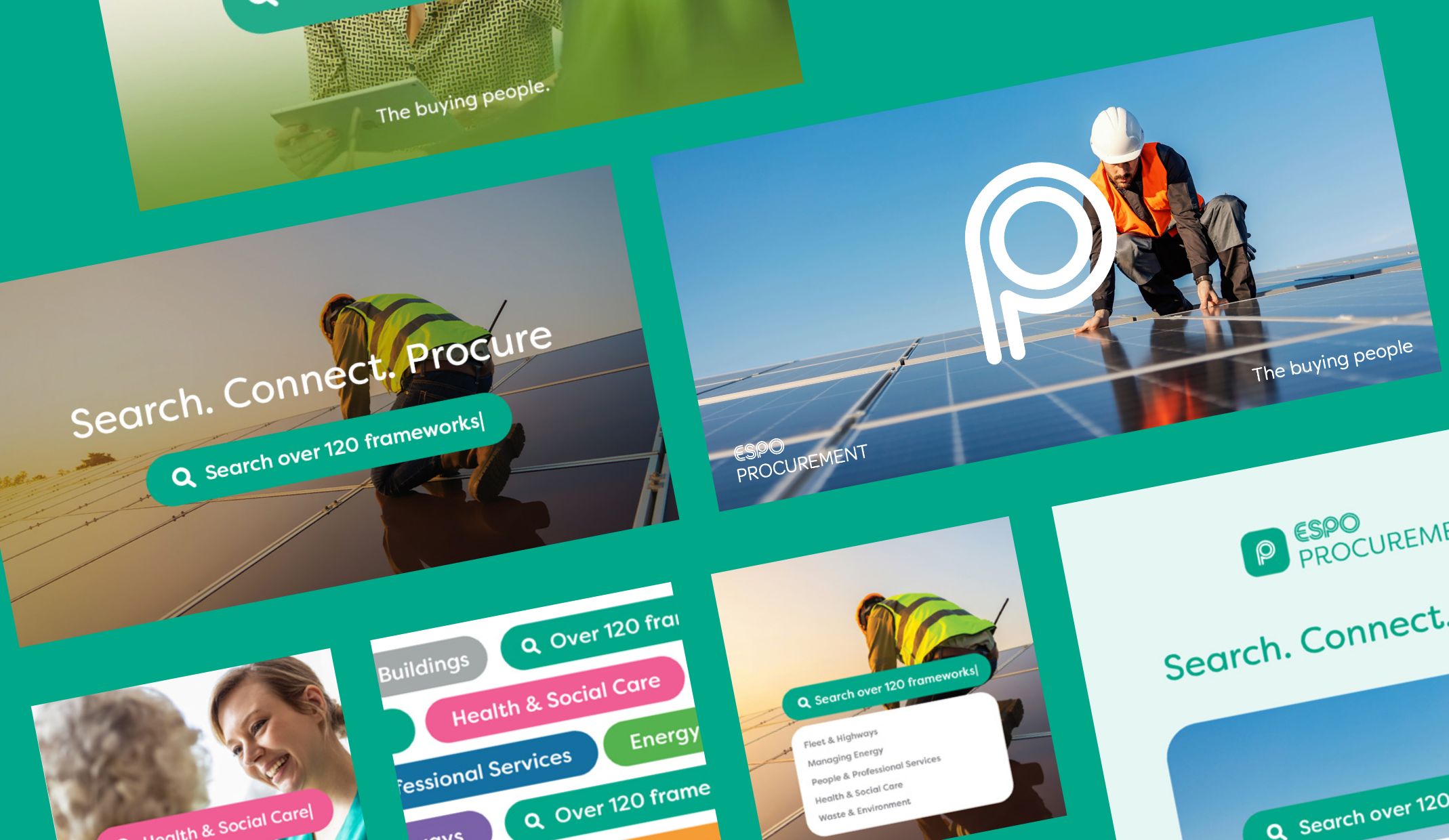
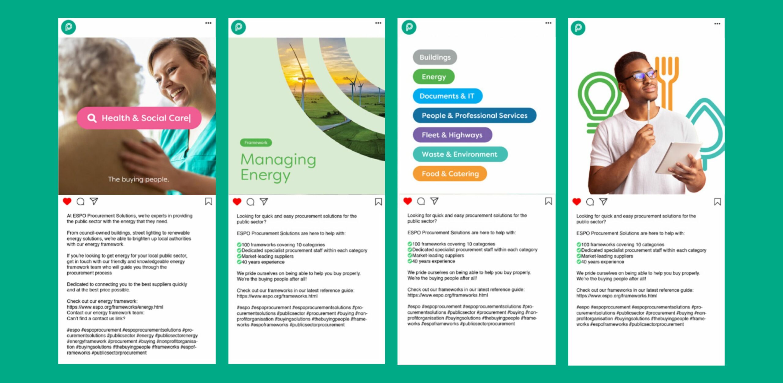
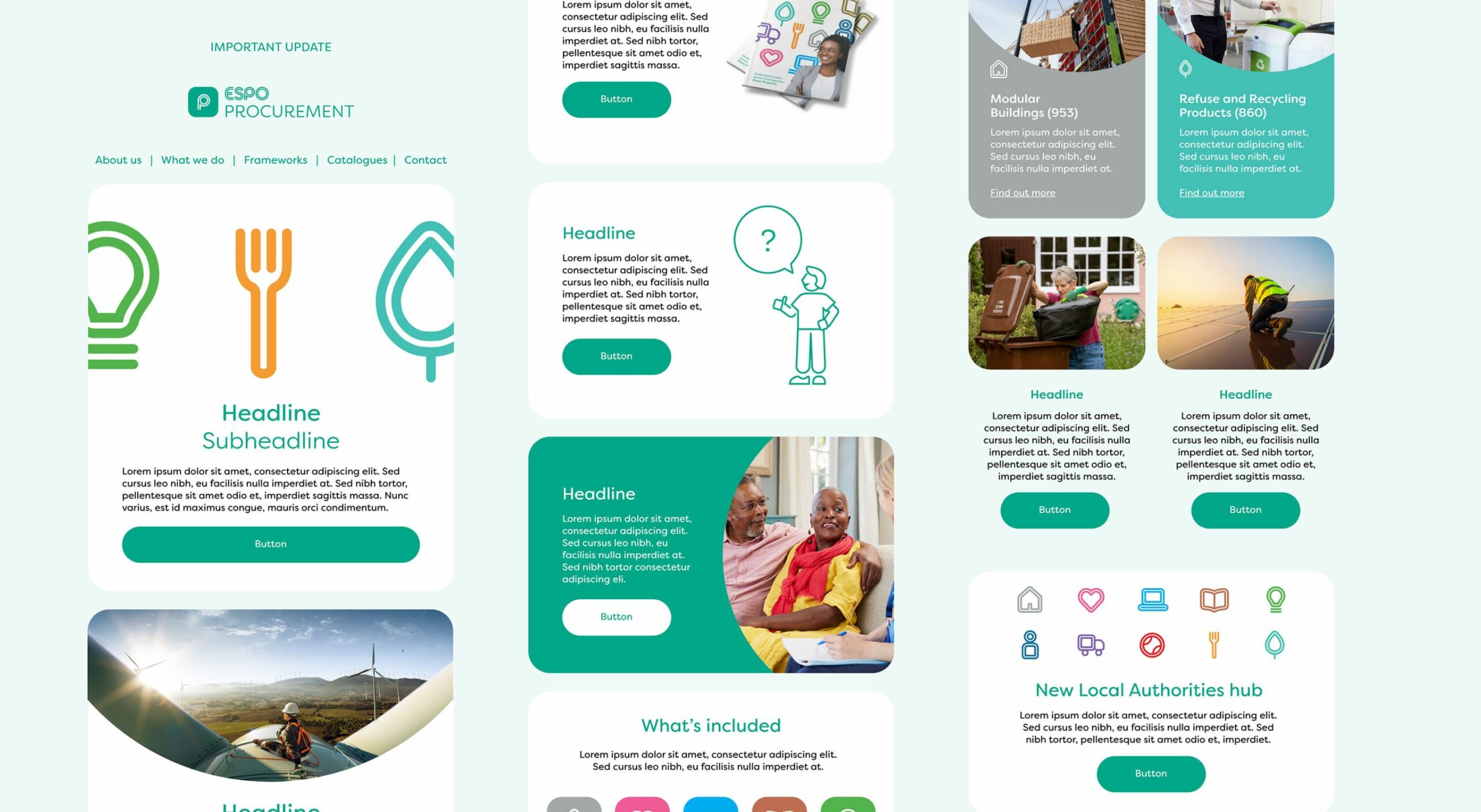
When ESPO realised that their internal team required a visual platform to help them apply their branding, they came to us looking for a set of branded guidelines that would enable their marketing to be consistent. Their previous branding across their marketing channels lacked consistency, due to their simple style guide, and ESPO needed help improving this to ensure their brand is represented in the best light. We offered a much needed fresh perspective, as the team were too close to the brand to decide where improvements could be made. The procurement business also wanted to refresh their look in order to stand out in the buying sector, and remind customers of their 40 years experience as a specialist procurement partner.
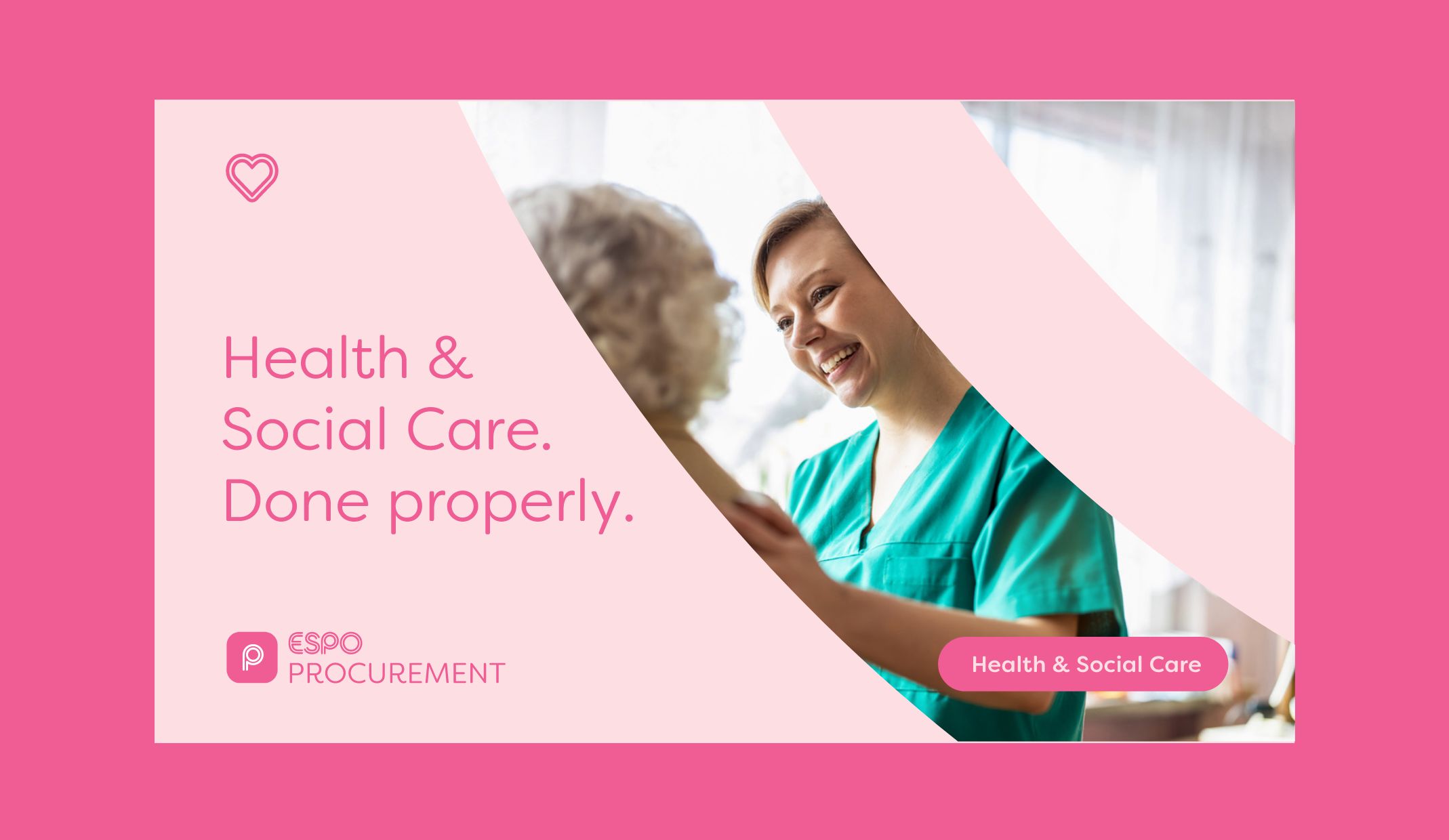
With 120 frameworks and bespoke procurement solutions, the public sector owned company needed branding that encompassed the full breath of their services, and represented the key USPs of the business. We audited their brand to help us provide the insight that informed the direction of the project.
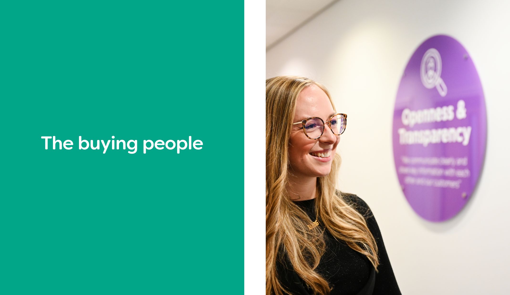
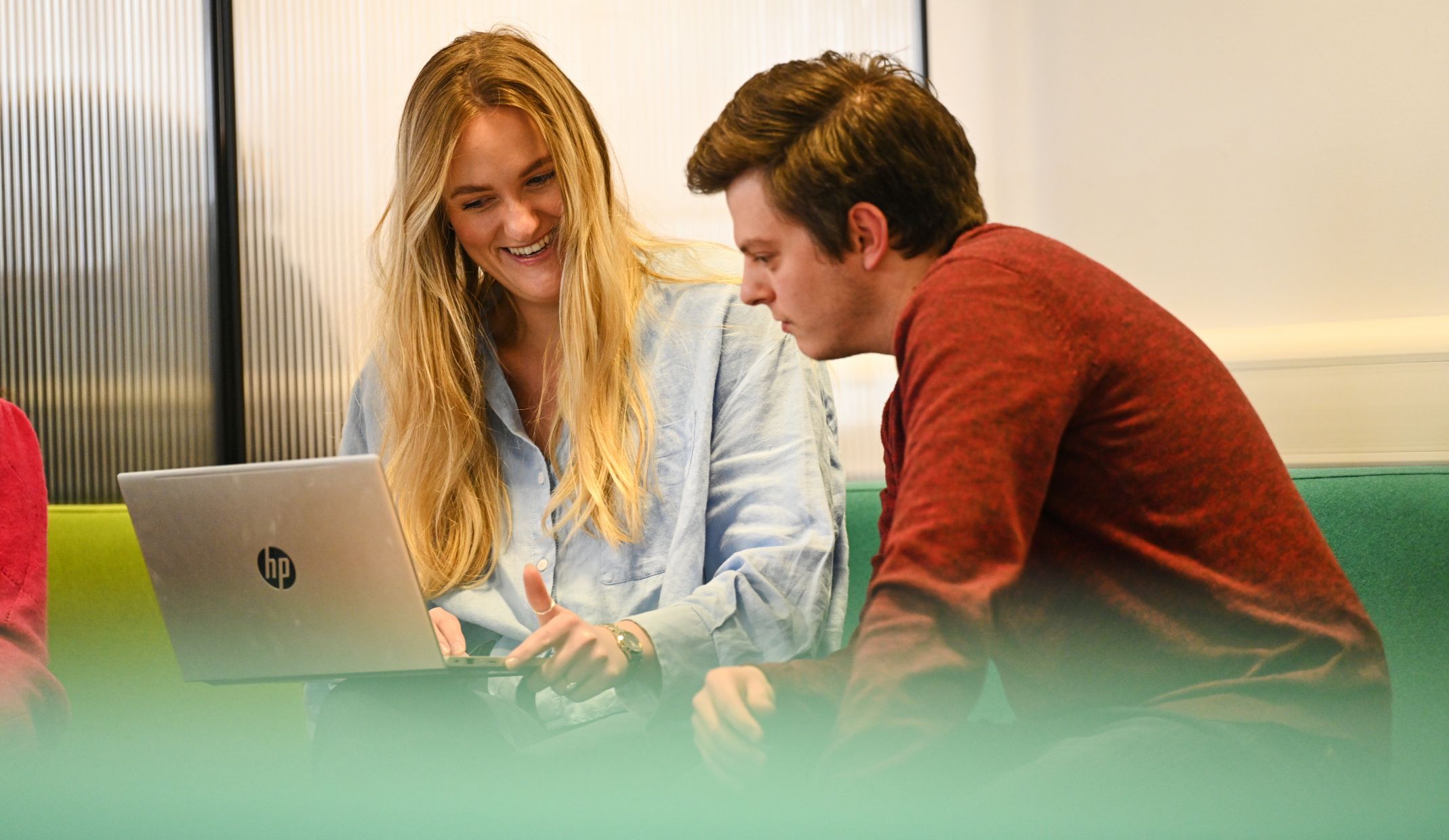
As experts in procurement, we created a strapline that resonated with their people, ‘The buying people’. Supported by a team of specialists, it was essential that the rebrand put the team centre stage. We carried out a lifestyle photoshoot with the ESPO team, providing them with a range of photography material that can be used across various marketing channels, including their recent marketing campaign. Other messaging included procurement ‘Done properly’ by ESPO, to reinforce and reassure their customers of their skills, reliability and experience.
After setting the tone with their procurement brand guidelines, we worked with ESPO to create a digital marketing campaign that focused on the brand’s key USPs. With a set of digital assets that centre around a search bar to emphasise ESPO’s wide variety of frameworks, this also highlighted how quick and easy it is for buyers to find the perfect public sector framework. The assets created allowed ESPO’s in-house team to deliver an effective marketing campaign, enabling them to apply consistent branding across all marketing materials.
Having refreshed the framework branding and provided the ESPO team with a set of branded guidelines to follow, they are able to consistently apply the branding throughout their marketing communications. The framework branding is modern, strong and represents everything the procurement brand stands for.
– Marketing Campaigns & Brand Manager, ESPO
increase in new users
page views per year
annual website conversions
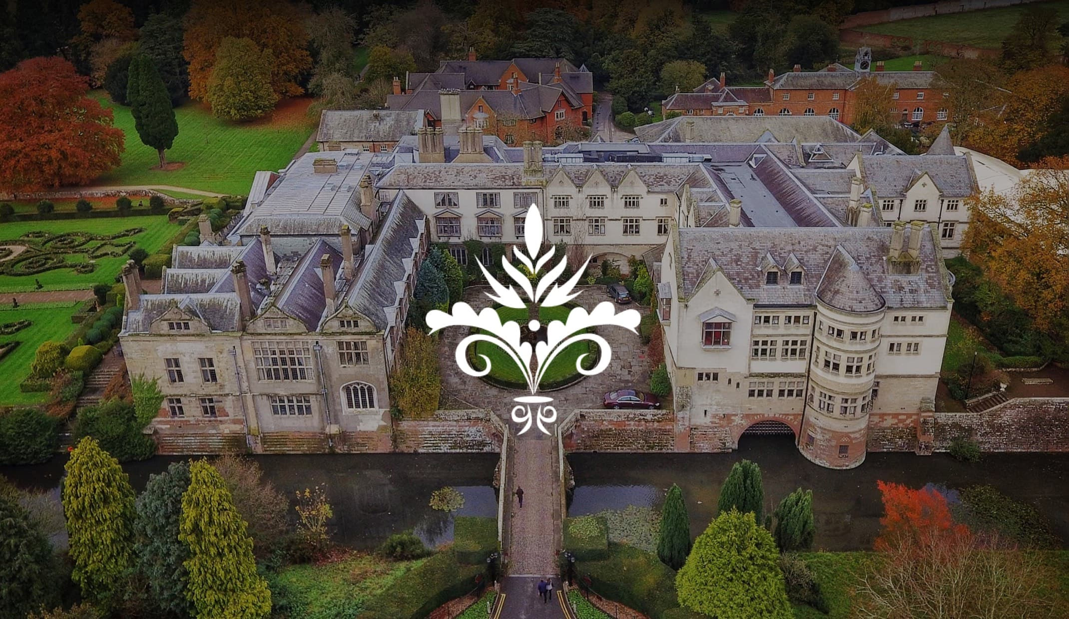
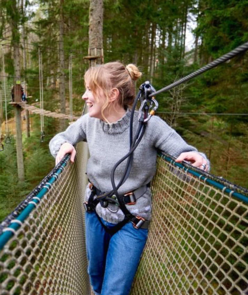
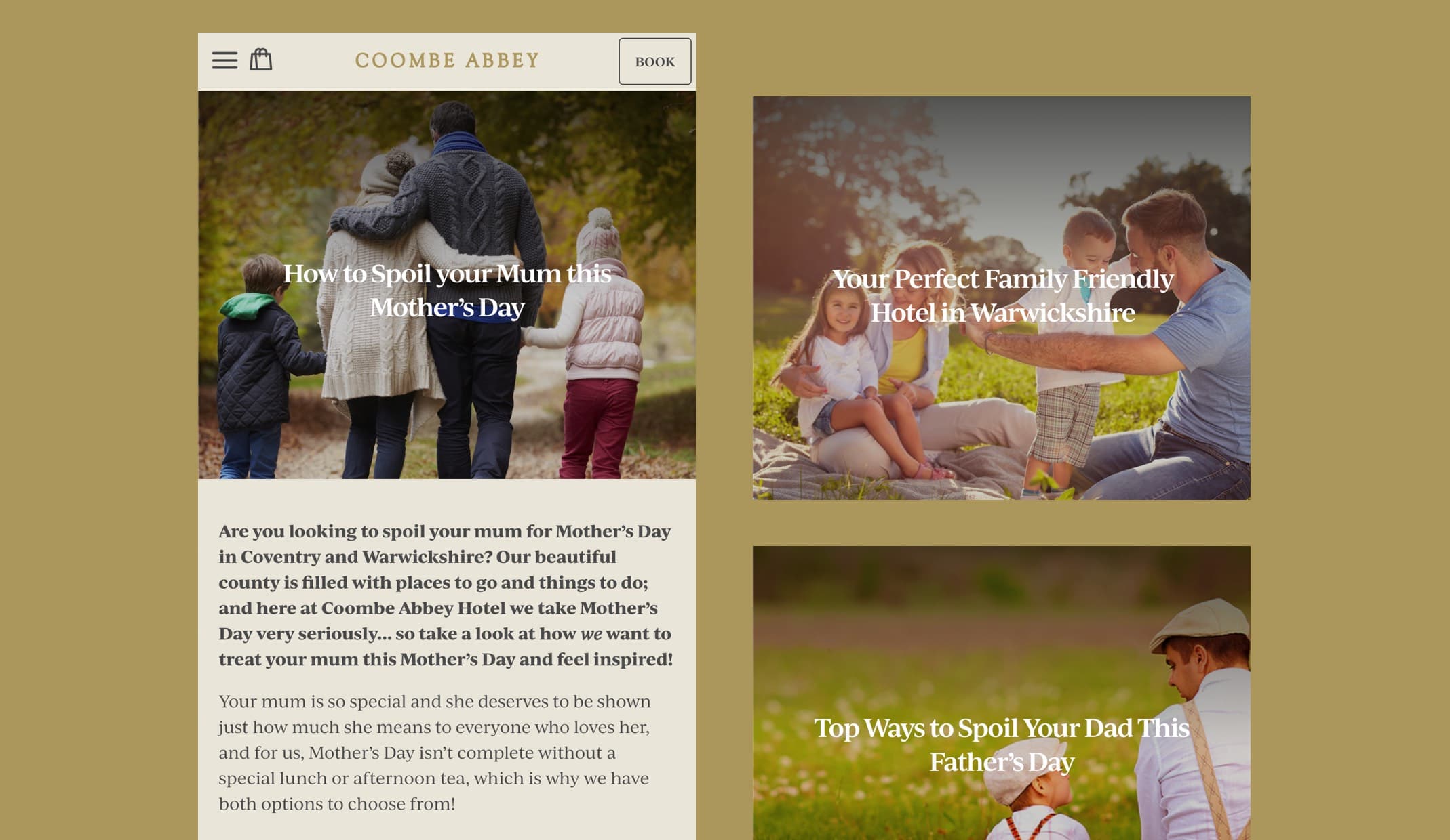
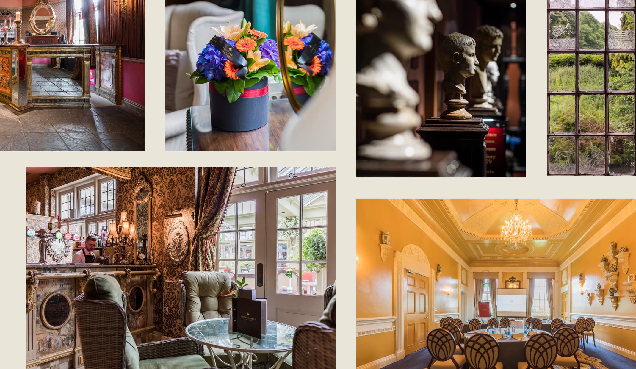
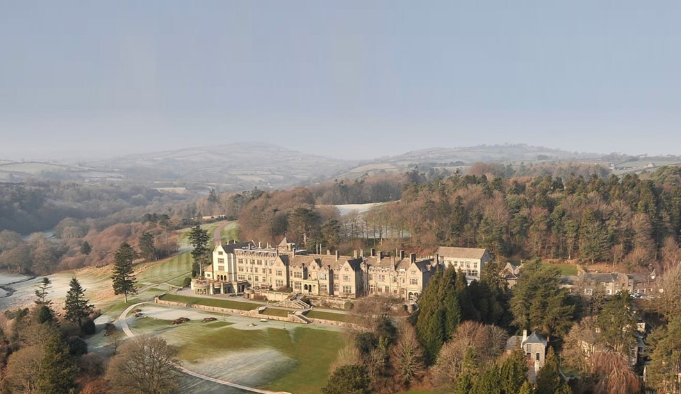
Coombe Abbey, a historic four-star hotel, wanted to reposition the brand as a ‘destination’ for everyone, promoting the wide variety of things to do. From medieval events, to the 500-acre country park, and the new Go Ape tree tops adventure, the website needed to encompass all the activities and experiences available for visitors and guests to enjoy.
To satisfy user intent, the new content-led website had to be easy to navigate and provide a more modern and holistic approach in presenting everything there is to do at Coombe Abbey, putting the venue on the map nationally as a standout destination.
To ensure visitors to the website were able to quickly find relevant information, we created a bespoke Inspire Me tool, to allow users to tailor their perfect visit to their own interests. Whether they’re looking for a romantic weekend away for two or a unique family experience.
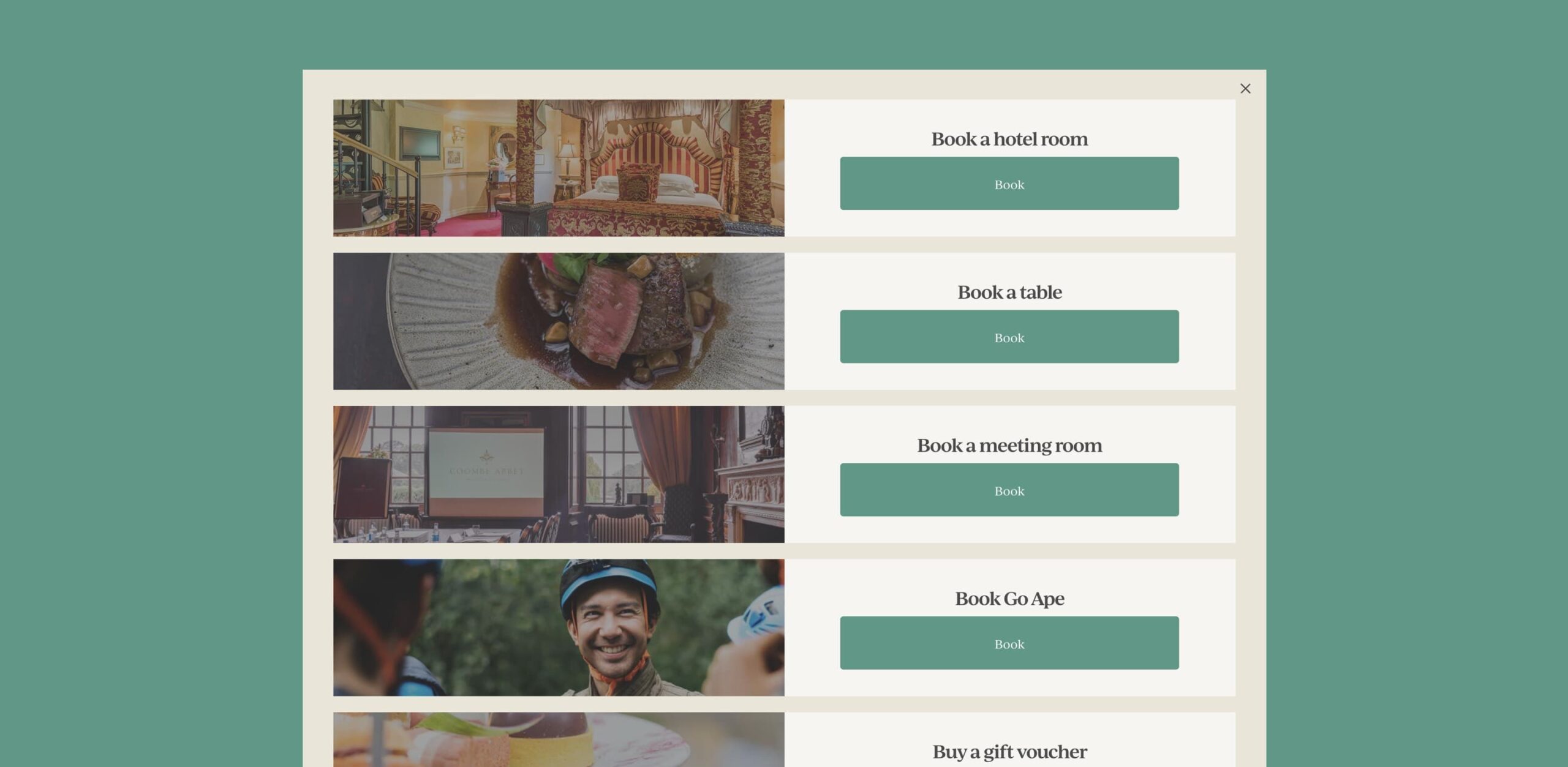
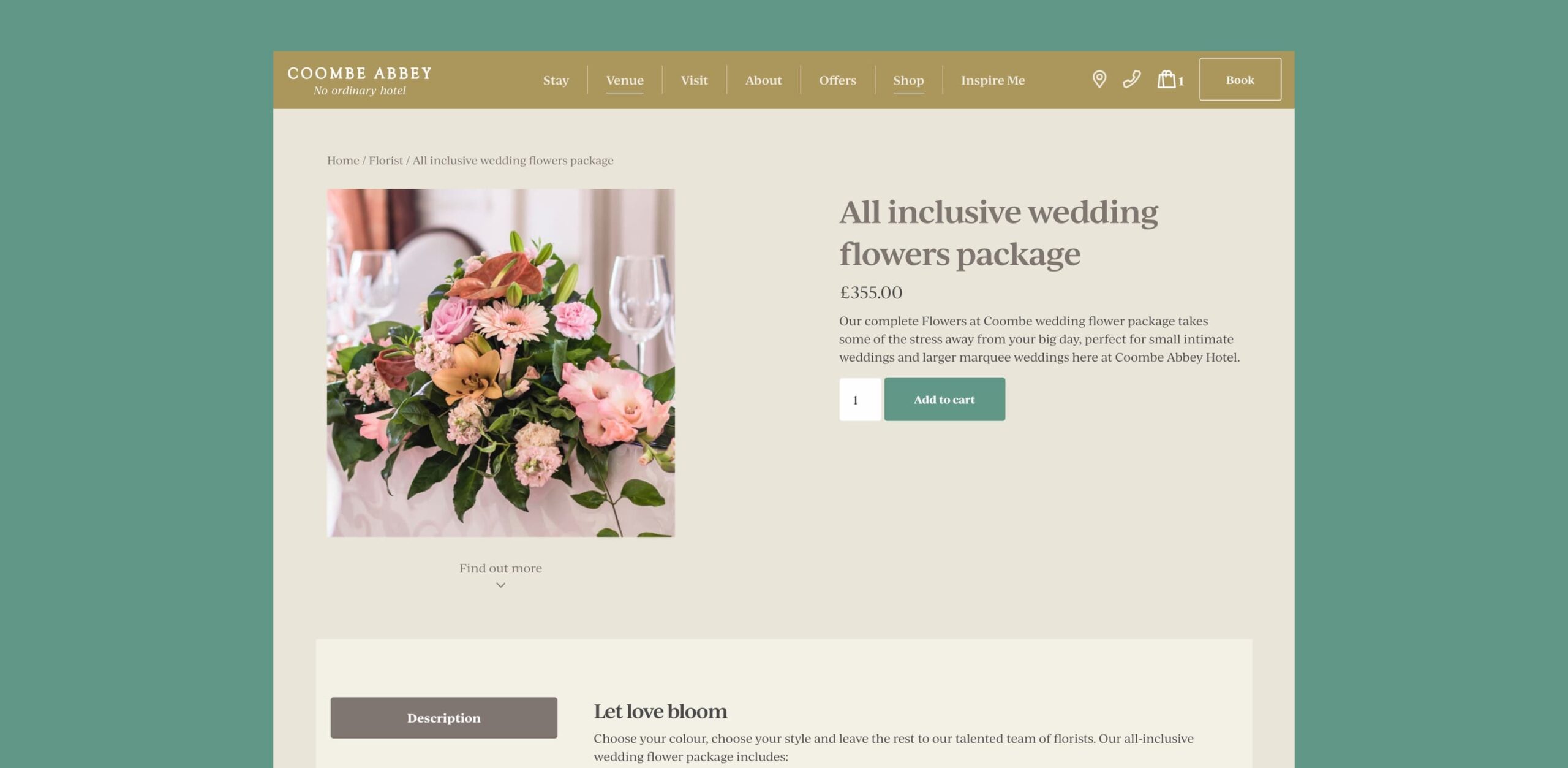
To encourage more direct bookings, we integrated multiple online booking systems, making the booking experience seamless and consistent. The Coombe Abbey shop was also updated, offering customers the chance to purchase merchandise, gift vouchers, event tickets and the on-site florist products in one centralised place without having to leave the website.
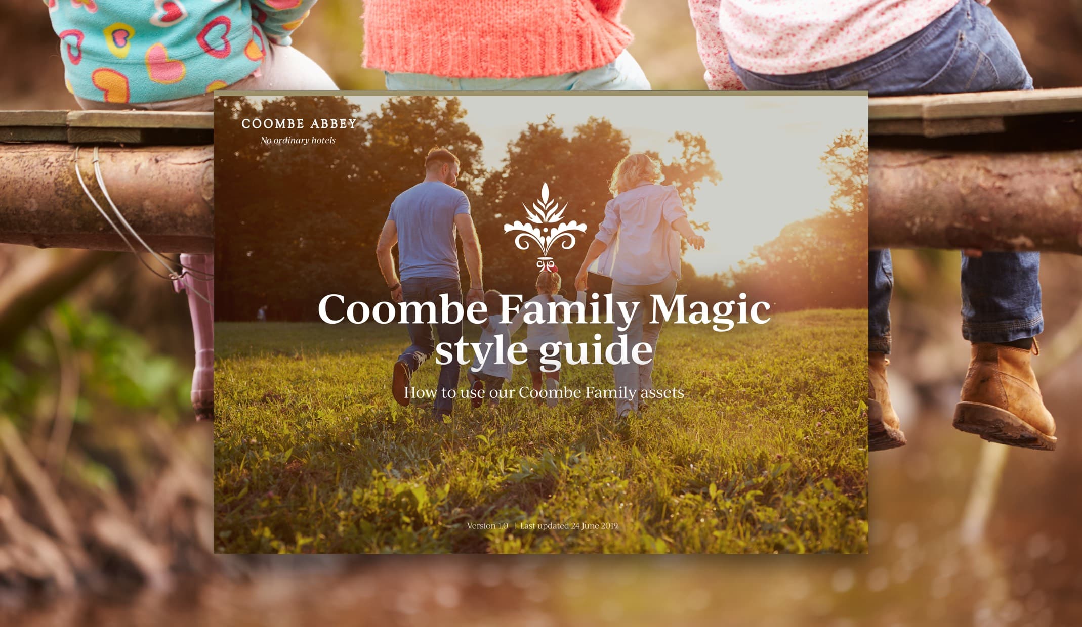
To attract more families to the hotel, Coombe Abbey developed new family-orientated packages. We provided branding support for the new sub-brand ‘Coombe Families’ and created a ‘Coombe Family Magic’ style guide, informing how to consistently use the new sub-brand digital assets on the website and social media.
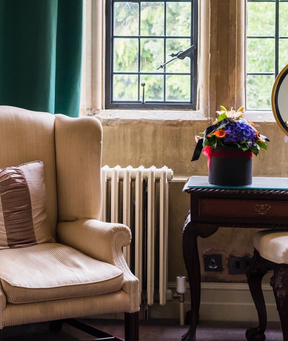
We also conducted a photoshoot for the hospitality brand, to capture the hotel and park in its best light. This provided their marketing team with a bank of images that they have been able to use across a variety of platforms.
– Managing Director, Coombe Abbey
The True Traveller was originally established in 2010 as a company specialising in adventure holidays by three traveller friends. As each knew the importance of having really good travel insurance, they also set up their own insurance scheme alongside the adventure holidays.
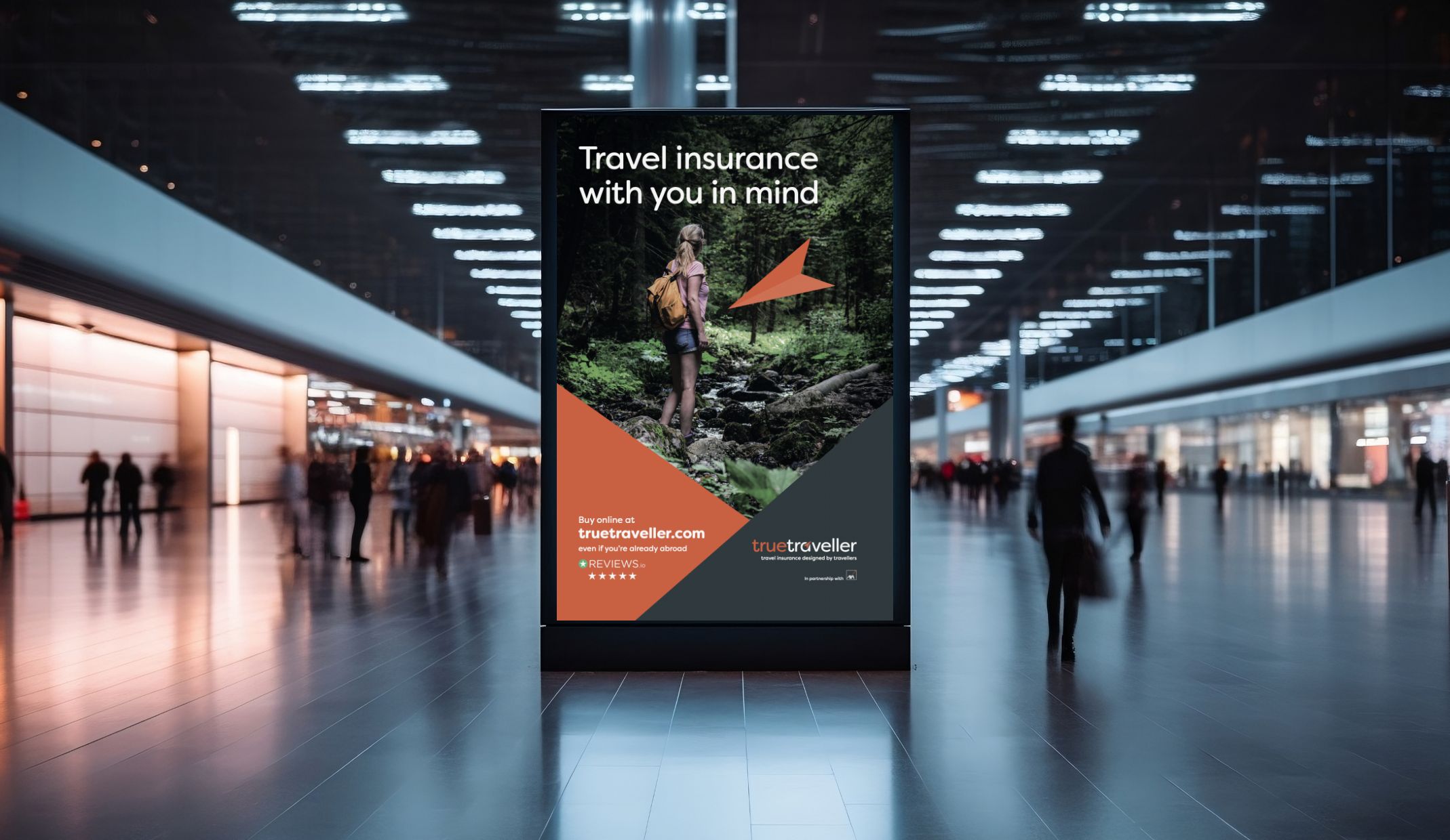
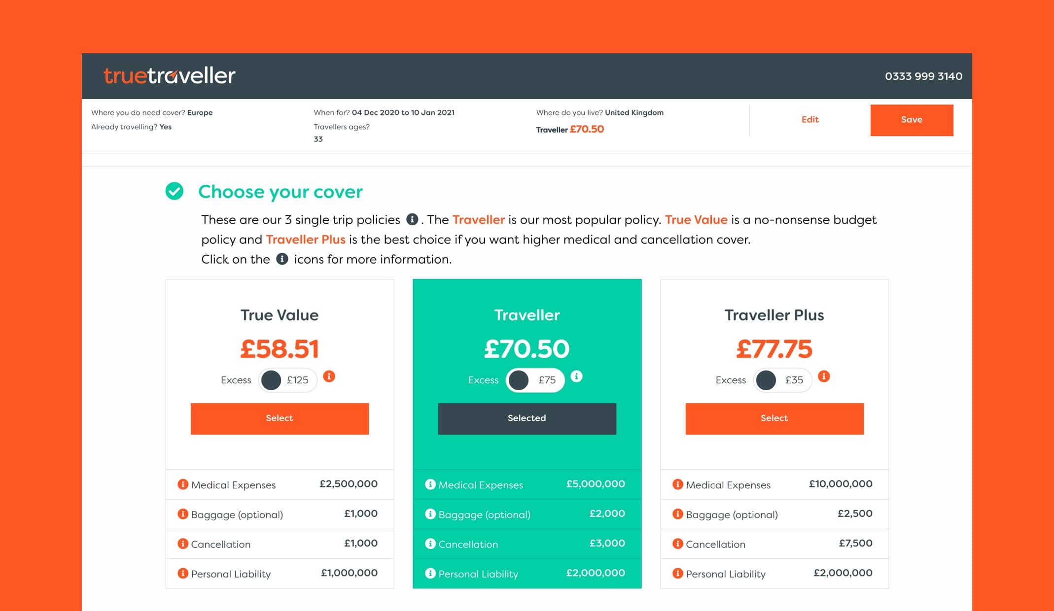
Today, True Traveller offers three core insurance policies created by travellers for holidaymakers, adventure travellers and backpackers. The team approached Rawww to help develop their brand and website to stay inline with audience expectations and increase conversions online.
Our creative strategy for True Traveller’s branding refresh focused on how to connect with seasoned travellers who are looking for more than just standard travel insurance.
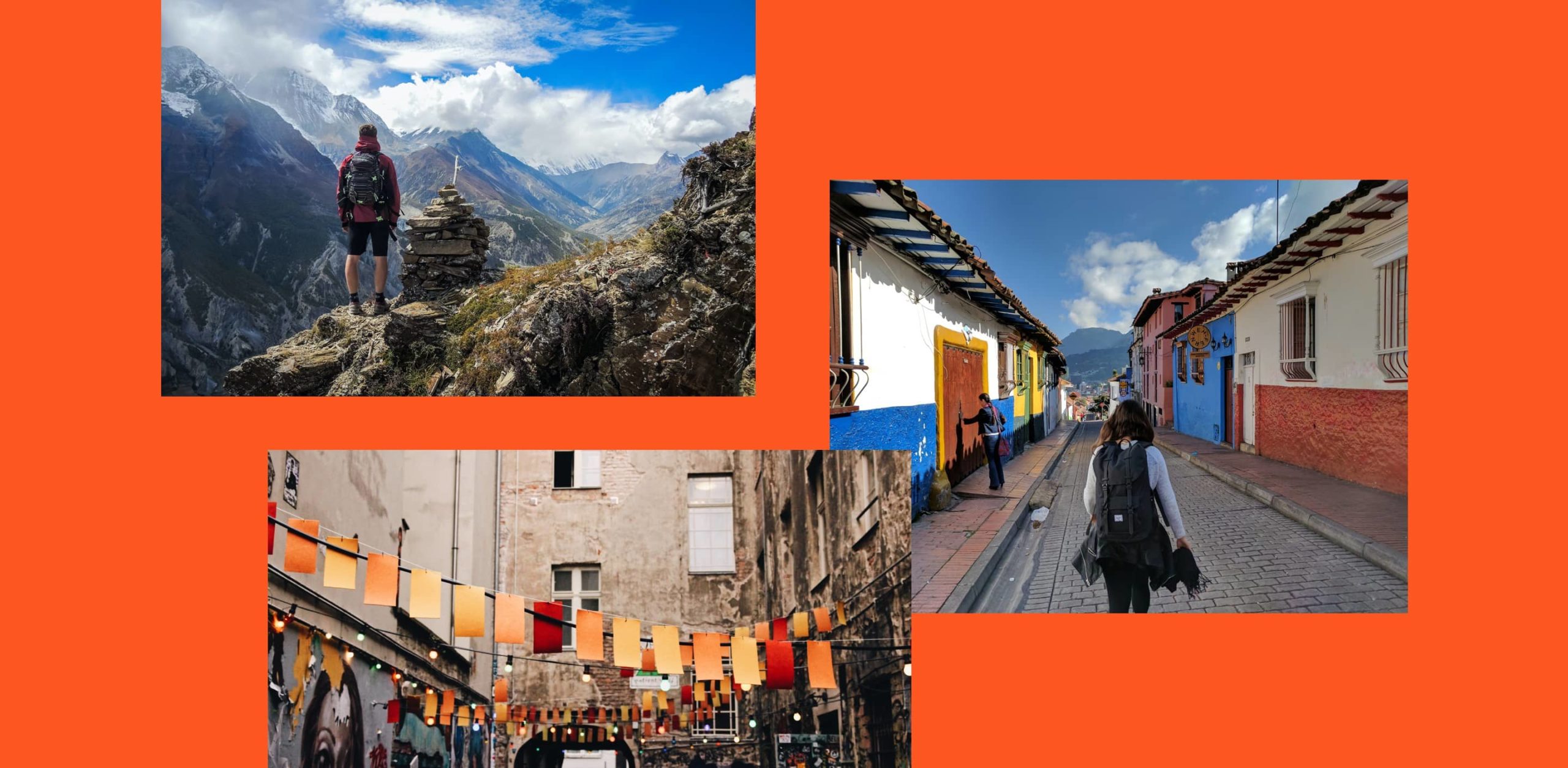
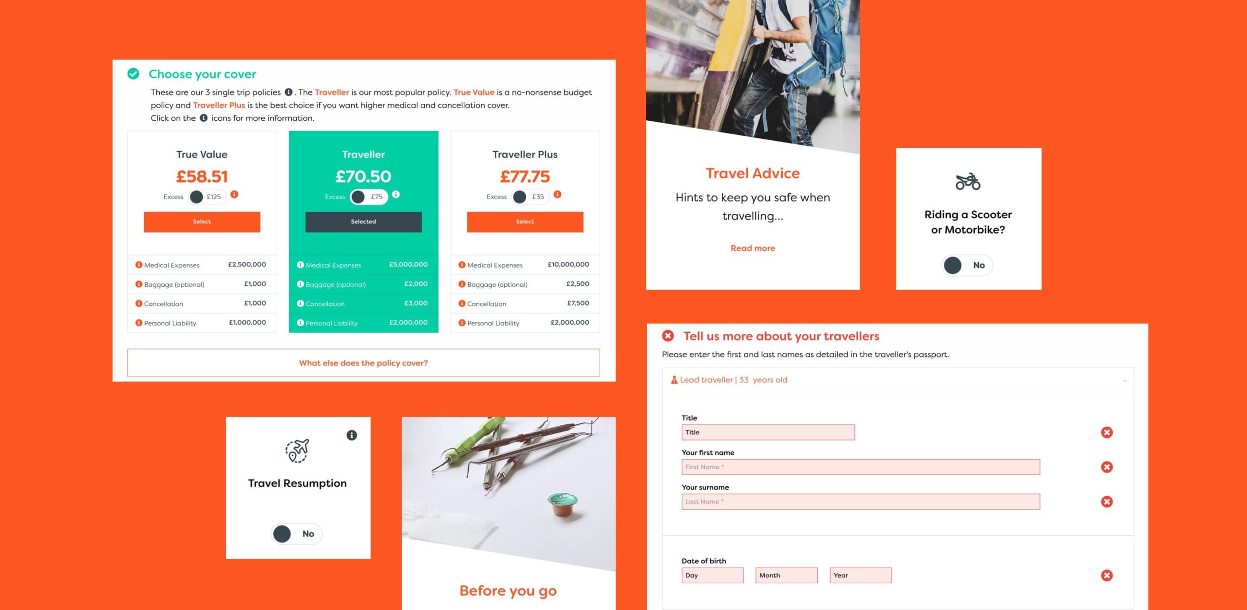
We knew the target audience would be curious about exploring new landscapes and through the use of inspiring photography of exotic locations, it encourages a feeling of escapism, helping to sell that epic moment travellers crave.
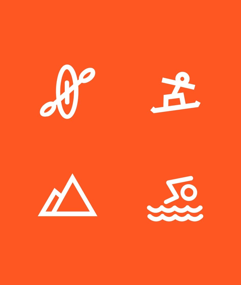
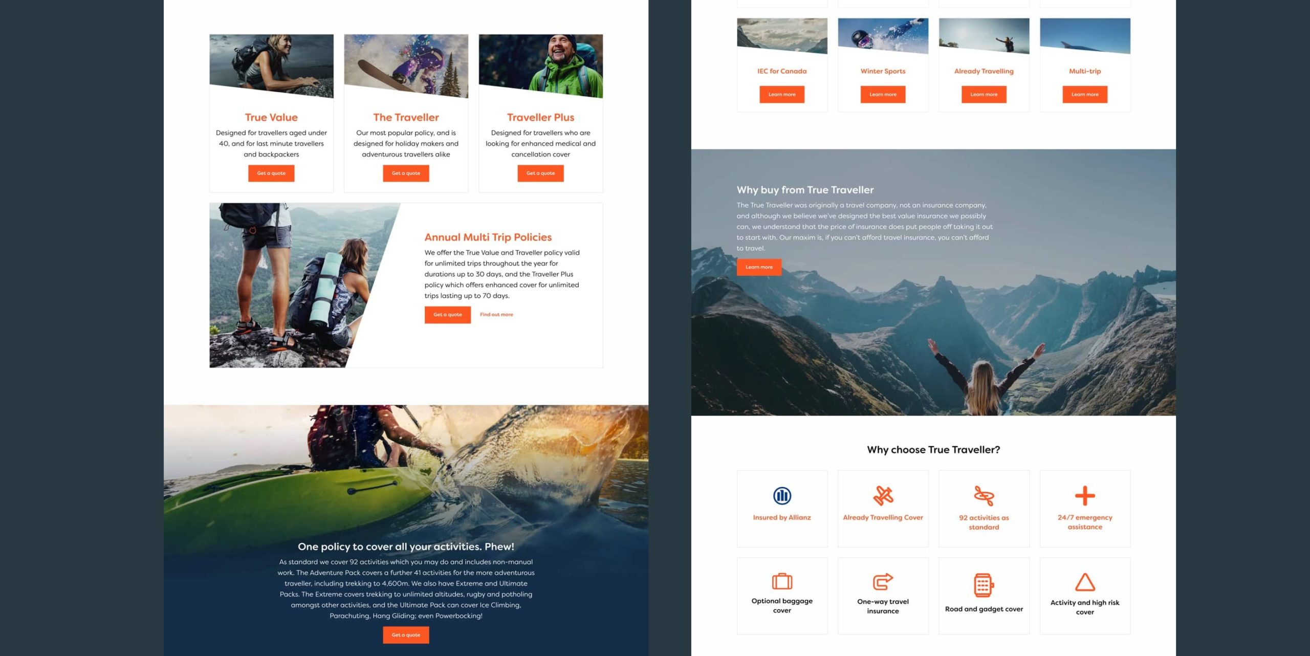
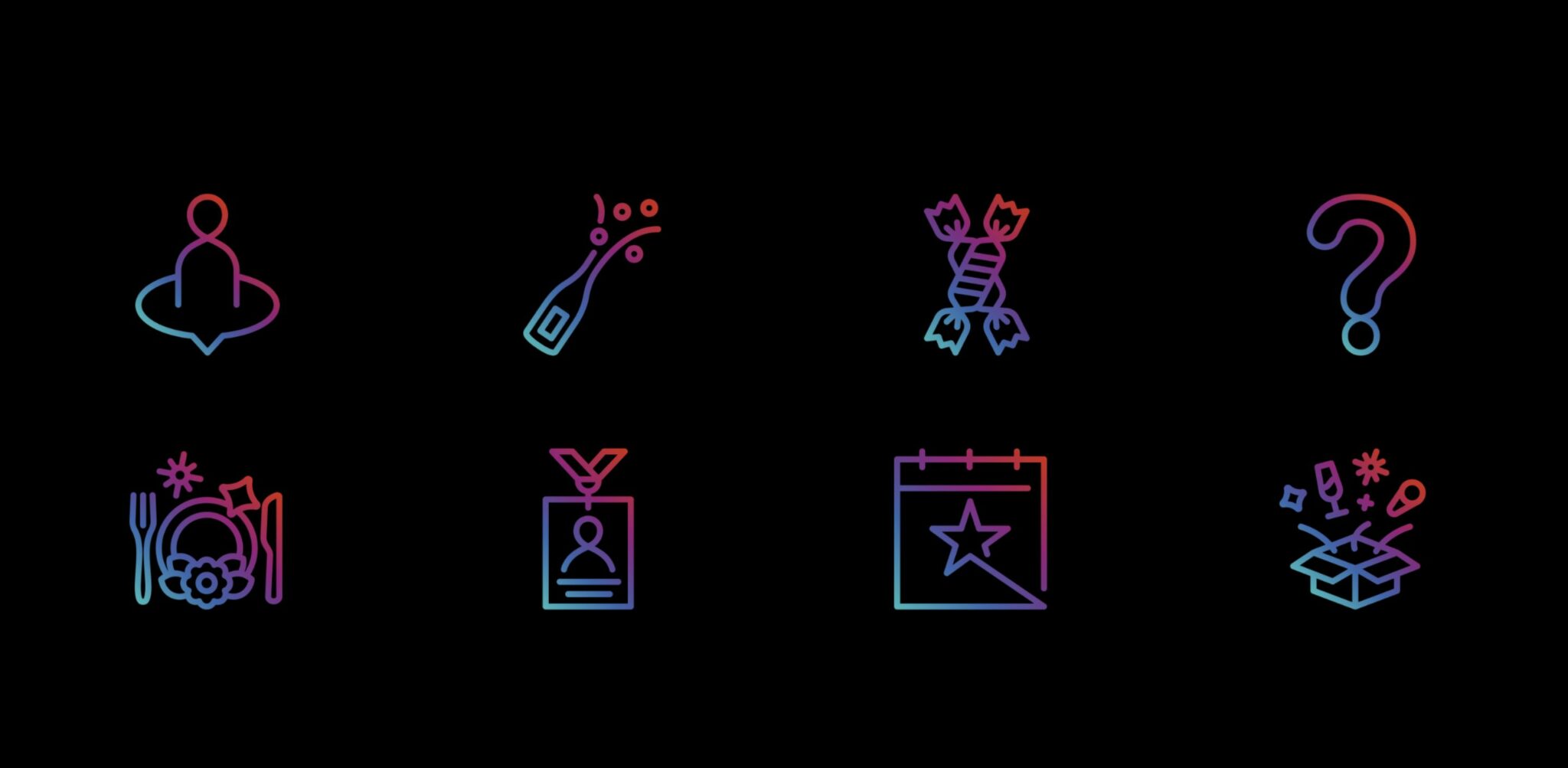
As True Traveller’s marketing strategy covered different media platforms, it was important the branding would work well across both digital and print. We focused on defining the visual approach with a simple colour palette and developed a bespoke set of brand icons.
The directional arrow in the logo was also extended to give more prominence to the idea of ‘seeking an adventure’ and appealing to travellers who are looking ahead at their next trip.
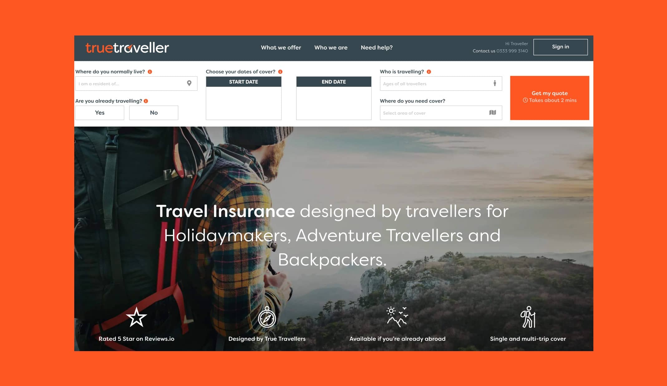
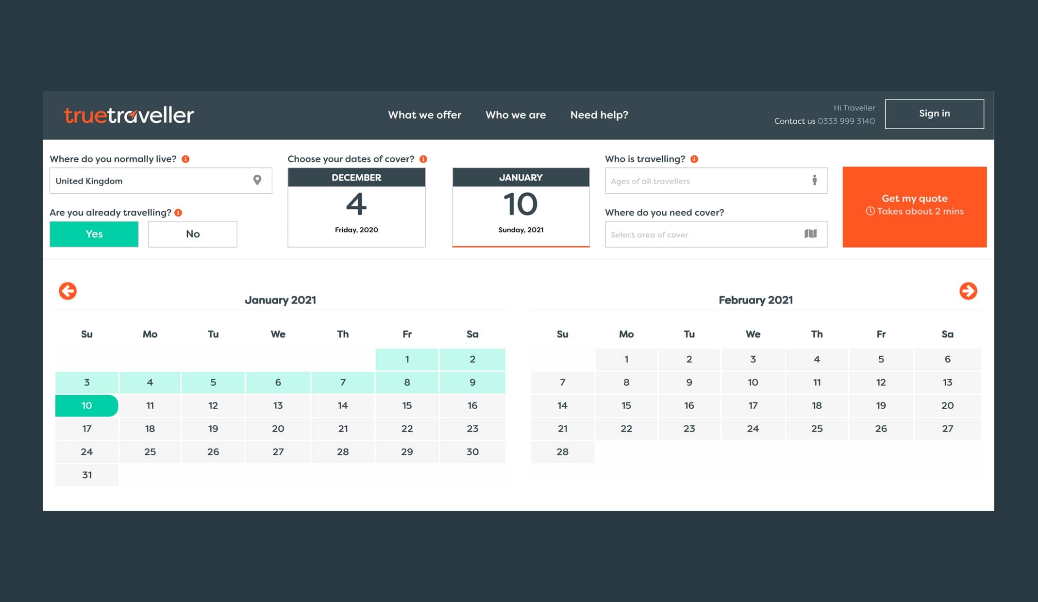
When searching for travel insurance online, most holidaymakers are looking for quick, relevant information and for the booking process to be simple. True Travellers’ previous website design wasn’t providing a good user experience and they were consequently losing potential customers.
To improve conversions online, Rawww redesigned True Traveller’s website with a focus on user experience and ensuring the all-important quote process was quick, easy and intuitive. Through the use of the brand icons, we were able to simplify messaging across the website and make content more memorable and easily digestible to travellers.
– Director, True Traveller
increase in traffic in the first 2 months
click through rate
increase in organic clicks and impressions
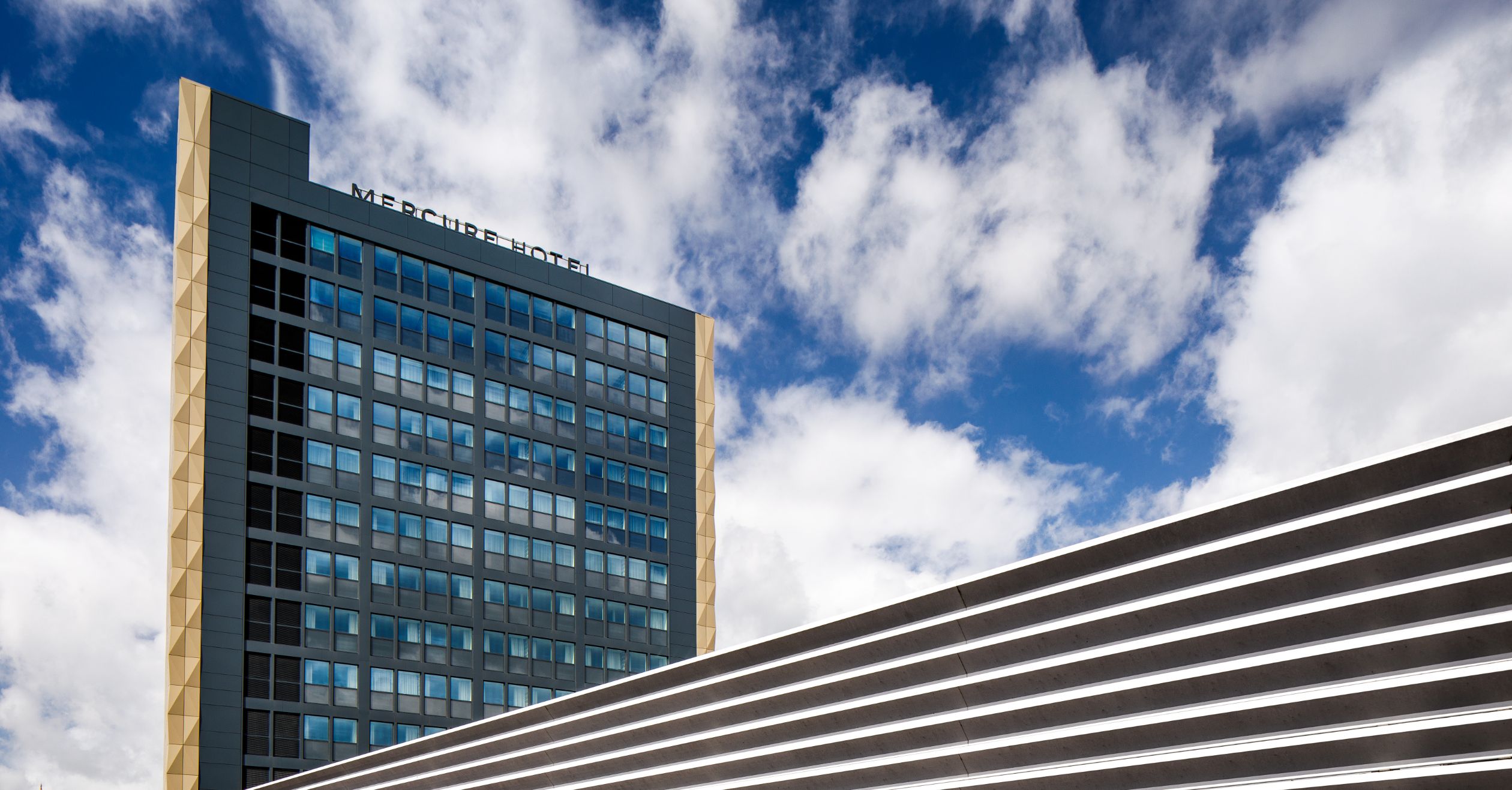
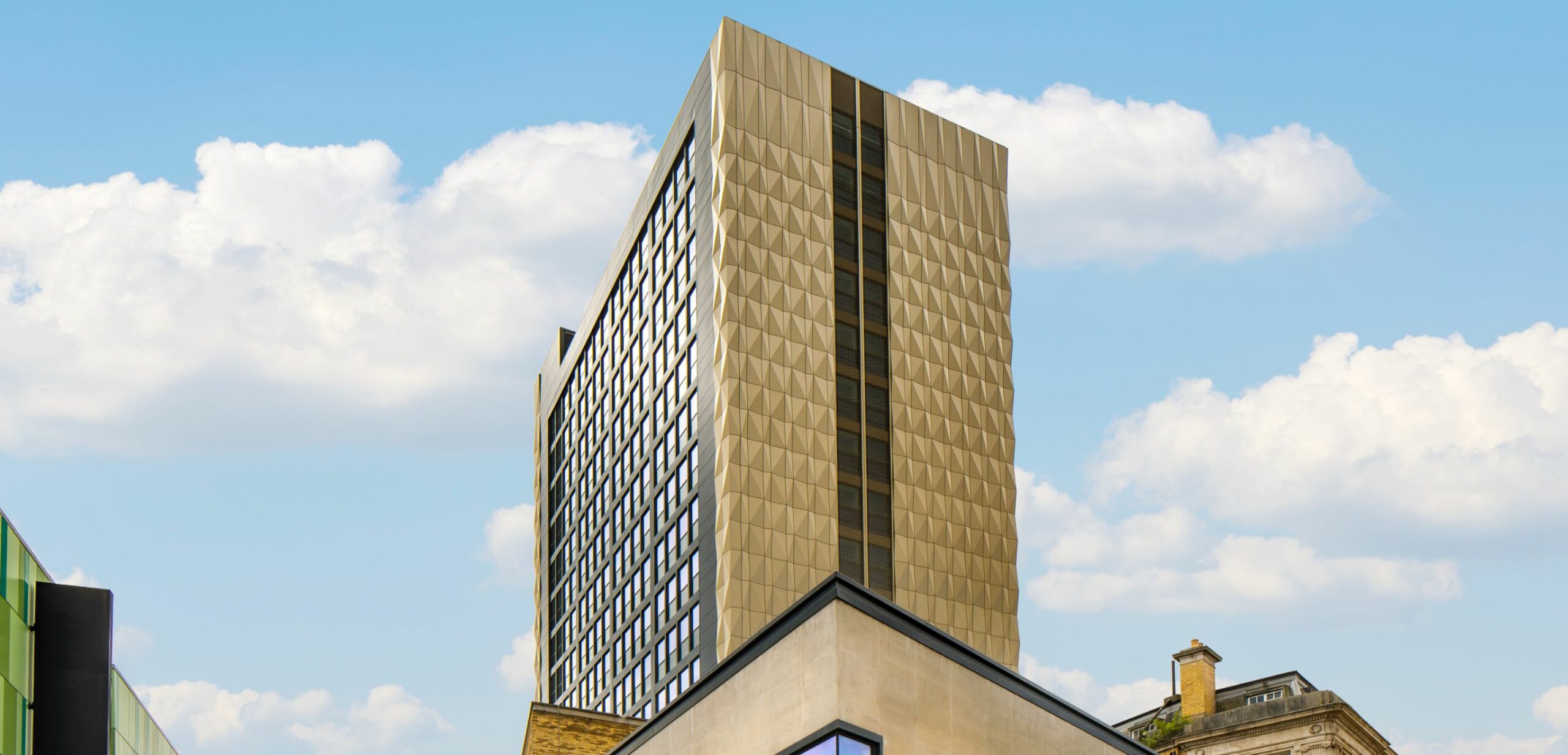
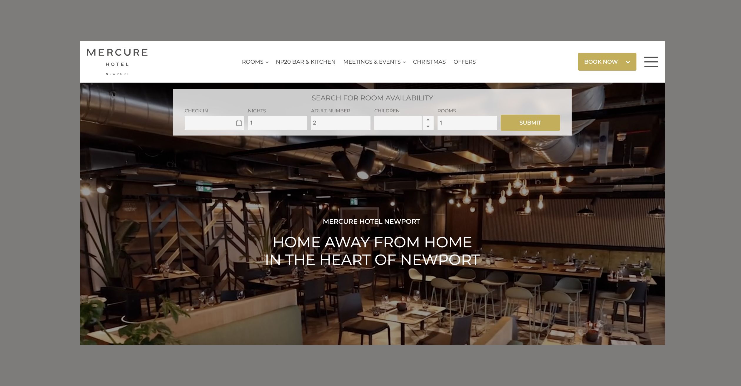
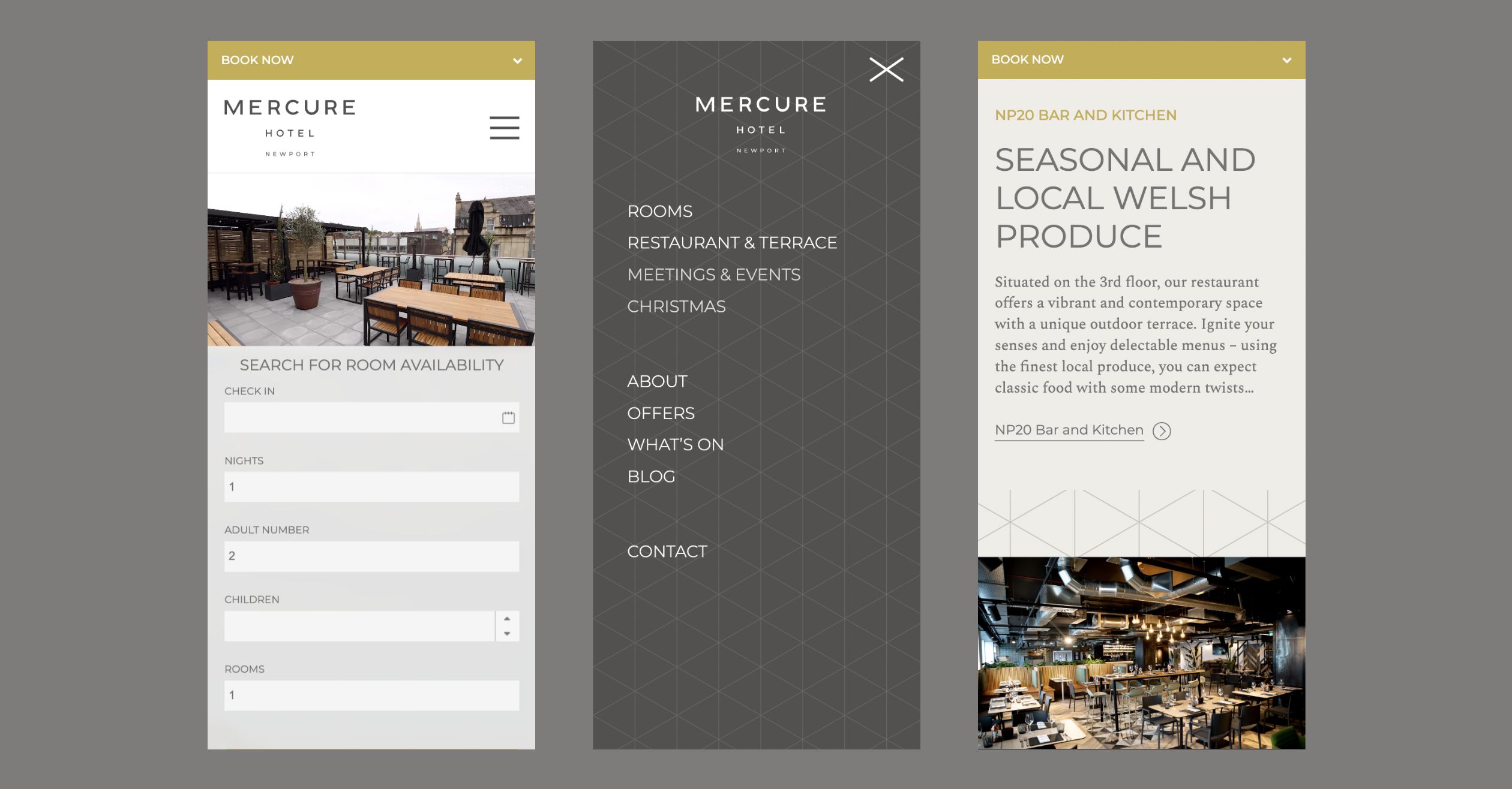
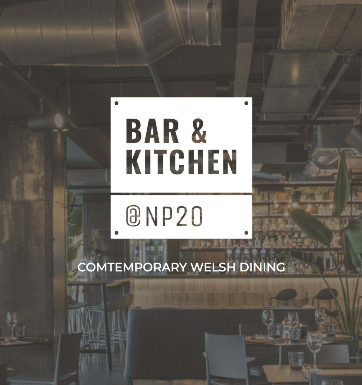
Although Mercure is a well established hotel brand, Mercure Newport was a completely new hotel to the area, and brand awareness was needed in the form of a new website to help drive more tourism interest to Newport and its history, especially those visiting Cardiff.
As a brand new hotel located at the gateway between England and Wales, Mercure Newport is perfectly situated for those looking to explore the Welsh city and surrounding areas. We created a distinctive, mobile-friendly website that differentiated the hotel as a standalone desired destination, but still encompassed the Mercure group brand to ensure consistency. Highlighting the hotel’s ideal location, Newport’s distinctive history, which served as inspiration for the décor, and the Mercure group’s solid reputation as a well-liked hotel brand that guests can trust.
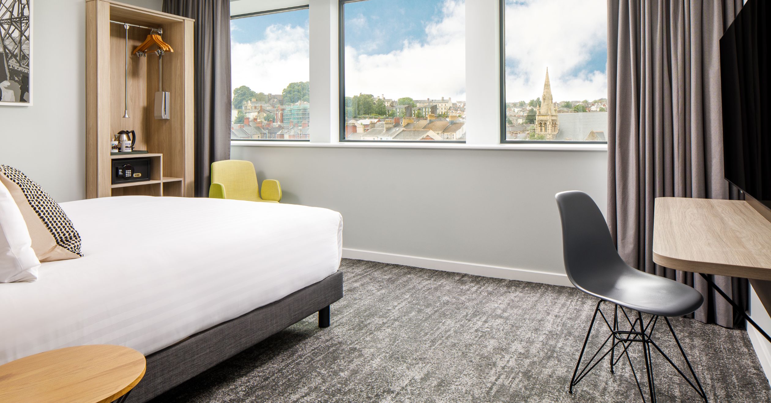
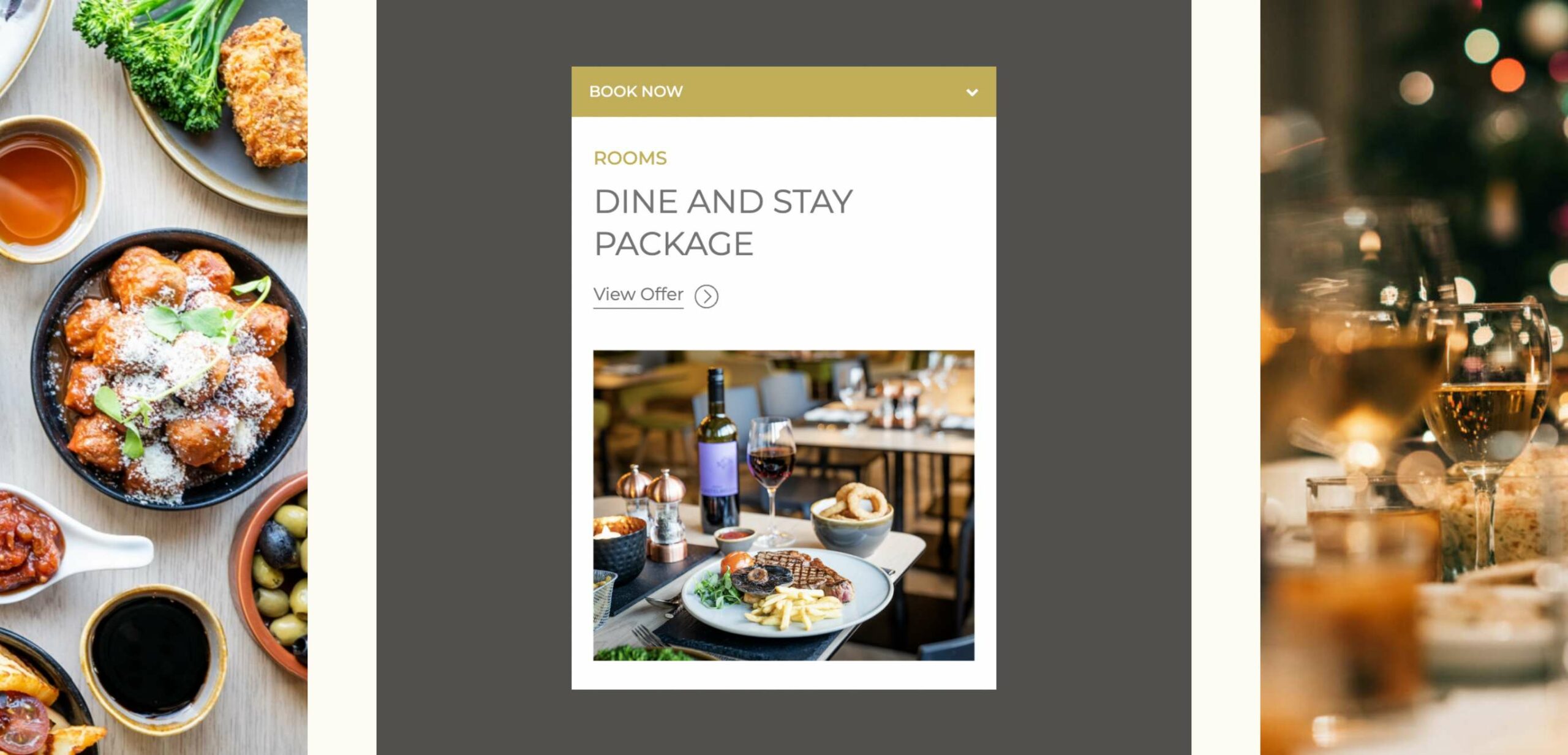
From dine and stay packages, festive food offerings and functional meeting spaces, the industrial Newport hotel has something for every type of guest to enjoy, which their contemporary website reflects using quality images that capture the hotel in all its glory, integrated with an easy to use booking system.
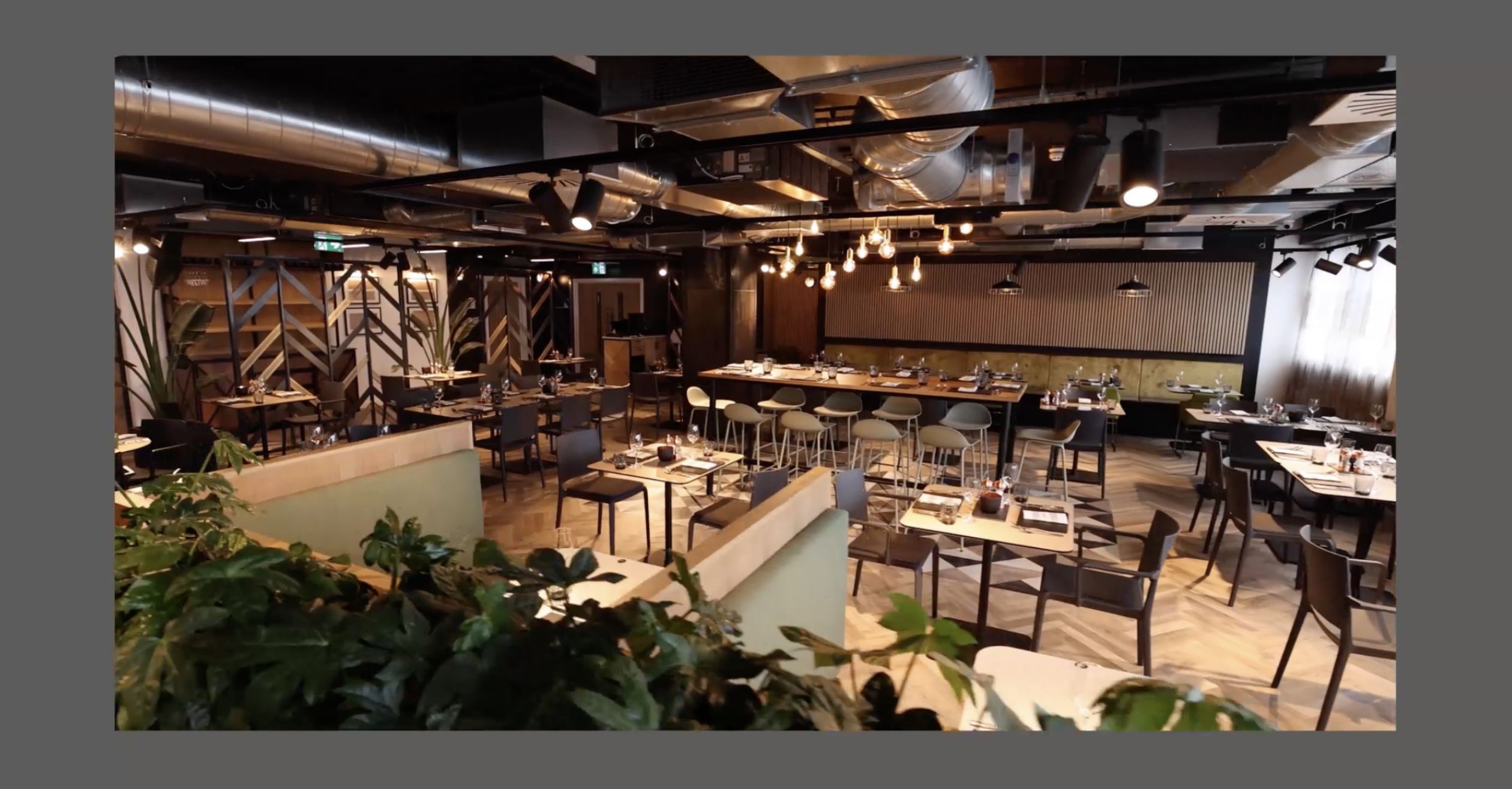
With the user journey in mind, it was key that the website felt welcoming and easy to use to suit the hotel’s wide target audience – from families to corporate guests and older couples, the website caters to all. The new site captures the hotel’s key USPs, particularly the NP20 restaurant, which is open not only to hotel guests, but to the general public for bookings too.
– Director of Sales, Mercure Newport
brand awareness
user friendly website
marketing approach
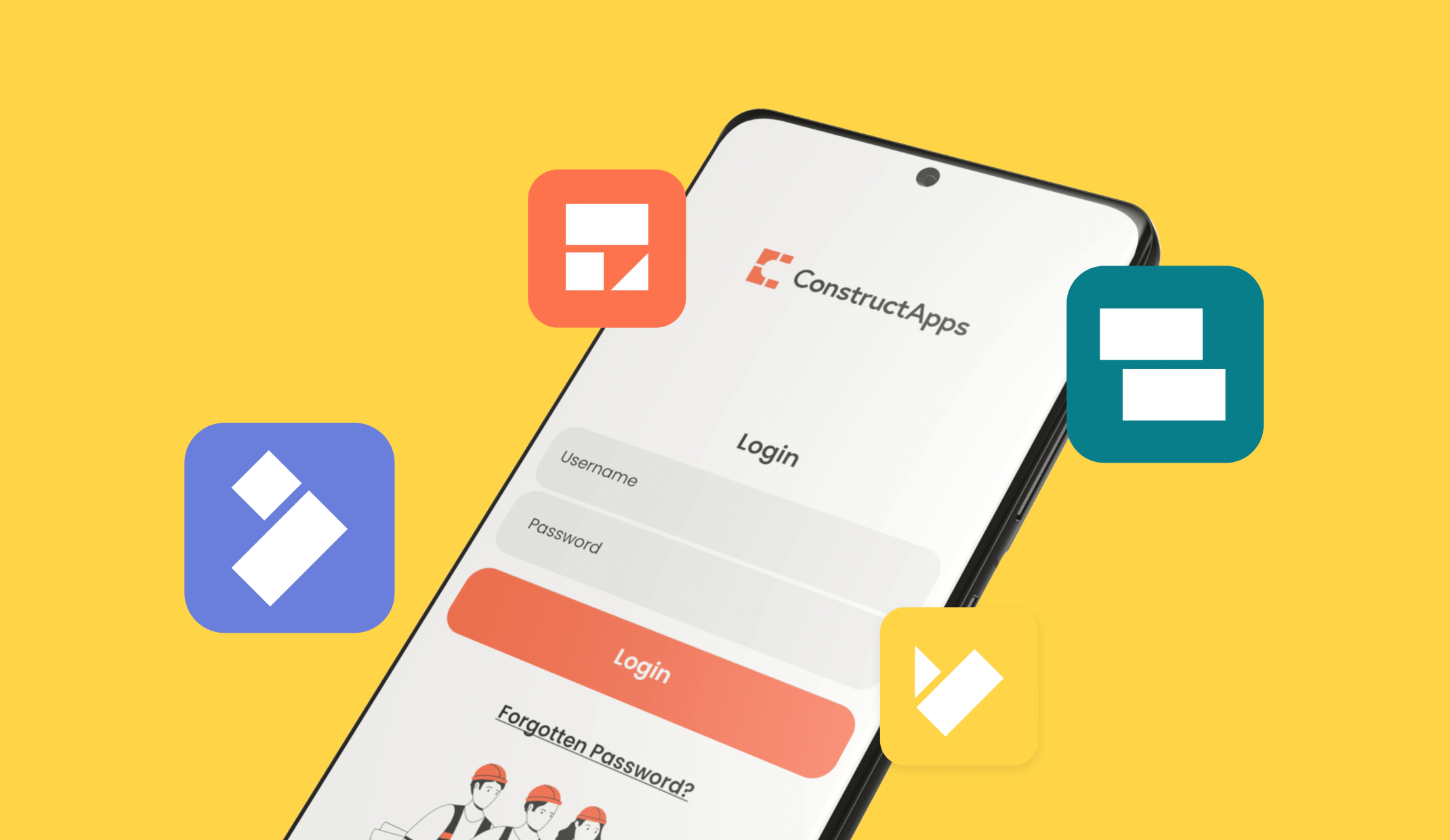
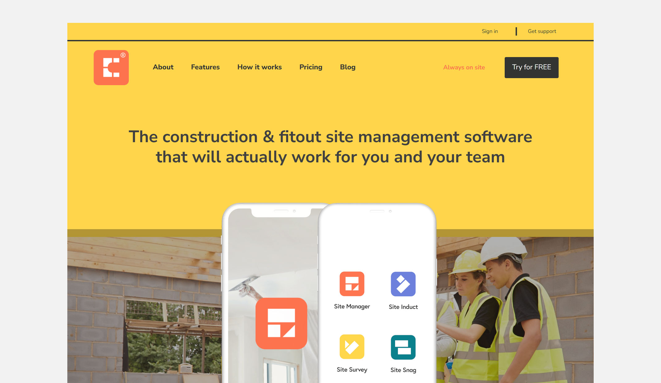
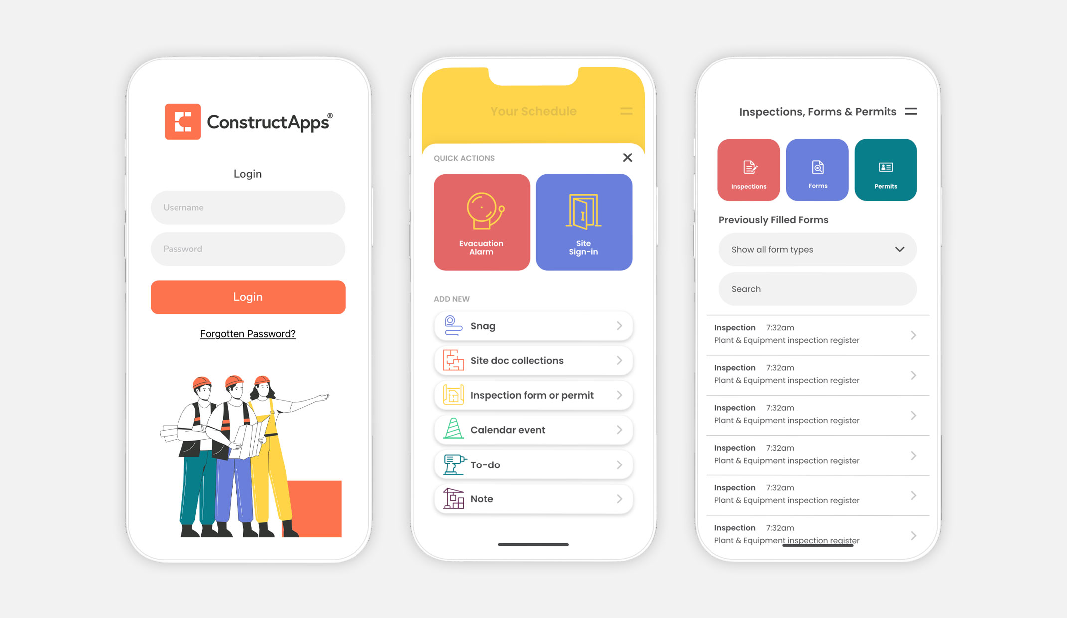
The primary goal was to establish a strong brand presence in the UK construction and fitout industry, communicating the app’s unique features and benefits through distinctive branding, messaging and omnichannel marketing.
The new compelling brand needed to reflect the key USPs of the app, which was to allow Sole Traders and SMEs in the UK construction industry access to carry out end-to-end management all in one place.
Colourful brick illustrations are used to create the ‘C’ mark in the logo to bring together all the aspects of a construction project in one digital space. The bricks are then evolved into scenes across the website, supported by characters who represent the target market and their job roles.
With a solid visual brand identity, we then focused our attention on building a user-friendly website. The website serves as a hub where users can learn about the app’s features, pricing plans, and even sign up for a free trial. It also provides valuable support and advice to users navigating the app and industry insight.
To drive more traffic to the website and promote the app effectively, we devised a comprehensive launch campaign strategy. From app store assets and optimisation, to email marketing, social advertising and video creation – the launch campaign successfully teased, attracted the target audience and announced the official launch of ConstructApps.
– Director, ConstructApps
CTR improvement
increase in impressions
increase in users
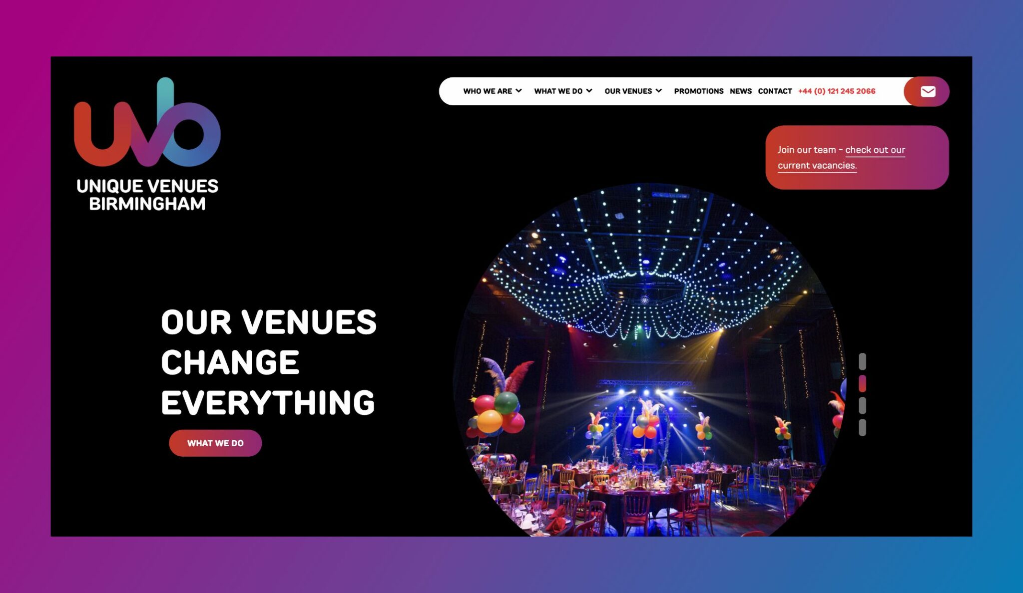
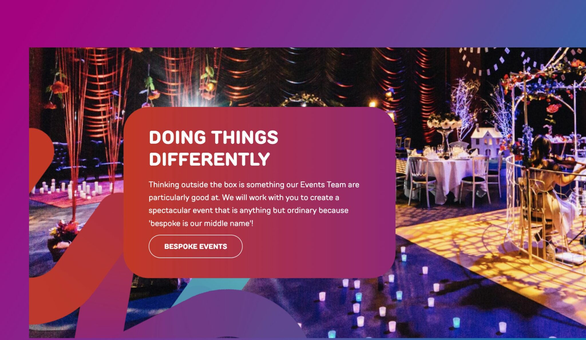
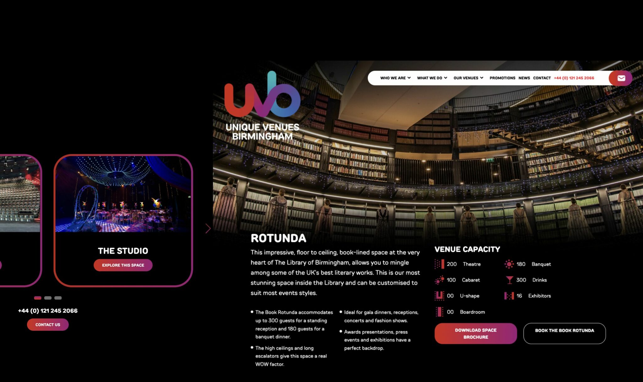
Having acquired a few new event locations, UVB needed to elevate the look and feel of their website. The new website needed to reflect their industry passion, highlight their USPs, and reach a diverse range of clientele, in keeping with their new brand.
We designed and built the website with the target market in mind, introducing a mix of vibrant colour, photography and illustrations, taking the user on a journey through the one-of-a-kind UVB approach. From providing the space, to managing the entire event experience, the new website captures UVB’s quirky brand personality, and builds on business perception in Birmingham.
Having elevated the easy to navigate website, we focused on the experimental element of the brand, and ensured it reflected the range of event rooms and expertise UVB had to offer. From corporate events, such as award dinners and parties, associations and charity events, to the occasional wedding, their versatility is showcased throughout the website.
It was important that the website was also future proofed for the developing business changes, as UVB are working to acquire new locations into their portfolio, including, The Alexander Stadium. The flexible website accommodates for any future acquisitions, which is key for business growth.
– Commercial Director, UVB
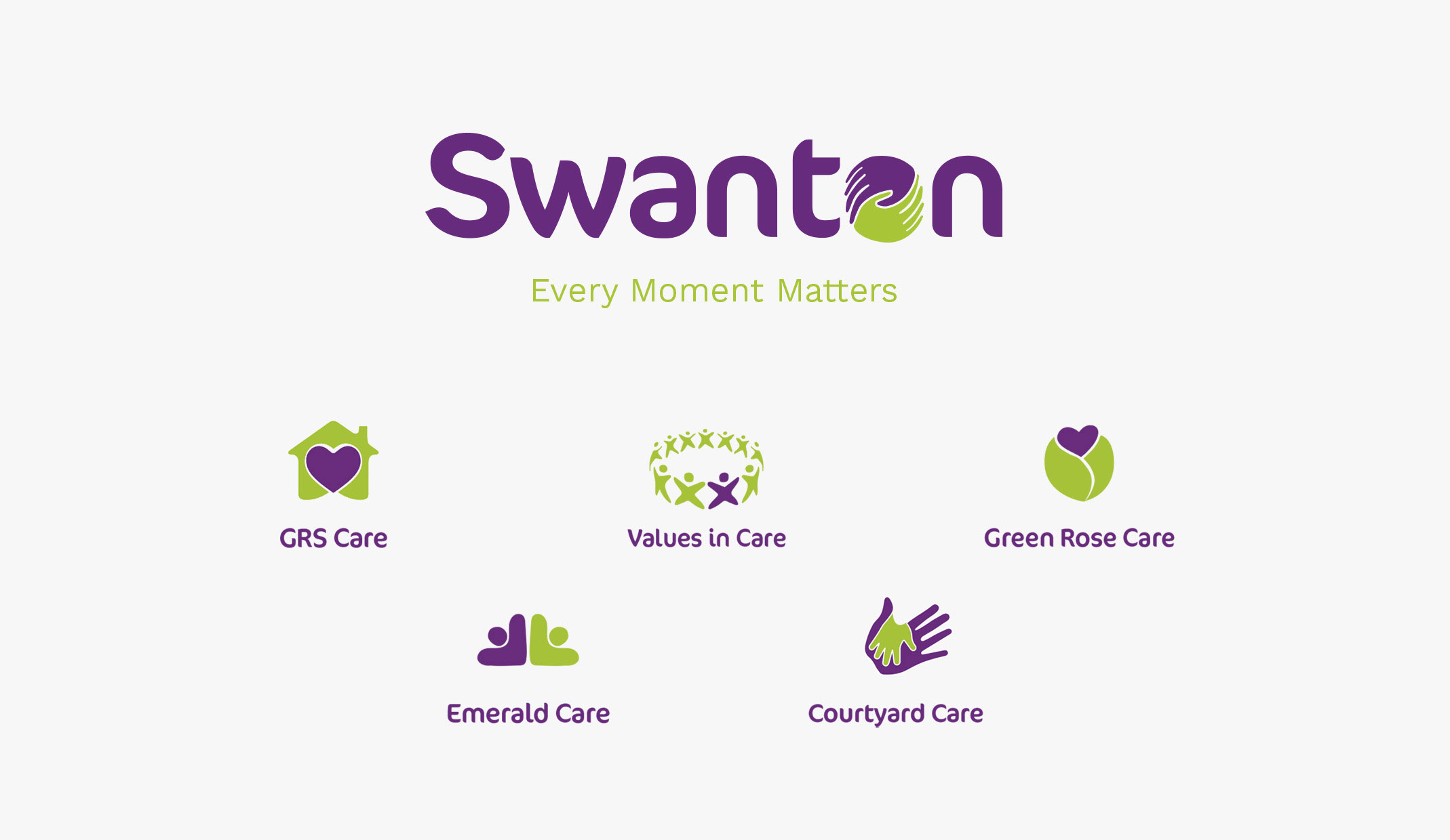
a community of 6 care and community brands.
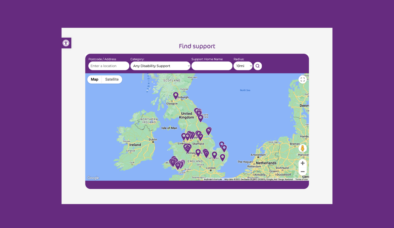
seamlessly search for 64 supported living locations.
a commitment to care, where every moment matters.
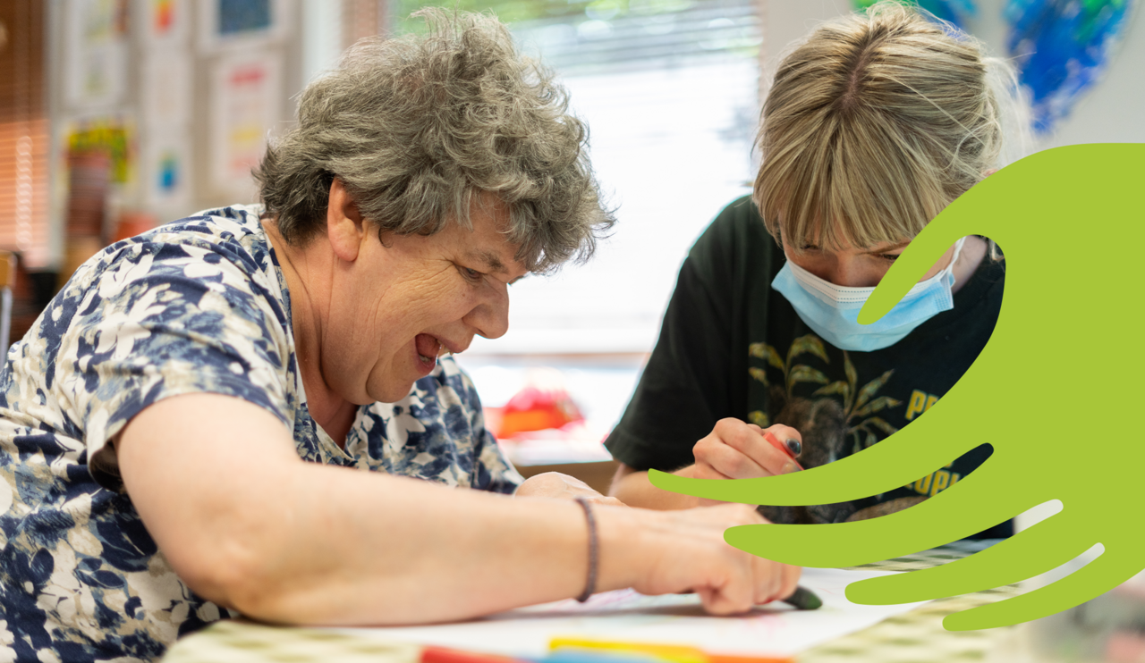
Over the years, Swanton Care has substantially grown, adding new acquisitions to their portfolio, which has helped expand their offering and locations of care and support nationwide. However, this left the branding feeling disjointed, inconsistent and outdated, they needed help unifying the different groups, without losing the Swanton name and brand values.
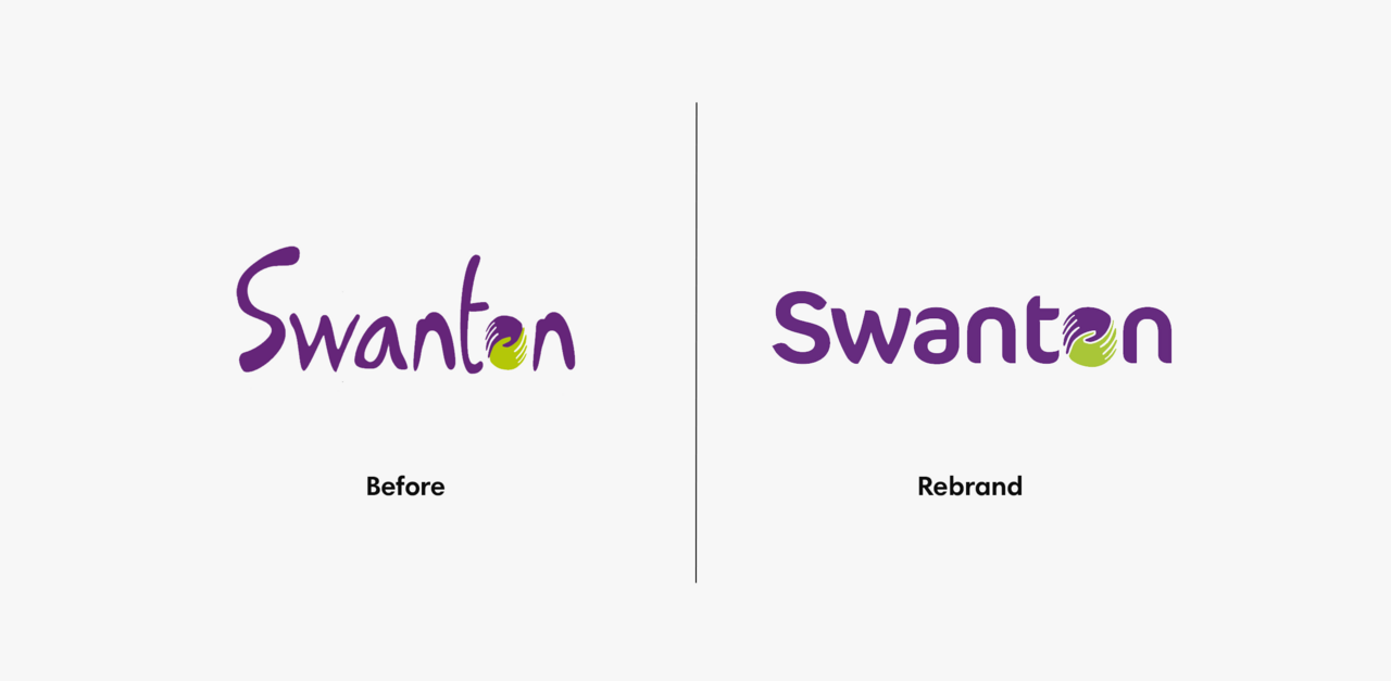
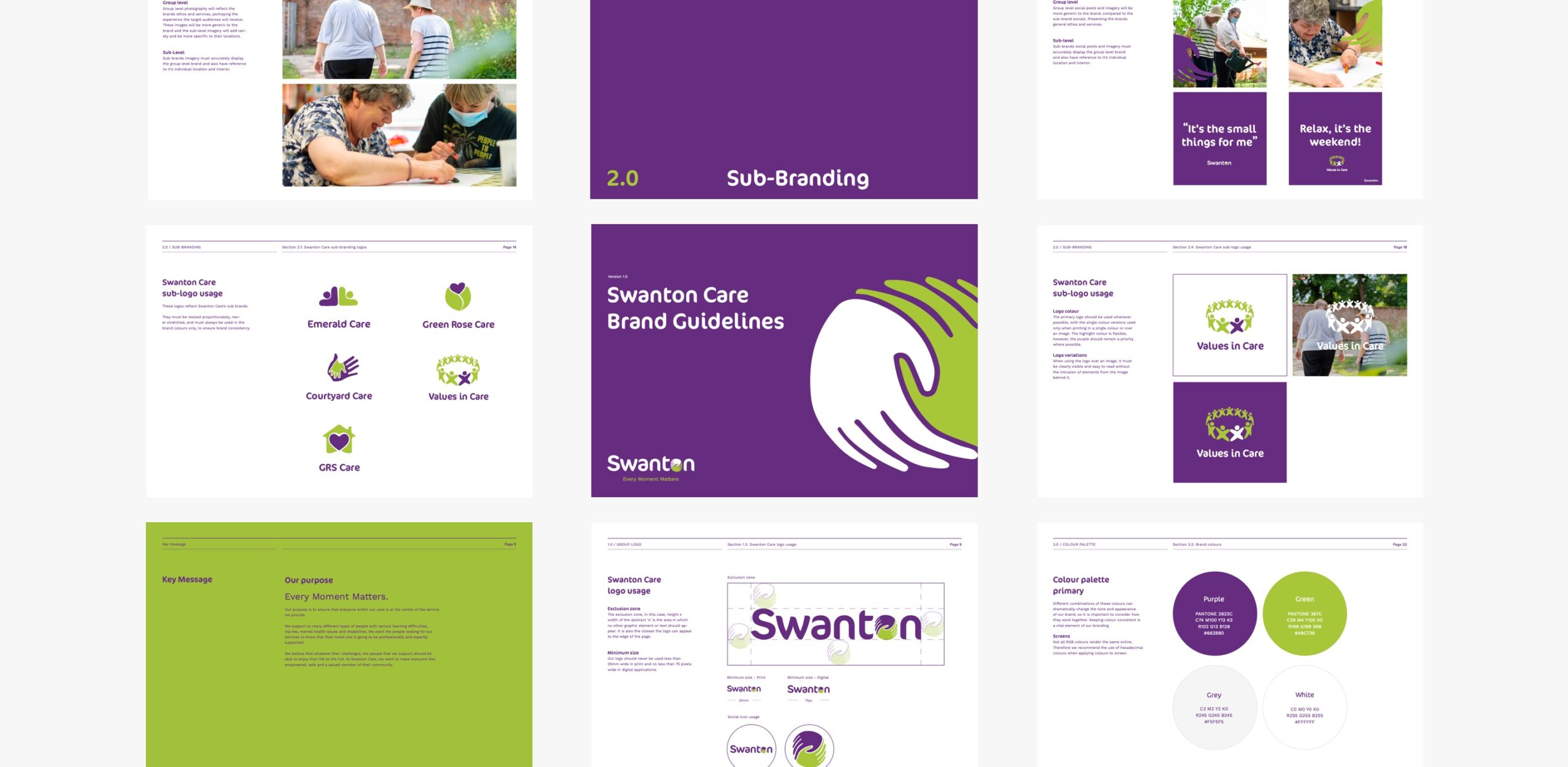
Swanton Care needed a brand direction that was cohesive, passionate, personal, inclusive and modern. Starting with the typeface and logo, we modernised these adding the subtle curvature of the font to help the brand feel softer and more supportive, alongside the introduction of the hands, which can be found in a few of the sub-brands too.
In order to maintain some familiarity, we kept the purple and green brand colours that are positively recognised as belonging to the much loved Swanton Care brand.
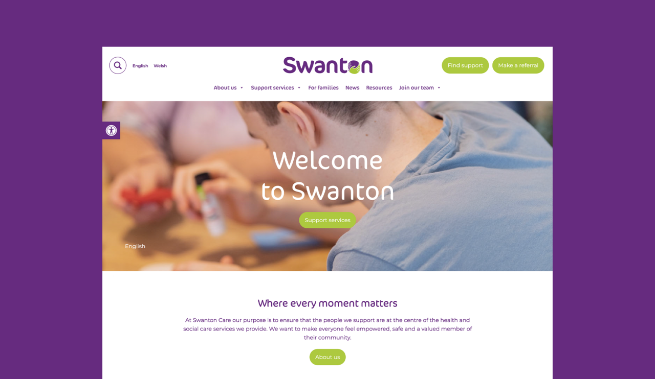
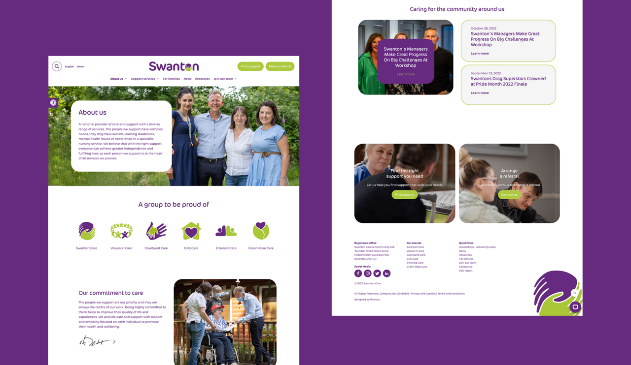
Their old website didn’t reflect their values and vision, or the breadth of personal care knowledge and services. We designed and developed the new website with user experience at the heart. When visiting the website, users can easily navigate the services and support they need, as well as read personal stories and news updates. With the introduction of various languages and accessibility tools, the website is inclusive for every type of user.
We also designed and developed the website to include an in depth search function and map, which includes 64 different locations of care homes and services they provide, all optimised for search.
We created brand guidelines, including tone of voice, and provided assets for the internal team to ensure consistency across the group. Their new and improved online branding supports those in need of Swanton’s care services and helps them or their loved ones quickly and easily find the right care.
– Regional Director (North East) and Registered Manager, Swanton Care


© 2023 Rawww Ltd | All Rights Reserved. Company No: 05508453