with a point of difference
to connect with long-term clients
positioned to showcase abilities
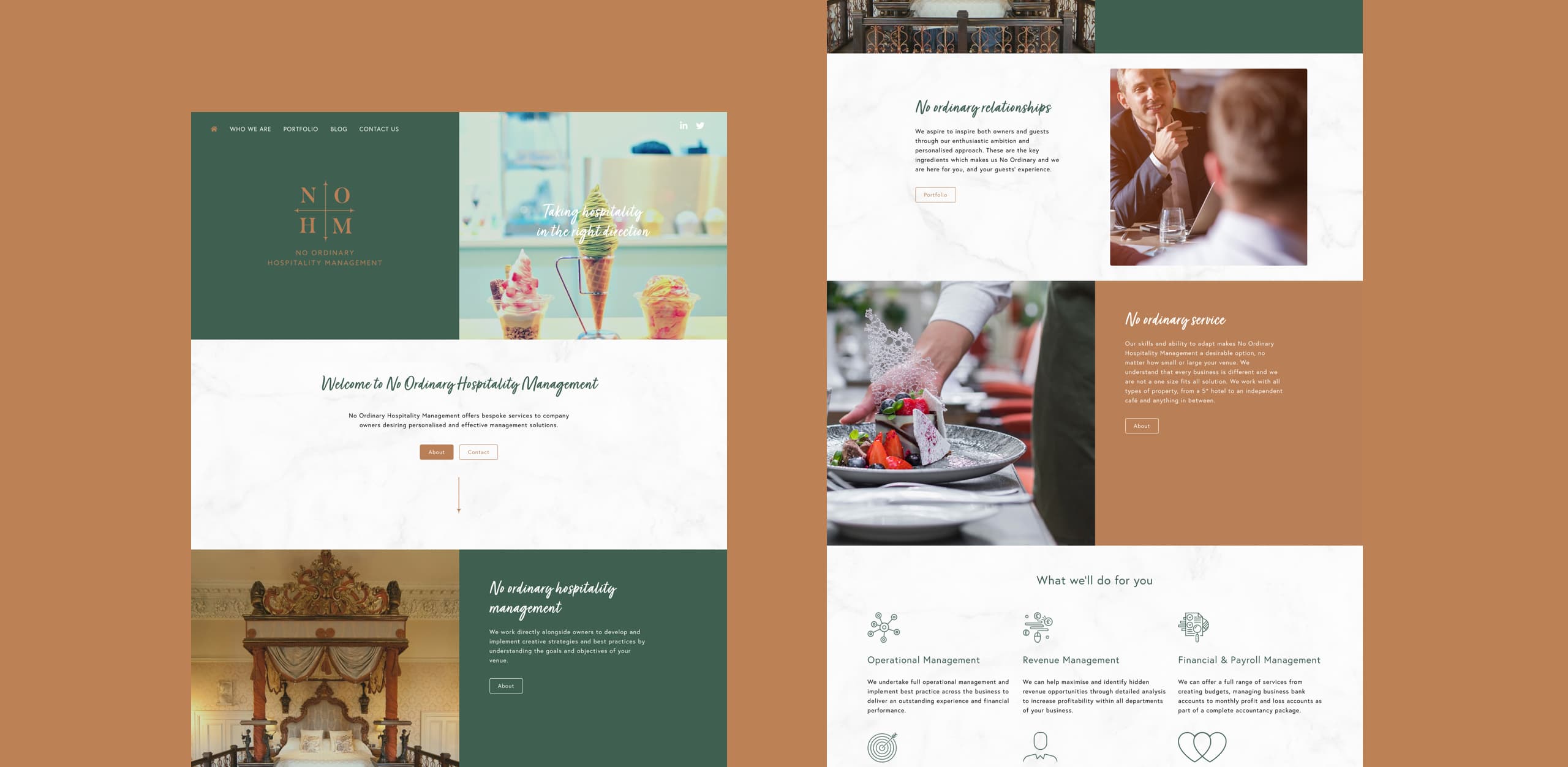
The hospitality branding, name and website needed to be developed to clearly communicate NOHM’s message, build trust and relationships with potential clients, and highlight their tailored services, all whilst reflecting the luxurious nature of their business.
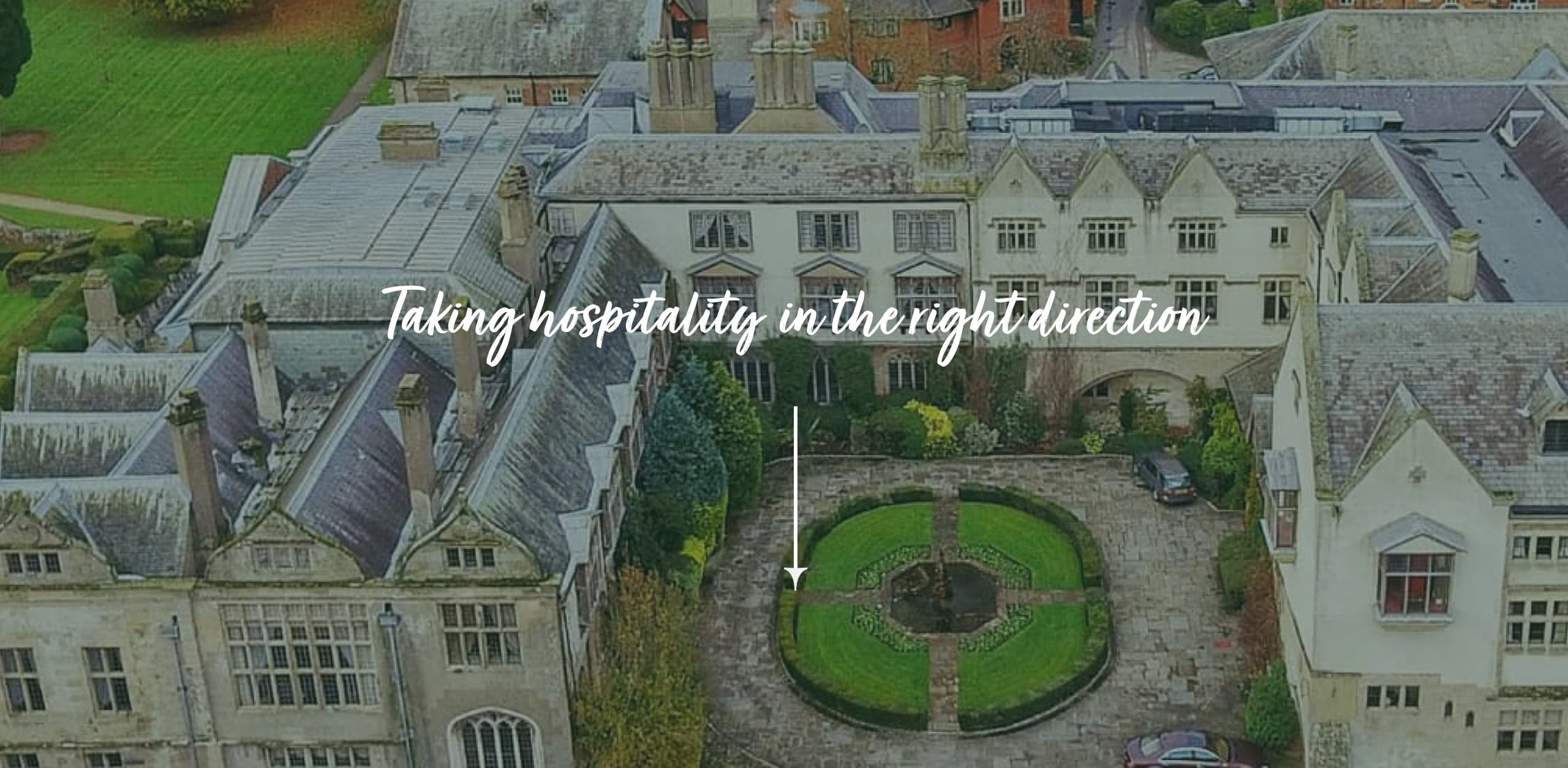
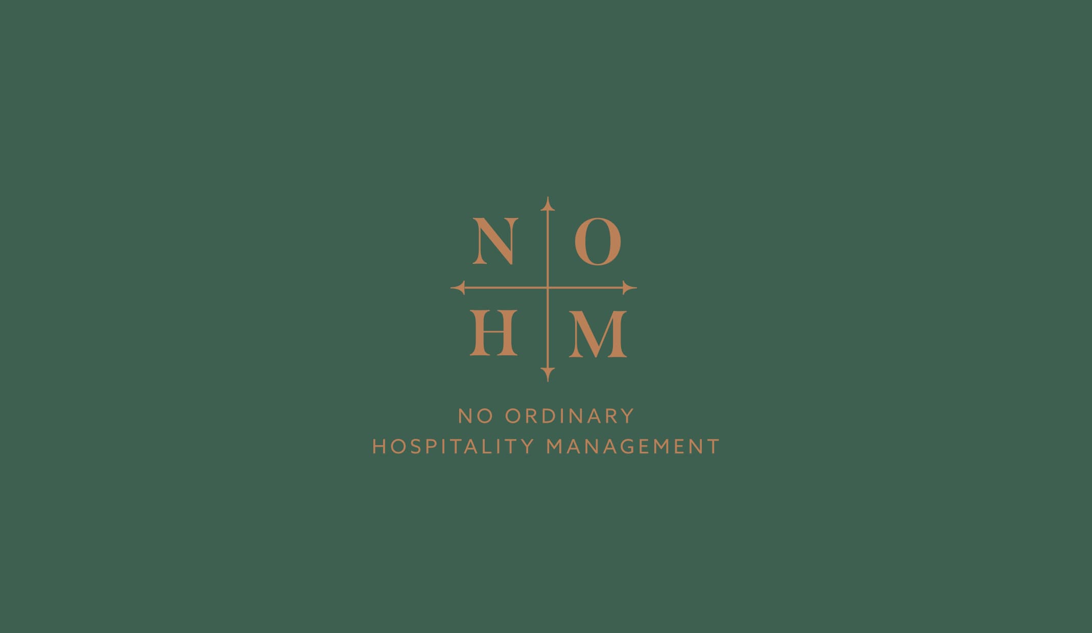
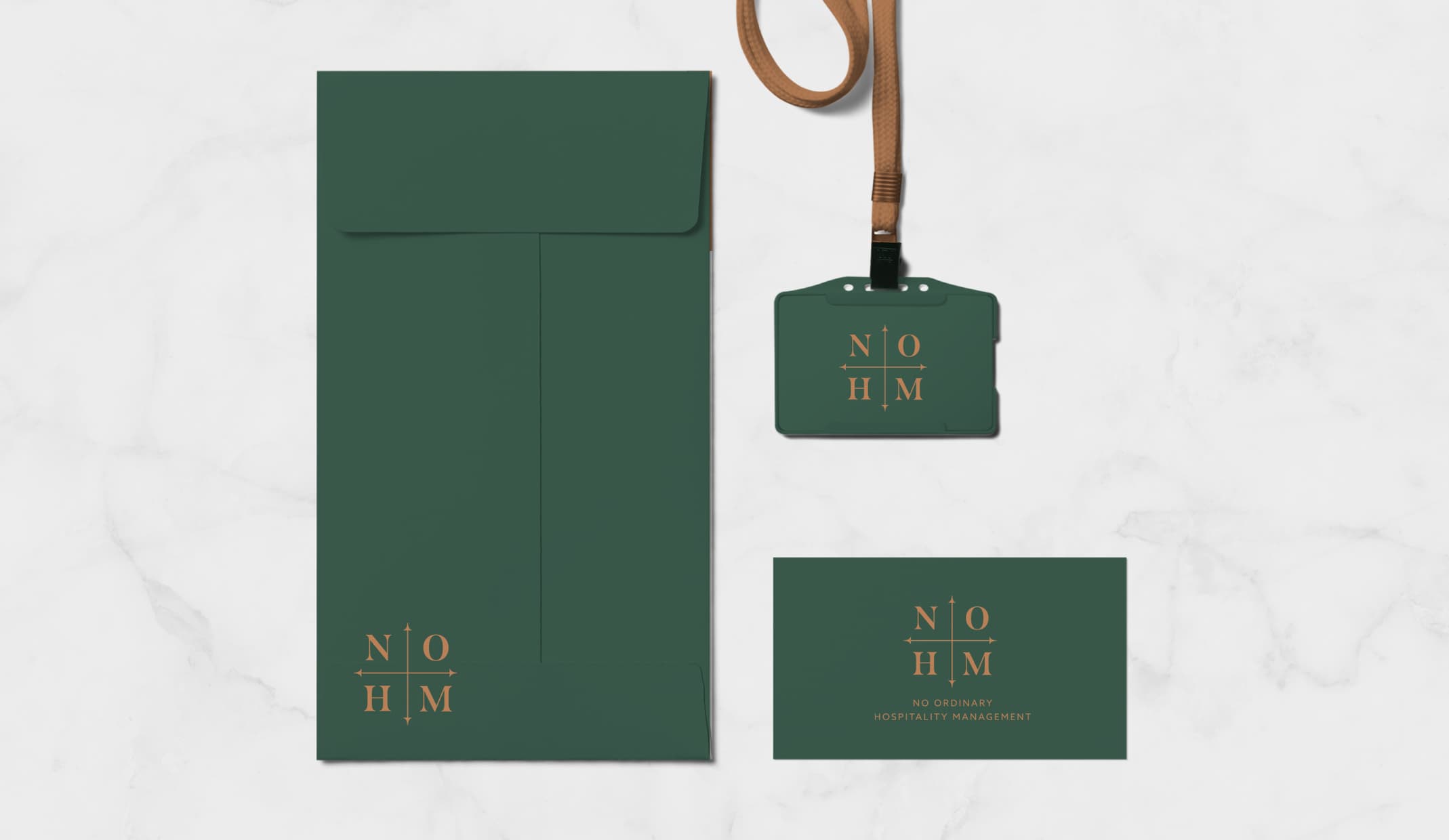
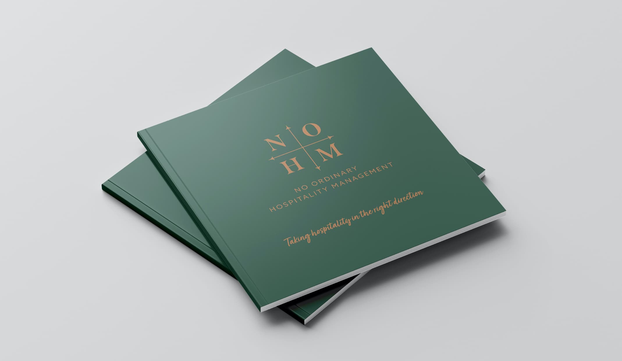
To develop the branding, we introduced the use of the arrows to guide customers through the website, and the abbreviation of the name has been used to create a symmetrical compass to reflect hospitality moving in the right direction.
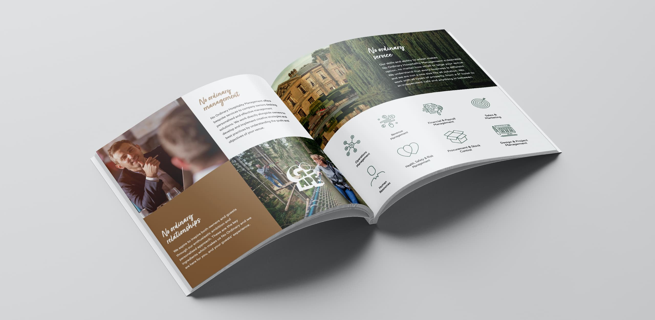
The green, bronze, and marble pattern was selected to portray a luxurious and professional aesthetic, as well as to highlight the colours and materials that might be found in a hotel or restaurant. The messaging on the website is clear and concise, making for a seamless customer experience, whilst the elegant copy tone reflects the prestigious nature of NOHM.
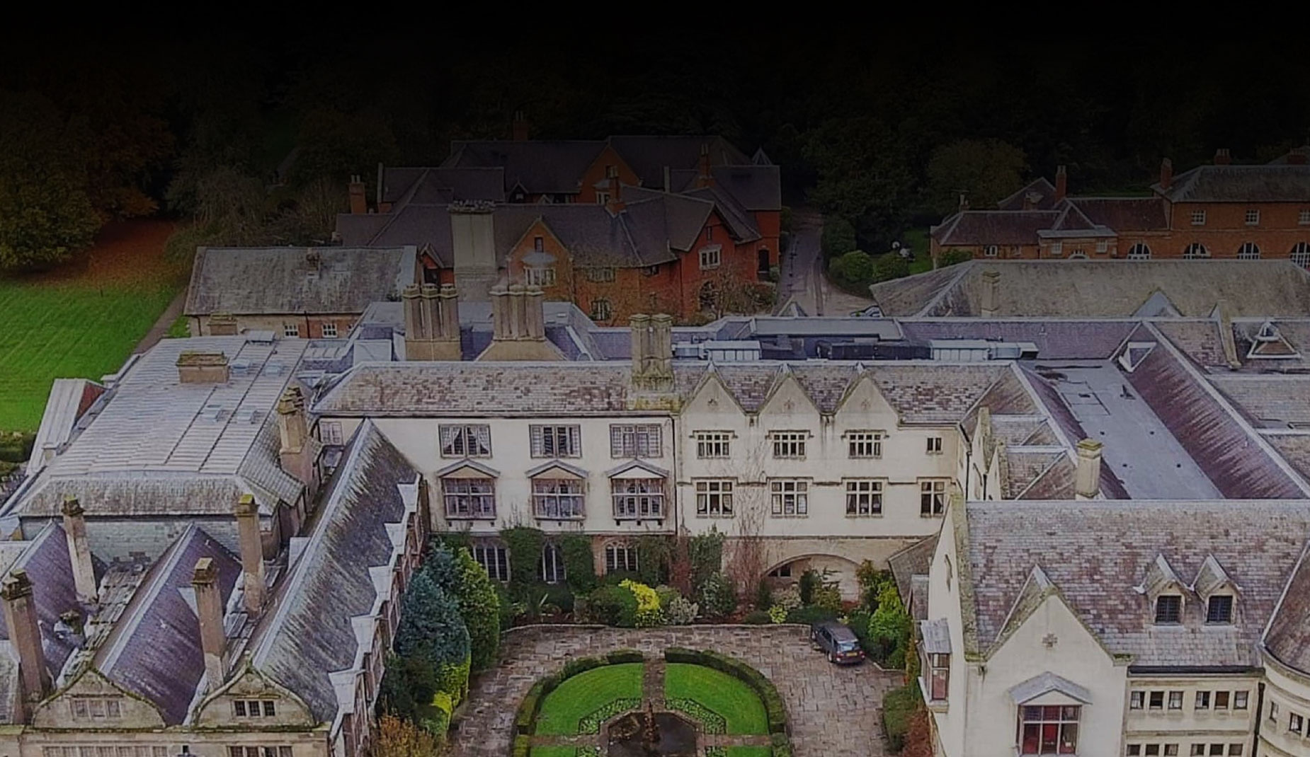
With a desire to focus on encompassing all aspects of hospitality, we made sure this was clearly portrayed throughout the website. From introducing the business, what they do, their experience and relationship with Coombe Abbey Hotel, to their impressive client portfolio, the website has been able to generate trust and brand awareness, while also gaining enquiries from potential customers.


© 2023 Rawww Ltd | All Rights Reserved. Company No: 05508453