Here at Rawww, we’re always striving to be and do better.
We actively support those who need us most by evaluating the impact we have on the environment and getting involved in various fundraising activities for causes that we’re passionate about.
Here are some honourable mentions…
We support local food banks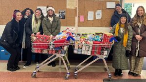
Each year, we support the Coventry food bank. Food banks allow people to break free from poverty by providing additional support to help resolve the crises they’re facing.
Foodbanks partner with a wide range of care professionals such as doctors, health visitors, social workers and police to identify people in crisis and issue them with a foodbank voucher.
They completely rely on the help and funding from their local communities so we think it’s extremely important to show our support and donate when we can.
With Food Banks being nation-wide, wherever you are, you’re can find one that’s not too far away and make a food donation.
To find out how you can donate to Coventry Food Bank, visit their website.
Supporting The Ambulance Staff Charity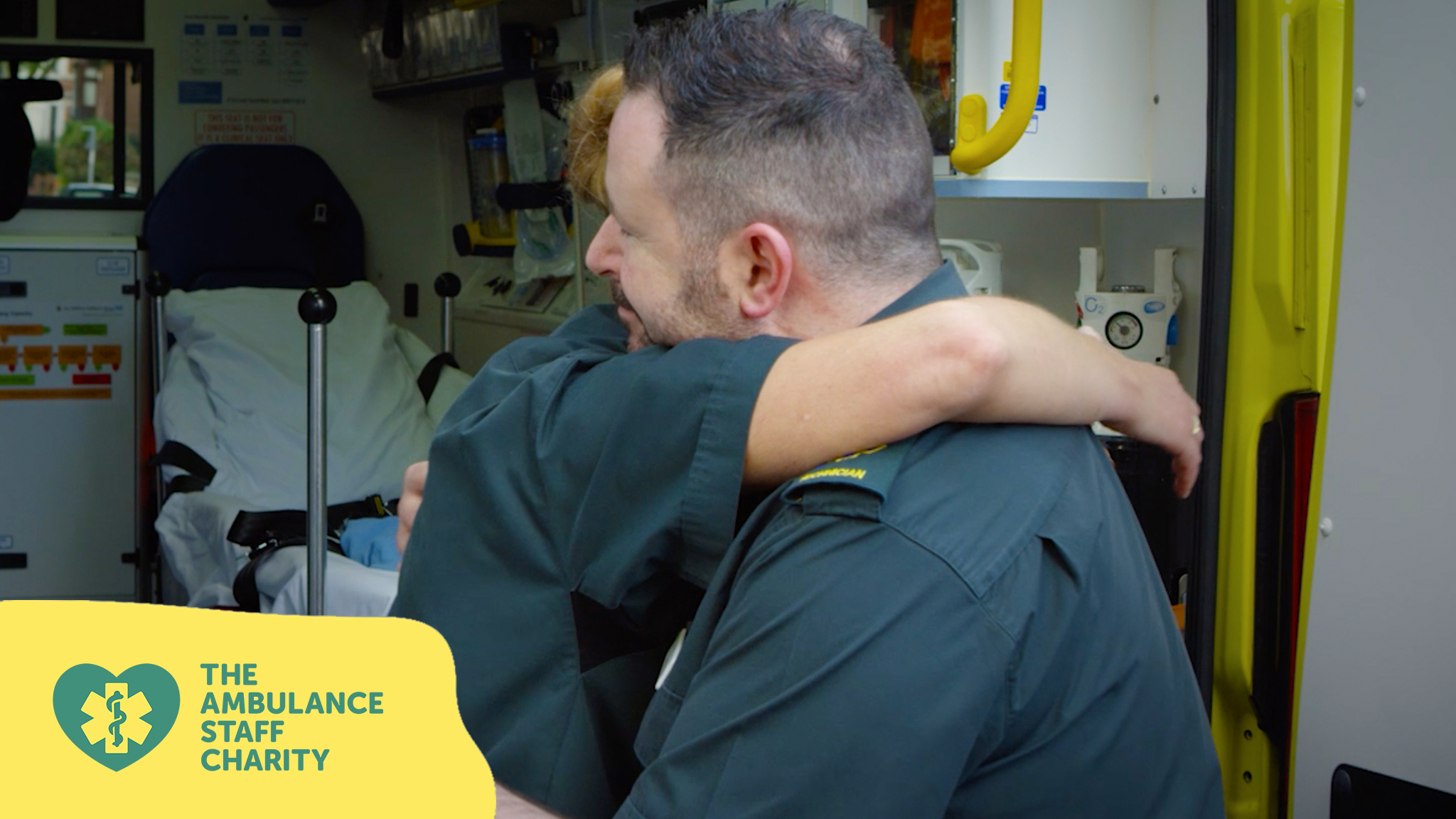
TASC (The Ambulance Staff Charity) are a national charity dedicated to supporting our ambulance community in times of need.
TASC supports the entire ambulance community, from ambulance service volunteers to first responders, paramedics and to family members of ambulance staff who have died in service or left due to terminal illness.
As an independent organisation, not affiliated with the NHS, The team relies on the generosity of the general public to help fund their services.
We helped the them to create a set of bespoke branded GIF stickers to be used on their Instagram stories to promote brand awareness and raise their profile.
Not only do we support them with branding and digital marketing, but we often donate to charities like TASC, to show our appreciation for the fantastic and important job that the team does on a daily basis.
If you’d like to find out more about how you can support TASC, visit their website.
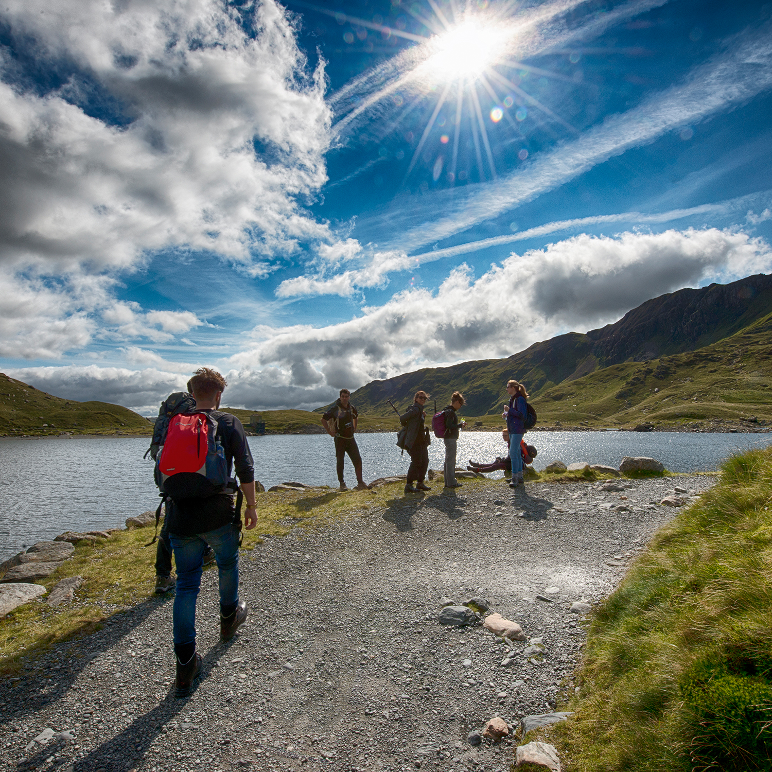
Climbing Snowdon for Zoe’s Place and Hospice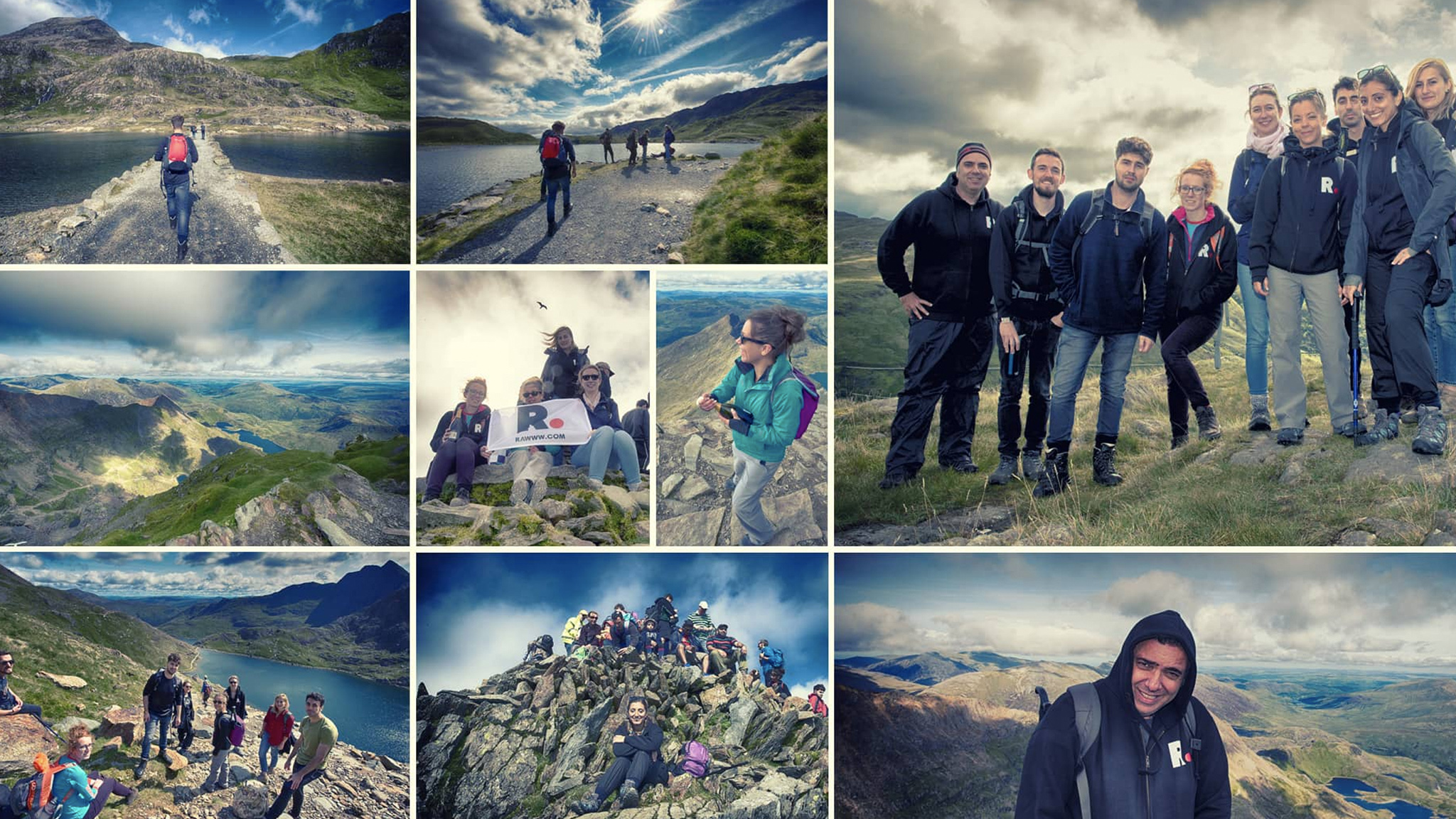 To celebrate 10 years of Rawww, the team laced up their walking boots and climbed Snowdon in aid of a fantastic charity called Zoe’s Place.
Zoe’s place is a baby-specific hospice that offers palliative, respite and end of life care and support for babies, infants and their families.
Everything they do is completely free of charge for the little ones and the families they look after, which means that any help they get is gratefully received and very much needed.
Through sponsorships for our climb, we managed to raise a total of £1,607 for the charity.
Visit their website to learn about how you can support the charity.
We’re committed to supporting the environment
As a business, we recognise the importance of evaluating what impact we’re having on the environment and how we can make positive changes.
We are committed to minimising the environmental impact of our operations, so have put together our own Environmental Policy.
This includes:
- Complying with all relevant environmental legislation and regulations.
- Regularly reviewing the environmental impact of our activities with particular reference to paper waste and recycling, and endeavouring to reduce our overall environmental impact and prevent waste using best practice techniques.
- Involve employees in our environmental programme and provide necessary training to enable them to be aware of their responsibilities.
- Fostering environmental awareness and understanding in all employees, suppliers, customers, subcontractors and other stakeholders.
- Sustaining a programme of continual improvement in how our business monitors and measures the handling of waste.
- Working with key suppliers to encourage them to develop environmental best practice.
- Improving resource efficiency (including our use of water and electricity).
Team 10K for the Alzheimers Society
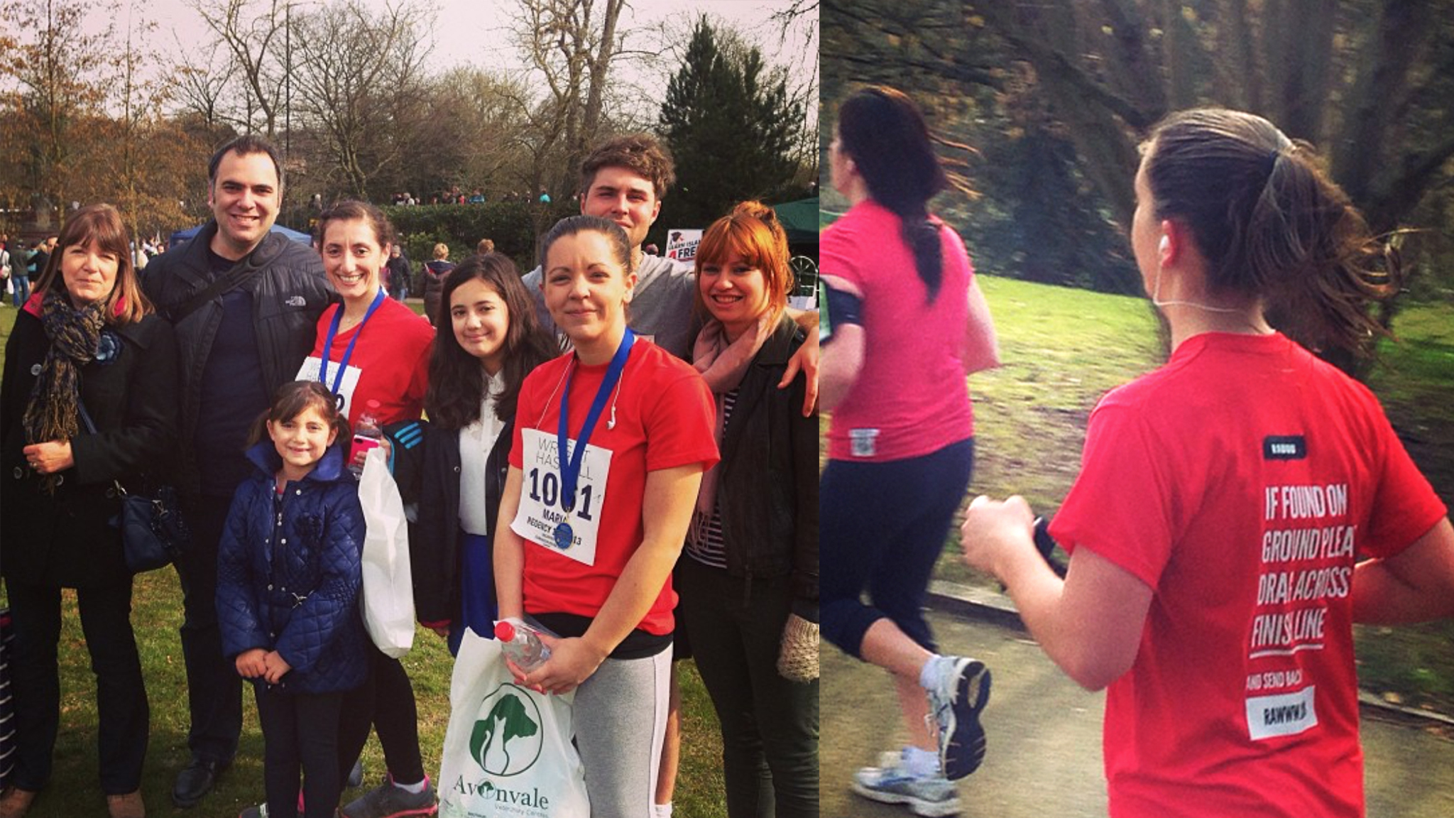
We swapped our office chairs for the running track and took on a 10k in aid of Alzheimer’s Society.
The Alzheimers Society is an organisation who work to improve the quality of life of people affected by Dementia in the UK.
In 2019, there were over 850,000 people with dementia in the UK. This represents 1 in every 14 of the population aged 65 years and over.
This makes The Alzheimers Society an incredibly worthy and important cause who we were thrilled to support and raise £795 for.
If you’d like to learn more about the charity, head to their website.
Doing our bit for charity is a small action that can make an immense difference to the lives of others.
Make sure to keep your eyes peeled on our website to hear about any future fundraising activities or initiatives that we’re taking part in.