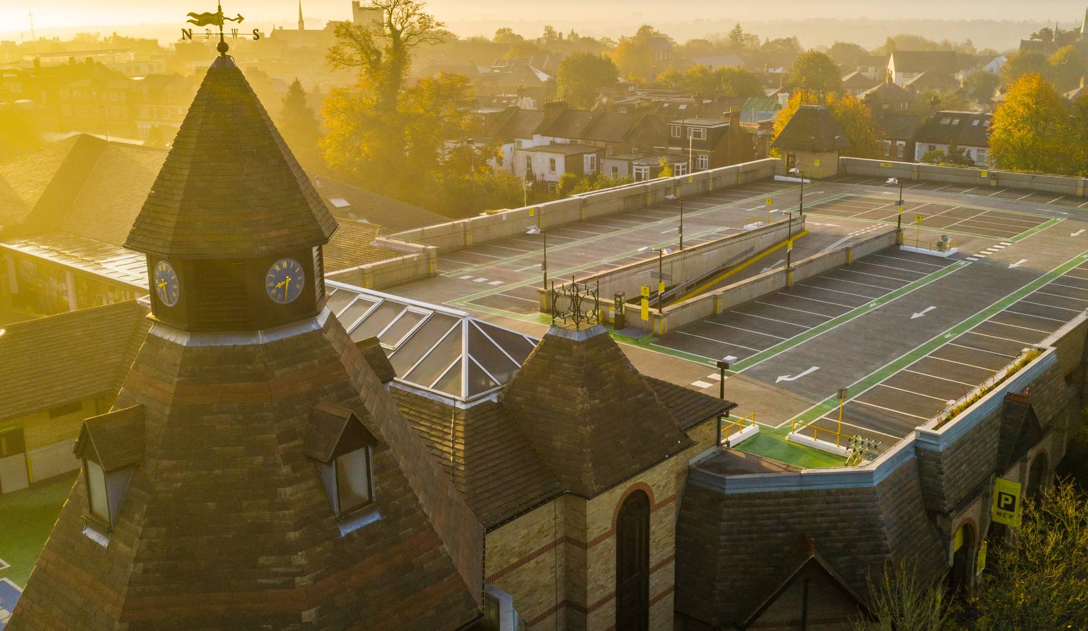
car parks gained an increased footfall
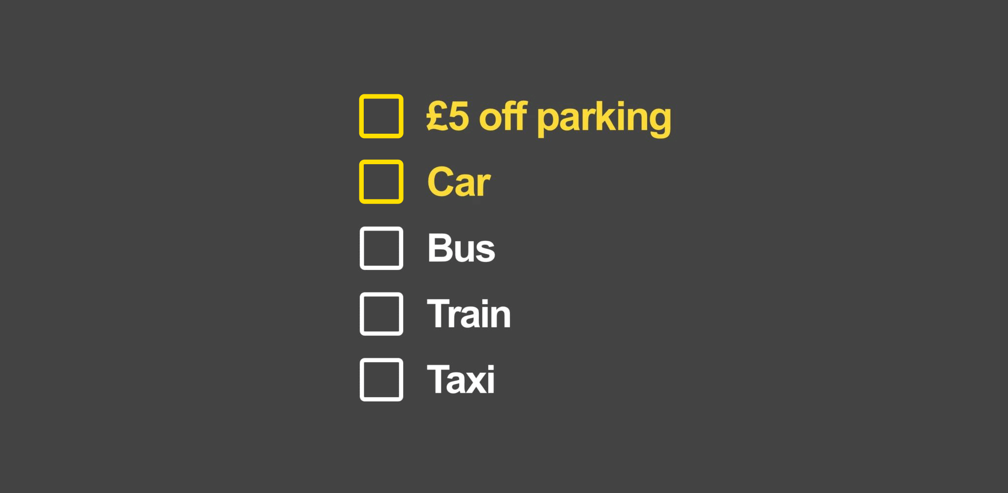
a consistent customer pre-book journey
into B2B and B2C brand
To increase visitor numbers to cities, airports and train stations including, Birmingham, Manchester, London and Coventry, and communicate to customers that car parking is a simple and hassle-free task with NCP.
We conducted customer, partner and employee research through branded workshops on behalf of NCP. This helped us look at the bigger picture of who NCP are, how they wanted to portray themselves to their customers and determined brand positioning. We developed a suite of brand guidelines to cover all areas of the business from B2B to B2C that aligned with the NCP brand strategy.
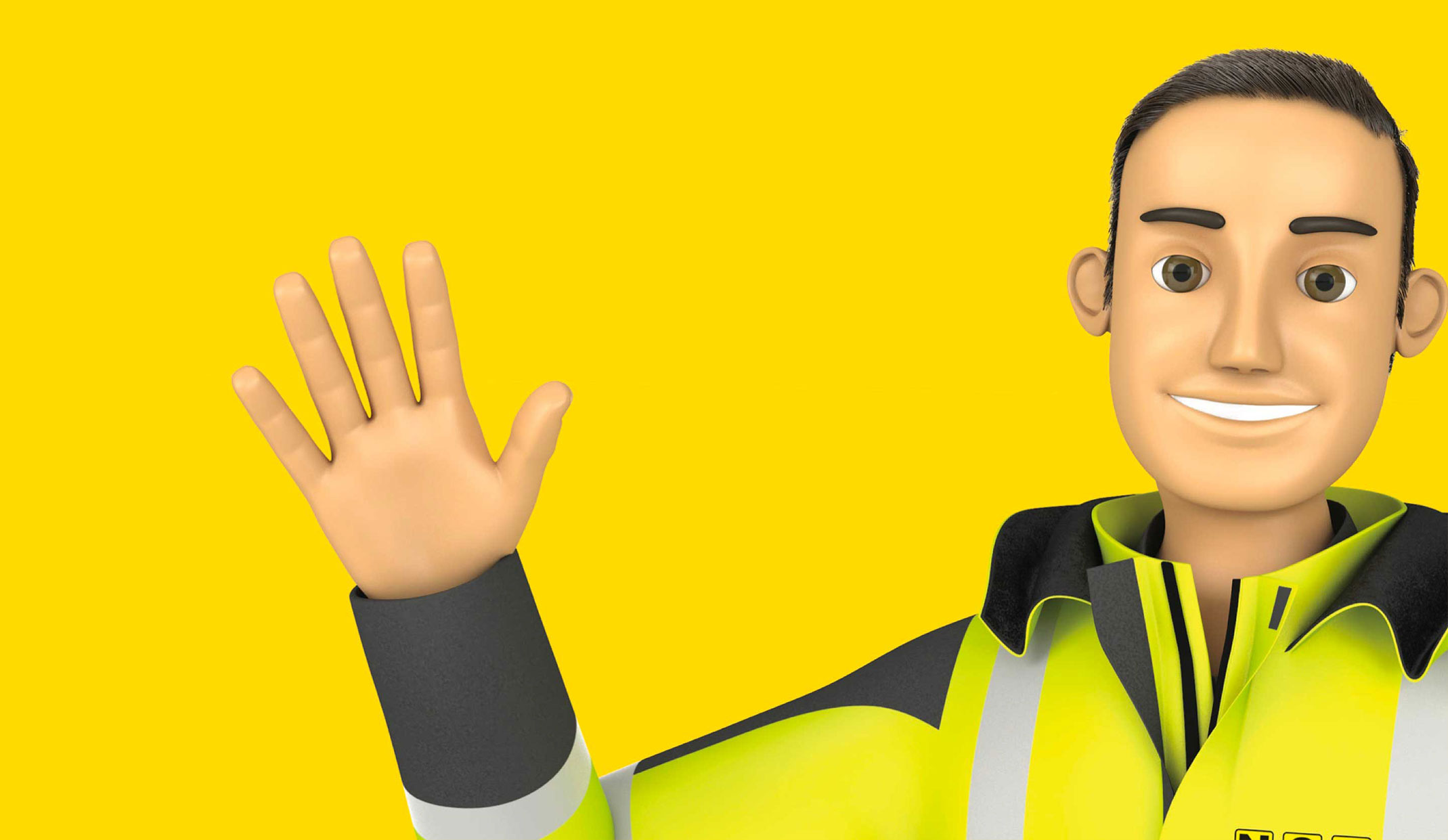
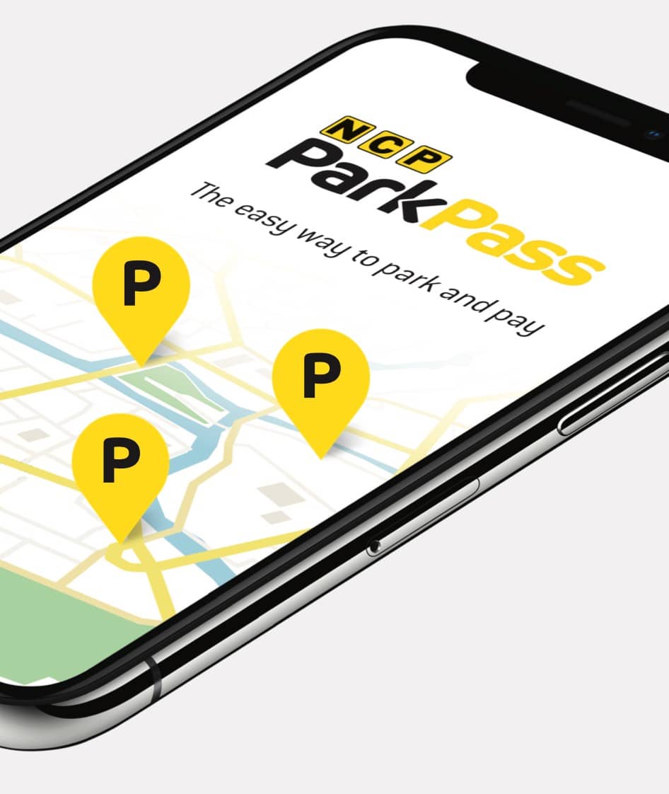
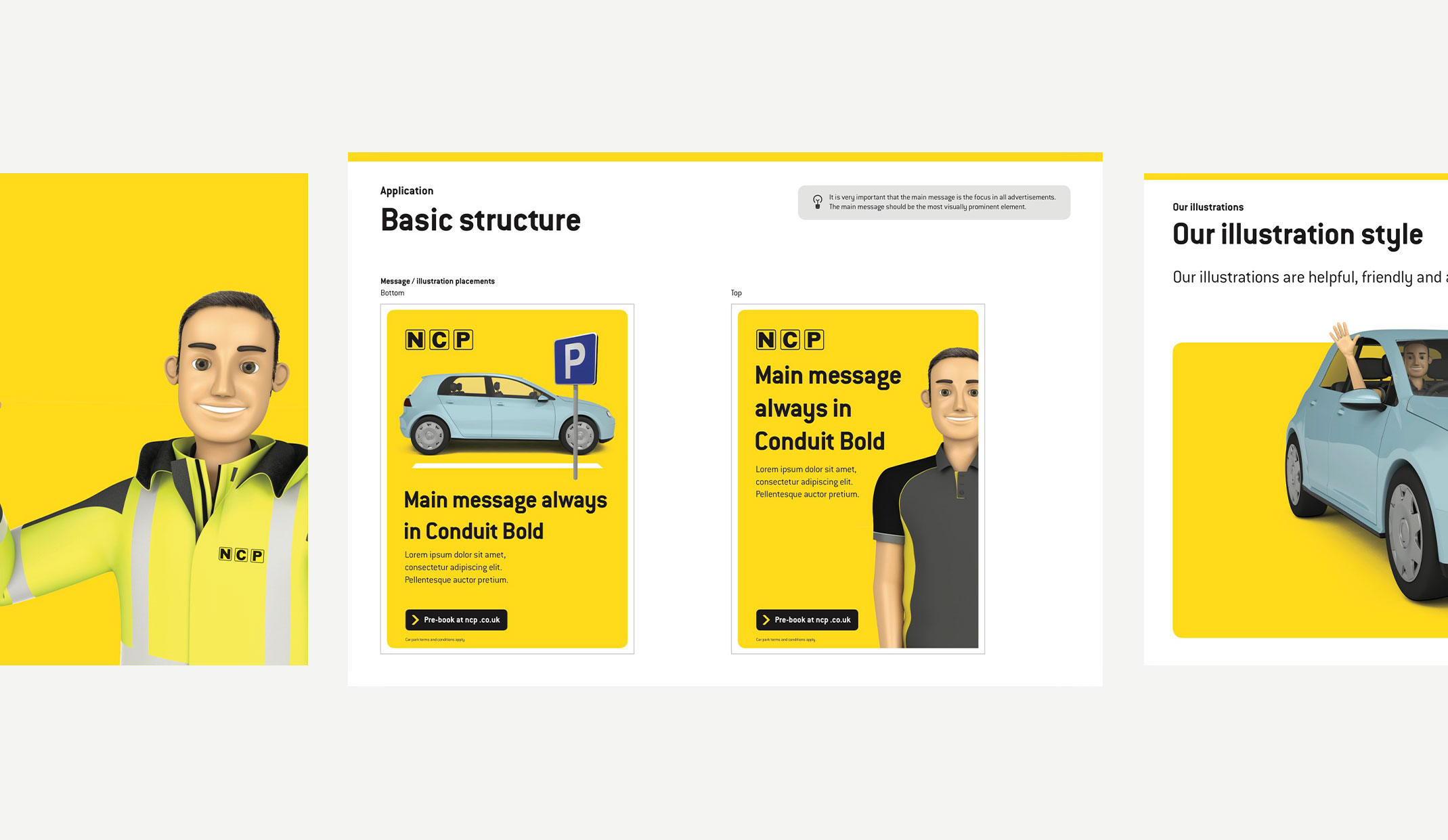
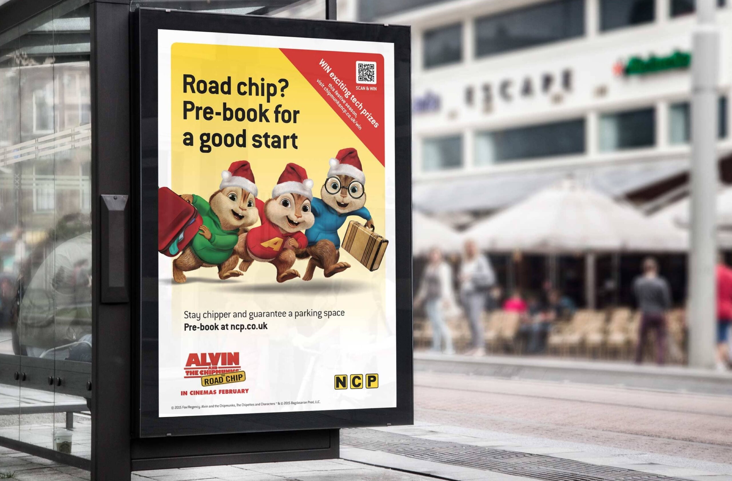
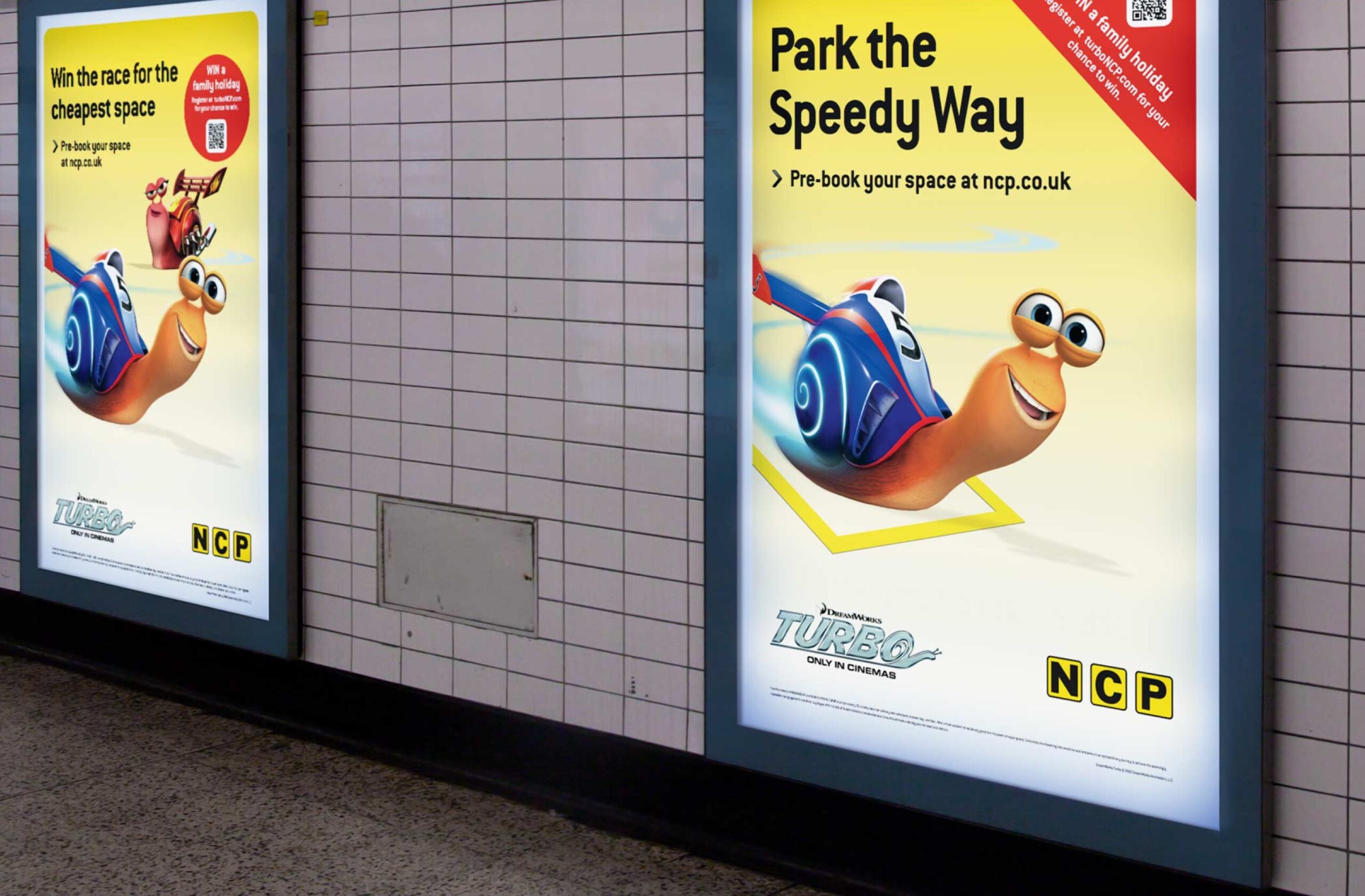
It was important that the customer journey remained consistently simple and easy to follow. From refreshing iconic visuals, to bringing the brand to life through creative assets for various B2C marketing channels including, their summer campaign, lockdown campaign, and the development of the ParkPass brand and App.
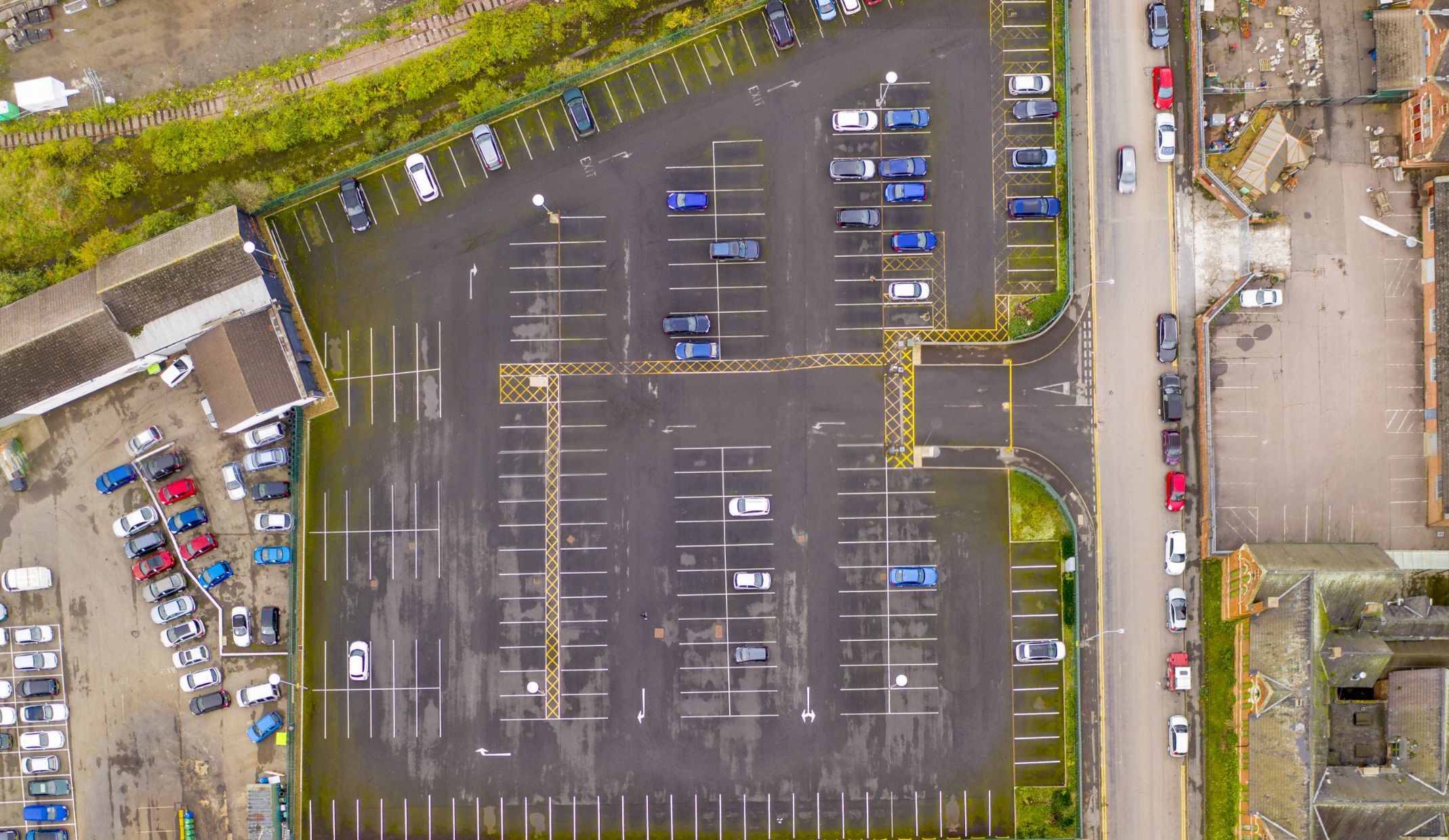
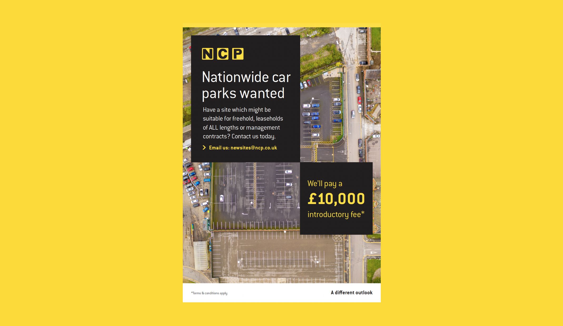
To help grow NCP’s B2B brand, we supported the team with the onboarding of new car parks. This strategic support not only contributed to the growth of NCP as a business but also significantly improved its brand recognition in the competitive landscape of the parking industry.
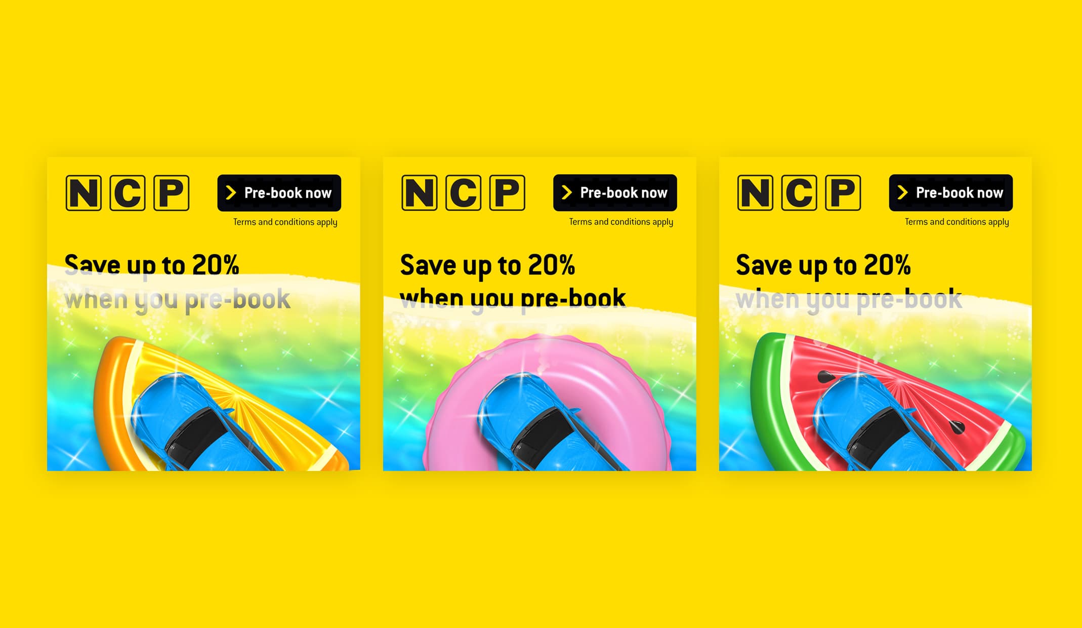
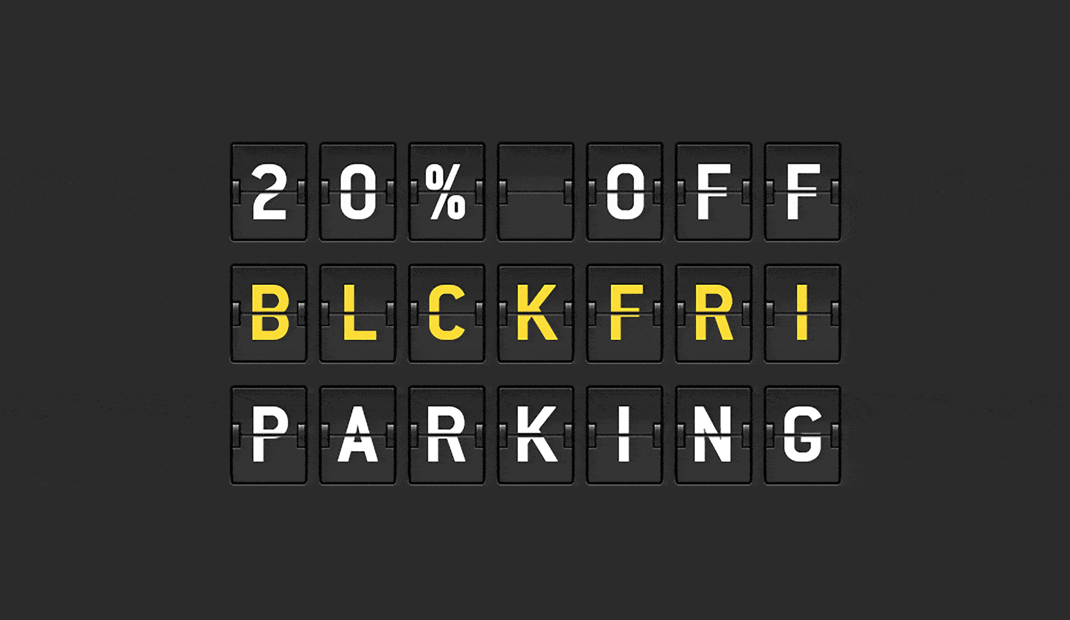
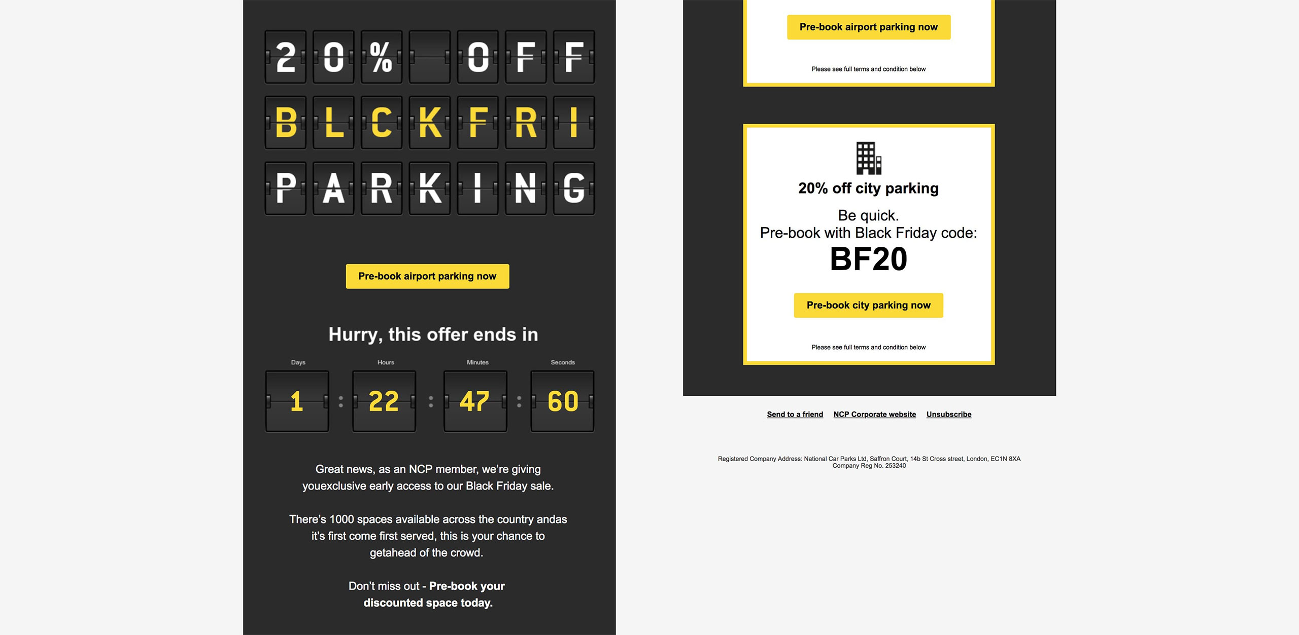
The seasonal campaigns, including their successful summer campaign, set the scene for key times of the year, engaging customers with standout creative and increasing the footfall in NCP car parks, especially during Christmas and summer. Alongside seasonal campaigns, we also designed and delivered creative campaigns for NCP, including their Black Friday and Cyber Monday Pre-book 24 hour parking offer. With compelling visuals, personalised variations and a strong call to action enhancing the overall performance.
– Brand Marketing Manager, NCP


© 2023 Rawww Ltd | All Rights Reserved. Company No: 05508453